In the previous article we looked at the GridLayout label pattern and explored how it is designed to keep the label text visible irrespective of the background. In this article we’ll look at this concept further.
It is worth mentioning that transparency is not a requirement for keeping text readable despite the background. An obvious example of this is the Android Toast mechanism. This displays text in an opaque container that ensures that it will always stand out from the background. So given that Toast works really quite well, why not simply use opaque containers?
A simple answer is that semi-transparent containers allow something of the background to show through. Compare the GridLayout label shown on the Android Design website with a Toast. A Toast is fairly unobtrusive and would not overly annoy you if you were, for example, watching a video when it popped up. However the GridLayout label is much larger than a Toast and a semi-transparent container allows it to overlay the background without completely obscuring it, as an opaque container would.
As well as using a semi-transparent container to help text stand out from the background, there is another technique that we can use to help text to stand out from the background: using a text shadow to create a contrasting glow around the text. This was covered in the post on text shadows.
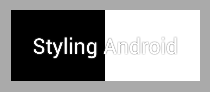
But surely we’re looking at transparency in this series, so why mention text shadows? When we specify a shadow radius to create the glow effect, this is actually implemented using transparency. If we create a TextView containing white text on top of the the black and white background that we used previously:
[xml][/xml]
As we would expect, the white text disappears against the white background:
We now add a shadow to the text:
[xml][/xml]
This uses a shadow with 0 offset from the shadowDx and shadowDy attributes to help the text stand out from the white background so that it remains readable:
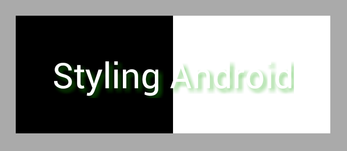
Of course we can also experiment with using offsets and coloured shadows to create different effect. Here we use a semi-transparent shade of “Styling Android green” with an offset:
[xml][/xml]
This gives us the following:
It is interesting to note that the green effect all but disappears against the black background. As we have seen previously semi-transparent colours behave differently against different coloured backgrounds. In this case we are using a semi-transparent colour for the shadow, and this gets largely absorbed by the black background, while standing out clearly against the white background. This is yet another example of how we can get some rather subtle effects by the use of transparency.
In the next part of this series well move away from text and explore some other things that we can do with transparency.
The source code for this article can be found here.
© 2012 – 2013, Mark Allison. All rights reserved.
Copyright © 2012 Styling Android. All Rights Reserved.
Information about how to reuse or republish this work may be available at http://blog.stylingandroid.com/license-information.


1 Comment