
In a recent post on Styling Android we looked SlidingPanelLayout. This can simplify the implementation of a List / Detail UI. It handles the logic of whether to show a side-by-side layout or a two-page layout depending on the screen size. Currently, there is no equivalent for this in Jetpack Compose. In this article, we’ll see how Compose makes this relatively easy.
Before we dive into this it’s worth pointing out the word “currently” in the opening paragraph. This is an area of Compose that is under active development. So keep an eye out for an official implementation of this kind of functionality. Even if this is only a temporary solution there are still some interesting techniques that we’ll cover.
It’s also worth mentioning that, we’ll have a working solution by the end of this article. This may be fine for many cases. But we’ll add further functionality in the second article. This will make the behaviour even better on foldable devices.
List / Detail
The basic behaviour that we’re after is when the UI has a list of items. When the user taps an item in the list then we display the details in the detail view. On larger screens, there may be sufficient space to display both the list and detail view side-by-side. However, on smaller devices tapping an item may replace the list view with the detail view, and hitting back will return.
We can do this on older View-based UIs by having different layouts for different screen sizes. More recently, SlidingPaneLayout can handle the heavy lifting.
To do this with Compose, let’s first look at the List and Detail composables:
@Composable
fun MyList(list: List, onSelectionChange: (String) -> Unit) {
    LazyColumn {
        for (entry in list) {
            item {
                Row(
                    Modifier
                        .fillMaxWidth()
                        .clickable { onSelectionChange(entry) }
                        .padding(horizontal = 16.dp, vertical = 8.dp)
                ) {
                    Text(text = entry)
                }
            }
        }
    }
}

@Composable
fun Detail(text: String) {
    Text(text = text)
}
I have deliberately kept these as simple as possible. This is to keep the code easy to understand.
MyList() uses a LazyColumn to display a list of items provided as an argument, and the selection action is handled by a listener argument. Detail() simply displays a piece of text – this will be inlined later on.
Create a simple DSL
To make things easier later, let’s create a simple DSL that will provide a fluent way of declaring both the list and detail UIs:
@Immutable interface TwoPaneScope{ val list: @Composable (List , (T) -> Unit) -> Unit val detail: @Composable (T) -> Unit @Composable fun List(newList: @Composable (List , (T) -> Unit) -> Unit) @Composable fun Detail(newDetail: @Composable (T) -> Unit) } private class TwoPaneScopeImpl ( val items: List ) : TwoPaneScope { override var list: @Composable (List , (T) -> Unit) -> Unit = { _, _ -> } private set override var detail: @Composable (T) -> Unit = {} private set @Composable override fun List(newList: @Composable (List , (T) -> Unit) -> Unit) { list = newList } @Composable override fun Detail(newDetail: @Composable (T) -> Unit) { detail = newDetail } }
This provides a scope within which we can declare the list and detail UIs. We’ll go in to the implementation of this later on. For now, all we need to know is that we can declare the UI like this:
ListDetailLayout(
    (1..10).map { index -> "Item $index" },
    LocalConfiguration.current
) {
    List { list, onSelectionChange ->
        MyList(list, onSelectionChange)
    }
    Detail { text ->
        Text(text = text)
    }
}
We’ll see how we can access the UI definitions for the List and Detail blocks shortly.
Split Layout
The split layout (i.e. the side-by-side one) is the relatively easy to implement:
@Composable
private fun SplitLayout(
    twoPaneScope: TwoPaneScopeImpl,
    selected: String?,
    onSelectionChange: (String) -> Unit
) {
    Row(Modifier.fillMaxWidth()) {
        Box(modifier = Modifier.weight(1f)) {
            twoPaneScope.list(twoPaneScope.items, onSelectionChange)
        }
        Box(modifier = Modifier.weight(1f)) {
            twoPaneScope.detail(selected ?: "Nothing selected")
        }
    }
}
Here we have the selected state passed in as an argument and a lambda to handle selection changes. Keeping our composables stateless is good practice as it can make them less error-prone, and easier to test.
We obtain the list and detail UIs from twoPaneScope.
For the list UI we specify the list as the first argument and the selection change handler as the second.
For the detail UI we set the text to the value of the selected argument.
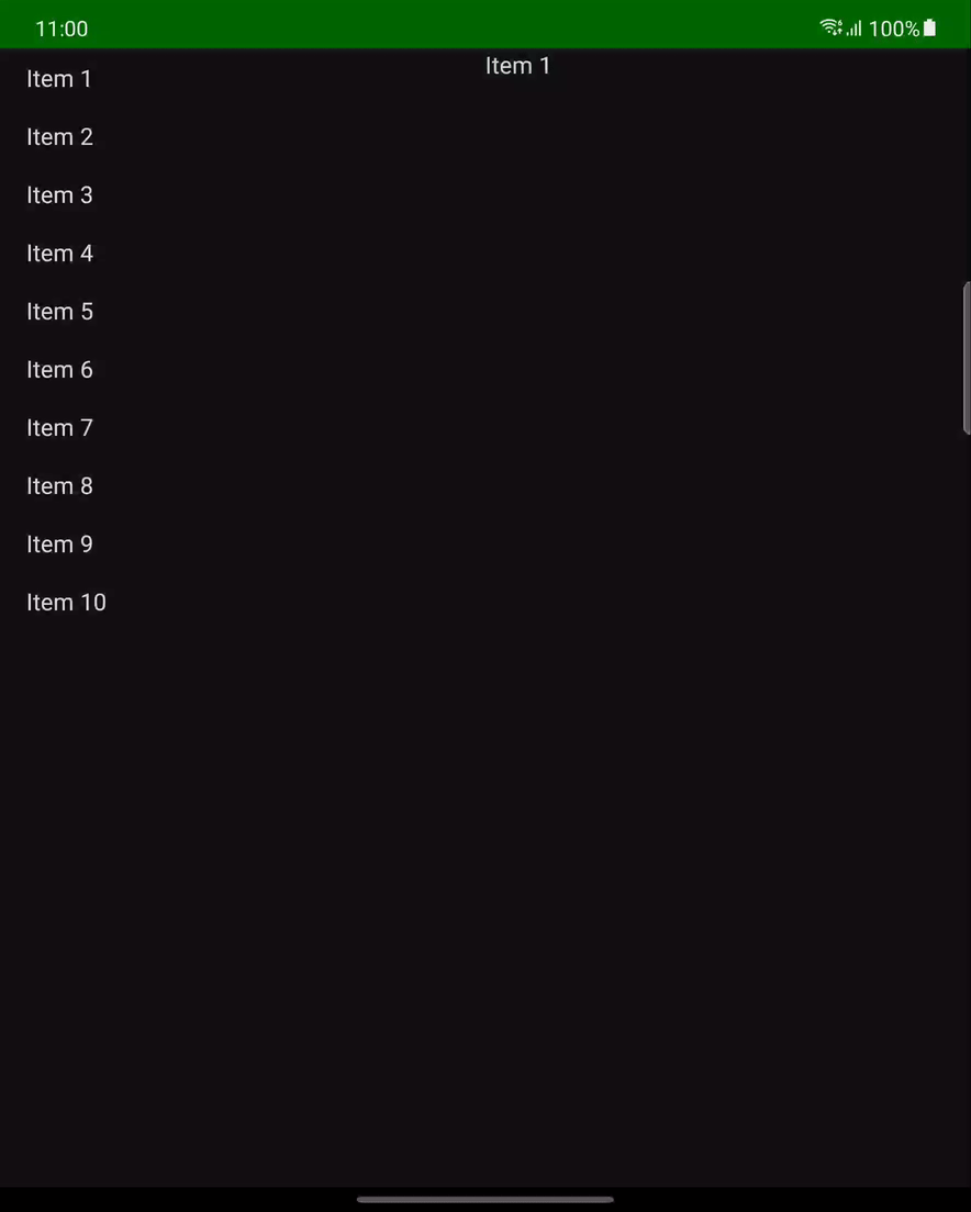
We display the List and Detail components side-by-side using a Row. I have used equal weights here to divide the screen in half. But it would be trivial to change that to meet differing requirements.
When the user taps on a list item, the text is displayed in the right hand pane:
Two Page Layout
Implementing the two-page layout is slightly different because we need to display either the list UI or the detail UI depending on whether we have a selected item:.
@Composable
private fun TwoPageLayout(
    twoPaneScope: TwoPaneScopeImpl,
    selected: String?,
    onSelectionChange: (String) -> Unit
) {
    Box(modifier = Modifier.fillMaxWidth()) {
        if (selected == null) {
            twoPaneScope.list(twoPaneScope.items, onSelectionChange)
        } else {
            twoPaneScope.detail(selected)
        }
    }
}
Once again we objtain the UI details from twoPaneScope and hook them up to selection and onSelectionChange as before. The real difference here is that we display either the list UI or the detail UI depending on whether selection is null.
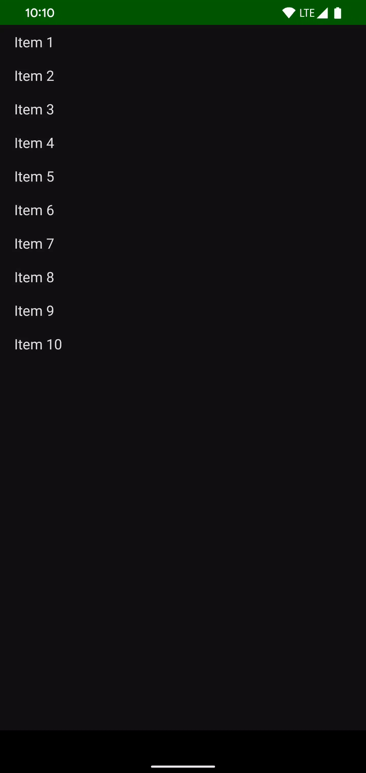
This gives the basic behahviour that we’re after:
To keep the code simple and easier to understand I haven’t included any navigation animations. But that is certainly something I’d look to add when using this for real.
Navigation
The selection of different detail items will be handled by the Navigation Compose library. In this simple example the NavGraph will have a single route:
private object NavGraph {
    sealed class Route(val route: String) {
        object Detail : Route("detail/{selected}") {
            fun navigateRoute(selected: String?) = "detail/$selected"
        }
    }
}
This route takes an argument of the string that will be displayed in the detail UI. Navigating to this will provide the appropriate argument.
The components that we’ve looked at so far are totally agnostic of the use of Navigation Compose. This is quite deliberate. It means that SplitLayout and TwoPageLayout or solely focused on the distinct layout types. Having them stateless will also help when it comes to handling configuration changes. Hoisting the navigation logic to a higher level will assist in this
ListDetailLayout
Now that we’ve implemented the basic behaviour patterns, we need to add the logic of when to use each. This is actually really easy in Compose:
@Composable
@Suppress("MagicNumber")
fun ListDetailLayout(
    list: List,
    configuration: Configuration,
    scope: @Composable TwoPaneScope.() -> Unit
) {
    val isSmallScreen = configuration.smallestScreenWidthDp < 580
    val navController = rememberNavController()
    val twoPaneScope = TwoPaneScopeImpl(list).apply { scope() }

    NavHost(navController = navController, startDestination = NavGraph.Route.Detail.route) {
        composable(NavGraph.Route.Detail.route) { navBackStackEntry ->
            val selected = navBackStackEntry.arguments?.getString("selected")
            if (isSmallScreen) {
                TwoPageLayout(twoPaneScope, selected) { selection ->
                    navController.navigate(route = NavGraph.Route.Detail.navigateRoute(selection)) {
                        popUpTo(NavGraph.Route.Detail.navigateRoute(null)) {
                            inclusive = true
                        }
                    }
                }
                BackHandler(true) {
                    navController.popBackStack()
                }
            } else {
                SplitLayout(twoPaneScope, selected) { selection ->
                    navController.navigate(route = NavGraph.Route.Detail.navigateRoute(selection)) {
                        popUpTo(NavGraph.Route.Detail.route) {
                            inclusive = true
                        }
                    }
                }
            }
        }
    }
}
A Configuration instance is passed in as an argument, and we apply some simple logic to determine whether we are running on a small screen.
The Configuration object is not specific to Compose, it is what is used by the resource management framework to provide alternate resources. So we can leverage it in much the same way we. In this case, we’re applying the same logic as when we put a layout in res/layout/sw580. We’ll look at where this comes from in a moment.
We invoke the scope lambda within the concrete implementation of TwoPaneScope which gives us a TwoPaneScopeImpl that is initialsed with the UI declared within the scope. This instance gets passed down to TwoPageLayout and SplitLayout. We then obtain a NavController instance to handle navigation.
Next we construct a NavHost which contain the entire list detail UI regardless of whether it is a two-page layout or a split layout. This has a single destination – a Detail route which takes a nullable argument of the current selection text.
Within the composable destination, we emit TwoPageLayout if we’re running on a small screen otherwise we emit SplitLayout. The navigation logic is subtly different for the two UIs because they use the back stack slightly differently.
Whenever we navigate to a new destination or get a configuration change, this will be recomposed. Having the navigation wrap the entire UI in this way will maintain both UI and navigation state following configuration changes.
Putting It All Together
We can now call DynamicLayout with three arguments: The list of strings to display, the Configuration instance, and a lambda scoped to TwoPaneScope<String>:
class MainActivity : ComponentActivity() {

    override fun onCreate(savedInstanceState: Bundle?) {
        super.onCreate(savedInstanceState)

        setContent {
            ComposeListDetailTheme {
                Surface(color = MaterialTheme.colors.background) {
                    @Suppress("MagicNumber")
                    ListDetailLayout(
                        (1..10).map { index -> "Item $index" },
                        LocalConfiguration.current
                    ) {
                        List { list, onSelectionChange ->
                            MyList(list, onSelectionChange)
                        }
                        Detail { text ->
                            Text(text = text)
                        }
                    }
                }
            }
        }
    }
}
We obtain the current Configuration by calling LocalConfiguration.current.
The user will now see different UIs depending on the window size. This also works in multi-window – as the window size crosses the 580dp width boundary the UI switches automatically.
Conclusion
None of the individual composables here are particularly complex. That is very much by design. Keeping the composables small and focused makes them much easier to combine to create the desired UI. For example DyanmicLayout is solely about the logic for which UI to emit. TwoPageLayout and SplitLayout are solely responsible for their own specific behaviour
While this may seem like we have the behaviour that we want now, this doesn’t quite match the functionality of SlidingPaneLayout. In the next article, we’ll look at how we can get this playing even nicer with foldables.
Many thanks to Ian Lake for providing some valuable feedback on my bad use of navigation in the original version of this post. Not only has that removed some potential state handling bugs, but it has also cleaned up the entire implementation. Thanks, Ian!
The source code for this article is available here.
© 2021, Mark Allison. All rights reserved.
Copyright © 2021 Styling Android. All Rights Reserved.
Information about how to reuse or republish this work may be available at http://blog.stylingandroid.com/license-information.
