
In August 2015 Google published a new support library along with the Marshmallow Developer Preview 3 named Percent which provides an alternative to using weights in LinearLayout to divide space within your layouts. In this short series we’ll take a look at this new library, explore how to implement it, and also look at some potential pitfalls.
One area worthy of some further exploration is the behaviour of wrap_content. The Javadoc for PercentRelativeLayout states:
If you want the view to be able to take up more space than what percentage value permits, you can add
layout_width/height="wrap_content". In that case if the percentage size is too small for the View’s content, it will be resized usingwrap_contentrule.
So let’s try this with a couple of TextViews which contain some long text and both have android:layout_height="wrap_content" with the first having app:layout_heightPercent="10%" set as well:
<android.support.percent.PercentRelativeLayout xmlns:android="http://schemas.android.com/apk/res/android"
  xmlns:app="http://schemas.android.com/apk/res-auto"
  xmlns:tools="http://schemas.android.com/tools"
  android:layout_width="match_parent"
  android:layout_height="match_parent"
  tools:context=".MainActivity">

  <TextView
    style="@style/Base.TextAppearance.AppCompat.Title"
    android:layout_height="wrap_content"
    android:layout_marginTop="@dimen/activity_vertical_margin"
    android:background="@color/light_grey"
    android:gravity="center_horizontal"
    android:padding="8dp"
    android:text="@string/long_string"
    app:layout_heightPercent="10%"
    app:layout_marginLeftPercent="10%"
    app:layout_marginStartPercent="10%"
    app:layout_widthPercent="35%" />

  <TextView
    style="@style/Base.TextAppearance.AppCompat.Title"
    android:layout_height="wrap_content"
    android:layout_alignParentEnd="true"
    android:layout_alignParentRight="true"
    android:layout_marginTop="@dimen/activity_vertical_margin"
    android:background="@color/light_grey"
    android:gravity="center_horizontal"
    android:padding="8dp"
    android:text="@string/long_string"
    app:layout_marginEndPercent="10%"
    app:layout_marginRightPercent="10%"
    app:layout_widthPercent="35%" />

</android.support.percent.PercentRelativeLayout>
Based upon the documentation I would expect the android:layout_height="wrap_content" to trump the percentage height when the content is larger than the percentage height, but this is clearly not the case:
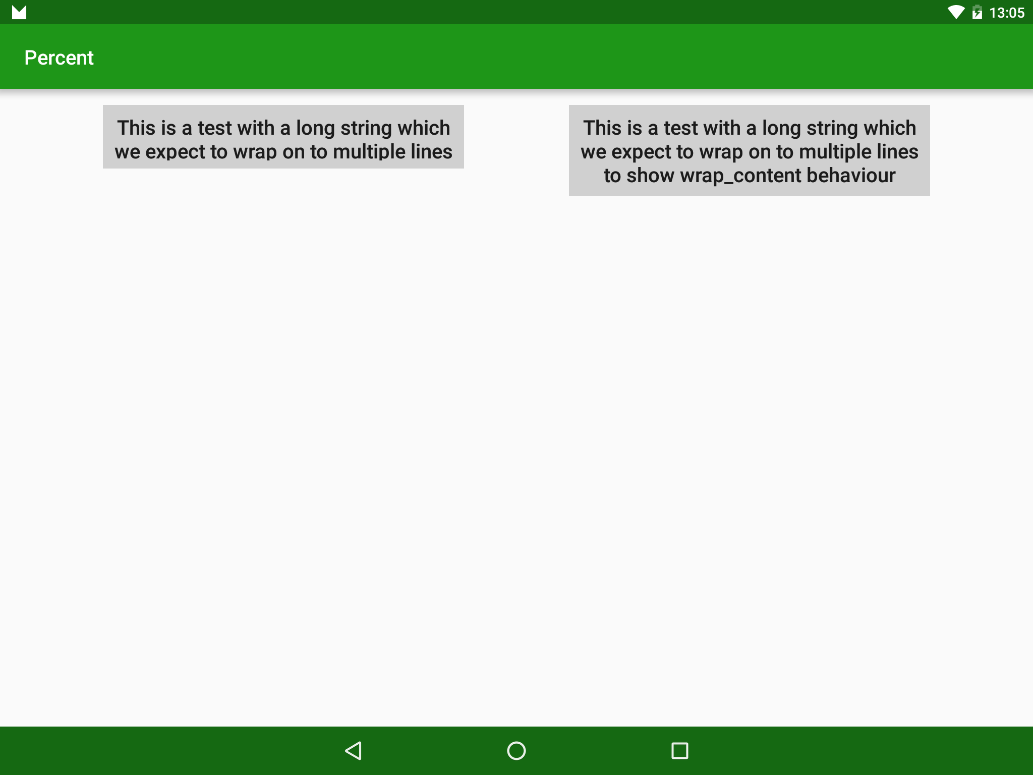
This isn’t a major issue because the second example shows that it’s easy enough to get the behaviour we want – it’s just that the behaviour when both attributes are included does not quite match the documentation. So expect either the underlying implementation or the documentation to change at some point.
The other point worth mentioning is one that was hinted at in the first article. When I first created the sample app accompanying this series, I used a default layout which had been created by Android Studio. Once I had a basic example working I noticed that the green box was not actually being centred within the layout:
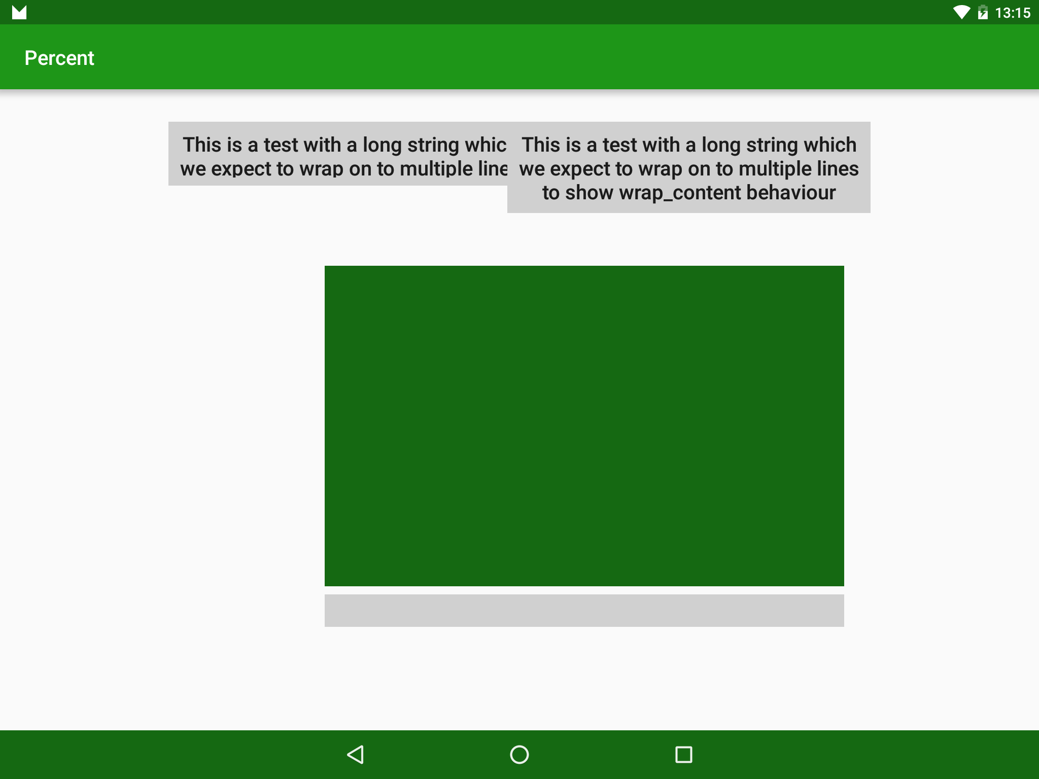
I have also kept the TextViews from the previous issue because they are also positioned incorrectly and further highlight that the green box is not being centred.
It was only when I studied the layout carefully that I discovered the cause of the problems:
<android.support.percent.PercentRelativeLayout xmlns:android="http://schemas.android.com/apk/res/android"
  xmlns:app="http://schemas.android.com/apk/res-auto"
  xmlns:tools="http://schemas.android.com/tools"
  android:layout_width="match_parent"
  android:layout_height="match_parent"
  android:paddingBottom="@dimen/activity_vertical_margin"
  android:paddingLeft="@dimen/activity_horizontal_margin"
  android:paddingRight="@dimen/activity_horizontal_margin"
  android:paddingTop="@dimen/activity_vertical_margin"
  tools:context=".MainActivity">
  .
  .
  .
</android.support.percent.PercentRelativeLayout>
The default paddings on the parent layout were actually causing the problems. It would appear that the percentages are based upon the total size of the PercentRelativeLayout but the position is performed relative to the padding. So by having padding set in the parent layout the total available space was no longer equivalent to 100% of the PercentRelativeLayout parent and therefore the positioning of the child Views was not what was expected. Moreover. because of differences between how the green box and the TextViews were positioned relative to the parent, the issue manifested in different ways.
For the green box, the implicit right and bottom margins which were discussed in the first article were no longer working because the total size available is no longer 100% of the parent. One solution for this would be to use android:layout_center[Horizontal|Vertcial]="true".
For the TextViews which we’re being positioned relative to opposite edges, this meant that the space between them was being affected. Unfortunately there is no easy work around at child View level to resolve this.
I honestly don’t know whether this behaviour is by design or is a bug, so there is a possibility that it may change at some point.
The only real solution is to avoid using padding on the PercentRelativeLayout parent. You will notice that none of the other examples in these articles contain padding!
Despite those two minor niggles (and they are minor niggles because they are very easy to work around) the Percent library provides us with some long overdue proportional sizing and positioning without having to embed a LinearLayout, or implement our own custom layouts to achieve it.
The source code for this article is available here.
© 2015, Mark Allison. All rights reserved.
Copyright © 2015 Styling Android. All Rights Reserved.
Information about how to reuse or republish this work may be available at http://blog.stylingandroid.com/license-information.

Great article. I would love to see a performance rundown of linearlayout with weights vs percentrelative/frame layout (as I’ve hear that linear layout withweights is somewhat expensive to measure).
Do you know if they maybe fixed the niggles in subsequent releases?