
One of the frustrations of working with VectorDrawable is having to tell designers: “Sorry gradients aren’t supported” when they provide assets which contain gradients which we need to import as VectorDrawable. The options are to either remove the gradients, or to import bitmap images instead. However that has all changed and we now have gradient support in API24 and later. In this short series of posts we’ll take a look at how to use them.
 In my experience designers are rather fond of using gradients in their designs. Subtle use of gradients can give a real feeling of depth even when they are actually quite difficult to spot. There can be a tendency go overuse them for some designers who are not aware that gradients are computationally more costly to render than solid fills. In such cases performance gains can be made by converting to bitmaps so the gradients are rendered when the bitmap is created rather than on the device. However, where we have a relatively small number of gradients we can now render them within VectorDrawable.
We’ll start with a simple linear gradient:
<?xml version="1.0" encoding="utf-8"?>
<vector xmlns:android="http://schemas.android.com/apk/res/android"
  xmlns:aapt="http://schemas.android.com/aapt"
  android:width="96dp"
  android:height="96dp"
  android:viewportHeight="100"
  android:viewportWidth="100">

  <path
    android:pathData="M1,1 H99 V99 H1Z"
    android:strokeColor="?android:attr/colorAccent"
    android:strokeWidth="2">
    <aapt:attr name="android:fillColor">
      <gradient
        android:endColor="?android:attr/colorPrimaryDark"
        android:endX="50"
        android:endY="99"
        android:startColor="?android:attr/colorPrimary"
        android:startX="50"
        android:startY="1"
        android:type="linear" />
    </aapt:attr>
  </path>
</vector>
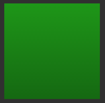
We specify the fillColor attribute as an inline complex resource in exactly the same way as we covered in the article about AnimatedVectorDrawable Bundles. This enables us to include a somewhat more complex fill colour than simply linking to a colour resource. In this case we define a gradient instance which is actually an instance of GradientColor. By keeping startX and endX the same, and having startY at the top of the canvas and endY at the bottom we create a vertical gradient which starts at the top with the primary app compat theme colour, and blends to the primary dark app compat theme colour at the bottom:
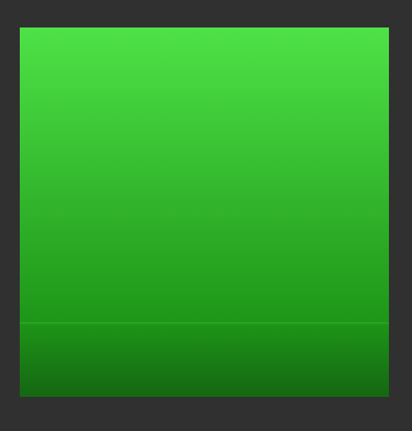
Those that are familiar with gradients, or those who read the recent Styling Android series on Radial Gradient will be aware that sometimes we need finer control over our gradients, and just providing a start and end colour is not sufficient. I deliberately kept the first example simple so that it was easier to understand, but we can also have multiple colours in our gradient, and have pretty fine grained control over the transition. In this case we go from the accent colour, through the primary colour at the 80% point, and finish at dark primary:
<?xml version="1.0" encoding="utf-8"?>
<vector xmlns:android="http://schemas.android.com/apk/res/android"
  xmlns:aapt="http://schemas.android.com/aapt"
  android:width="96dp"
  android:height="96dp"
  android:viewportHeight="100"
  android:viewportWidth="100">

  <path
    android:pathData="M1,1 H99 V99 H1Z"
    android:strokeColor="?android:attr/colorAccent"
    android:strokeWidth="2">
    <aapt:attr name="android:fillColor">
      <gradient
        android:endX="50"
        android:endY="99"
        android:startX="50"
        android:startY="1"
        android:type="linear">
        <item
          android:color="?android:attr/colorAccent"
          android:offset="0.0" />
        <item
          android:color="?android:attr/colorPrimary"
          android:offset="0.8" />
        <item
          android:color="?android:attr/colorPrimaryDark"
          android:offset="1.0" />
      </gradient>
    </aapt:attr>
  </path>

  <path android:strokeWidth="0.1"
    android:strokeColor="@color/colorAccent"
    android:pathData="M0,80 H100" />
</vector>
We can define multiple distinct <item> elements, each of which represents a different stop within the gradient, and the offset attribute specifies where it is. In this case much of the gradient will be the transition between the accent colour and the primary colour, and the final 20% being the transition from primary to dark primary. I have drawn a thin line at the 80% point which shows this offset point:
I can also confirm that linear gradients in SVG images created in Sketch import through the Vector Asset tool in Android Studio effortlessly.
Linear gradients work extremely well, but unfortunately there are some gotchas and issues when it comes to other types of gradient and in the concluding article in this series we’ll take a look at those.
The source code for this article is available here.
© 2018, Mark Allison. All rights reserved.
Copyright © 2018 Styling Android. All Rights Reserved.
Information about how to reuse or republish this work may be available at http://blog.stylingandroid.com/license-information.
