Previously in this series we have worked through porting the existing ActionBar tutorial code to work with ActionBarCompat and therefore be compatible with Android API 7 and later. In this concluding article of the series we’ll compare the example app on both API 7 and API 18 devices to see the differences in UI that our users will experience.
Before we continue it is worth pointing out that ActionBarCompat will make use of ActionBar support if it is already baked in to the OS. This makes sense because it means that users will get a consistent experience on their device which use the built in ActionBar support and those which use ActionBarCompat. This does, however, mean that our app will use a different ActionBar implementation on different OS levels, and we will see subtle, and some not so subtle, differences in UI as a do result.
An important decision which you should consider is how you want the UI to be consistent to the OS level of their device. By this I mean the look of various controls which have changed as Android have evolved. A good example of this is the humble ProgressBar. In newer versions it has a slim Holo-styling, but prior to that it was chunky and orange. To many the older style now looks garish and dated, but it is important to remember that this style is the default look for this control on older devices, and many other apps will still use this. If you stock to the default styles for the stock controls and set targetSdkVersion to the latest version of Android then the OS will use the appropriate styling.
Let’s begin looking at the differences. All of the following examples show how the code from this series looks on a Galaxy Nexus running 4.3 (API 18) and an emulator running 2.1 (API 7). The first example shows tab navigation:
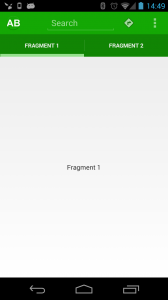
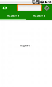
There are a few differences here. Firstly the EditText is rendering rather differently because, as had already been discussed, the look of the native control on different API levels is different. This is also true of the direction icon because we are using a stock Android image for this button, and the look of these has also changed.
Another difference is that the API 18 version is rendered with two district shades of green, one for the ActionBar proper, and another for the tabs. After much tinkering I have been unable to resolve this and believe it to be a minor bug in ActionBarCompat.
The final difference is that on API 18 the overflow menu is shown, but this is absent on API 7. This is in keeping with the context menu implementation prior to the introduction of the ActionBar in Honeycomb where a hardware menu button would bring up the context menu. We can see the different context menu implementations when the menu is opened:
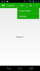
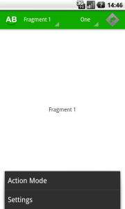
If we now switch to Spinner navigation, this looks to be fairly similar:
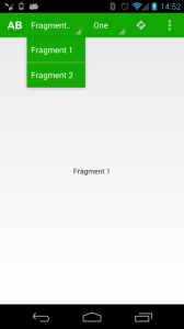
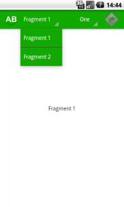
The only significant difference in the navigation drop down is the separator color. However, if we look at the other Spinner there’s something of a problem:
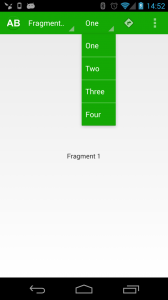

The reason for this is that Spinner was completely overhauled in Honeycomb, and the fundamental behaviour of this control changed from a pop up overlay (resembling the options menu, appearing in the middle of the display) to the now standard drop down. This makes perfect sense except for the fact that the navigation Spinner on API 7 looks pretty close to it’s counterpart in API 18. The reason behind this is that there is a back-port of the Ice Cream Sandwich Spinner implementation baked in to ActionBarCompat named SpinnerICS which is used for the navigation Spinner. Unfortunately this back-port is a private API and we cannot use it.
On the face of it this would appear to be something of an issue, but in reality using multiple Spinners in a single ActionBar is something of a rarity. One of the reasons that I did this in the original articles was to demonstrate how you needed to style a navigation Spinner and a Spinner as a custom view separately, and this further reinforces how different these visually similar controls actually are.
The final comparison is that of the ActionMode:
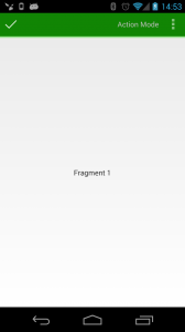
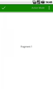
This is actually the closest of all, with no obvious differences.
The only issue that I have with this is that up until now we have seen consistent behaviour on each platform. On API 18 we have consistently seen an overflow menu appear on the ActionBar, but on API 7 this is accessed through the hardware menu button. But now we see an overflow menu on both platforms when we enter an ActionMode.
I contacted Goggle regarding this perceived discrepancy and received the following explanation by Adam Powell:
Overflow is really an idea that goes beyond activities and action bars. Any time you see it, it’s in context and offers extra functionality in-place. See the Gmail message headers within a conversation for an example. You’ll see an overflow menu for each one.
On newer devices without a menu key it’s not just that the menu button has moved, there is no menu button anymore. Overflow isn’t a direct analog even though it’s used to display the options menu that is presented using the menu key on older devices. People who find inconsistency between overflow button placement between single bar and split action bar activity configurations are expecting overflow to be an on-screen options menu button and that’s not the case.
Looking for a consistency between the options menu and action modes isn’t really appropriate either. They’re different ideas. On Gingerbread devices the presentation of the activity options menu stays consistent with the options menu everywhere else on the device, whether those apps use appcompat or not. Action modes stay consistent with themselves and surface their actions contextually, in-place so they won’t be missed or overlooked in a transient mode of the activity UI.
Adam’s explanation certainly makes it easier to understand what a complex issue it is, yet I cannot help but feel that this provides an inconsistent UX. The average user does not know the difference between a standard ActionBar and an ActionMode and to have different overflow menu behaviour on two distinct components which look very similar simply feels wrong, to me.
That said, I’m sure that many average users would not actually perceive any discrepancy, so I’m probably being over-picky!
These minor criticism aside, ActionBarCompat is a nicely put together library. I’m deeply indebted to Chris Banes for providing some invaluable assistance and advice to me while writing this series, and for the work that he put in to ActionBarCompat.
© 2013, Mark Allison. All rights reserved.
Copyright © 2013 Styling Android. All Rights Reserved.
Information about how to reuse or republish this work may be available at http://blog.stylingandroid.com/license-information.


hi , when i rotate the app (screen rotation) , the fragments are overlaid .how to resolve this small prob ??
thanks
Hi, great tutorial, all works here, now I’m using a shareactionprovider as a action menu and I’m having problem with the style, I already went through the android source code and I can’t change the background of the menu, can you help?