In the last article we began styling an AlertDialog, but ran in to problems because Android does not apply text styles to AlertDialogs. In this article we’ll explore how we can overcome this problem.
The source code from the previous article can be found here.
The solution that I’m going to propose here is the result of some excellent work by Joseph Earl which he shared in an answer on Stack Overflow.
As I have previously mentioned, Honeycomb supports text styling in Alert Dialogs and what we’re going to do use the layouts used in Honeycomb from AOSP, which have styleable attributes, as a basis for our own custom layout, and use these to that we can apply the necessary styles. First let’s add two new layouts, the first at res/layout/alert_dialog_message.xml:
The key line here is line 8 which sets the style to the styleable attribute “textAppearanceMedium”. We can now create the second layout at res/layout/alert_dialog_title.xml:
The key line here is line 15 which sets the styleable attribute as “textAppearanceLarge”. Next we need to actually use these in our app. To do this, we need to create our own AlertDialog.Builder implementation which is actually less work than it sounds because we can subclass AlertDialog.Builder. So let’s create a new class named CustomBuilder:
public class CustomBuilder extends Builder
{
	private TextView title = null;
	private TextView message = null;
	private ImageView icon = null;

	public CustomBuilder( Context context )
	{
		super( context );

		View customTitle = View.inflate( context, R.layout.alert_dialog_title, null );
		title = (TextView) customTitle.findViewById( R.id.alertTitle );
		icon = (ImageView) customTitle.findViewById( R.id.icon );
		setCustomTitle( customTitle );

		View customMessage = View.inflate( context,
				R.layout.alert_dialog_message, null );
		message = (TextView) customMessage.findViewById( R.id.message );
		setView( customMessage );
	}

	@Override
	public CustomBuilder setTitle( int textResId )
	{
		title.setText( textResId );
		return this;
	}

	@Override
	public CustomBuilder setTitle( CharSequence text )
	{
		title.setText( text );
		return this;
	}

	@Override
	public CustomBuilder setMessage( int textResId )
	{
		message.setText( textResId );
		return this;
	}

	@Override
	public CustomBuilder setMessage( CharSequence text )
	{
		message.setText( text );
		return this;
	}

	@Override
	public CustomBuilder setIcon( int drawableResId )
	{
		icon.setImageResource( drawableResId );
		return this;
	}

	@Override
	public CustomBuilder setIcon( Drawable icon )
	{
		this.icon.setImageDrawable( icon );
		return this;
	}
}
We now need to modify our onCreateDialog() method in MainActivity to use our custom builder:
@Override
protected Dialog onCreateDialog( int id )
{
	Dialog dialog = null;
	if ( id == ALERT_DIALOG )
	{
		ContextThemeWrapper ctw = new ContextThemeWrapper( this, R.style.MyTheme );
		CustomBuilder builder = new CustomBuilder( ctw );
		builder.setMessage( "Hello World" )
			.setTitle( "Alert Dialog" )
			.setIcon( android.R.drawable.ic_dialog_alert )
			.setCancelable( false )
			.setPositiveButton( "Close",
				new DialogInterface.OnClickListener()
				{
					@Override
					public void onClick( DialogInterface dialog, int which )
					{
						dialog.dismiss();
					}
				}
		);
		dialog = builder.create();
	}
	if ( dialog == null )
	{
		dialog = super.onCreateDialog( id );
	}
	return dialog;
}
We have simply changed line 8 to use CustomBuilder instead of AlertDialog.Builder. Finally we need to override things in res/values/themes.xml” to apply our styles to the text:
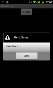
We can now run this:
So, we now have our AlertDialog styled as we want it. We haven’t covered the styling of the buttons or progress bar and other controls here, but the same techniques can be used. Have a look at the Alert Dialog layout and use that as a basis for adding other styleable attributes so that you can apply styles.
While this has allowed us to achieve exactly what we set out to do, it is worth considering that the amount of work necessary to work-around the limitations in pre-Honeycomb android is not trivial. Moreover, it could be argued that less work is required to implement things using an Activity as we did in the articles on Shape Drawables because an Activity-based implementation is much more styleable than an AlertDialog.
The final source for this article can be found here.
© 2011 – 2014, Mark Allison. All rights reserved.
Copyright © 2011 Styling Android. All Rights Reserved.
Information about how to reuse or republish this work may be available at http://blog.stylingandroid.com/license-information.

Hi, thanks for this useful article…
Nevertheless, what if the dialog has a ListView ? How to override the CustomBuilder so that it could handle the way list items are dsiplayed ? By default, the setView() provides a light background for the list. Therefore, font is black. Problem is that I want dark background in my list with a readable kinda white font…
🙂
Any clue ?
Cyril
Hi,
How to achieve the same in Honeycomb and above devices. Only solution I could thought is using the builder.setview with my custom layout both header, body and footer inside it. Is there any other way I can customise the background of dialog in HoneyComb and above…?
Regards,
Amjed
Thanks a lot very helpfull i was digging into codes of different kinds to get the result that i just got with your example, i just wanted to change the background of my title to be different from the one of the options of my list….well keep up the good work! thumbs up!
Thank you this was so helpful.