
Often we’ll receive designs which require us to customise the look of some of the standard Android controls. One problem with this is that when we override the default look of these controls we lose some of the nice state transitions that we get in newer versions of Android. In this article we’ll take a look at how we can implement our own transitions. It’s a lot easier than you might think!
 The example will be changing the look of a standard CheckBox to be a circle with a tick in it (see left) and the unchecked state will be an empty grey circle. I have created the assets in Sketch, and imported them in to the project as VectorDrawable. The checked asset is named
 toggle_checkedand contains two distinct paths: the circle, and the tick; and the unchecked asset is named toggle_unchecked and contains just the grey circle.
The technique that we’re going to use for animation is only available on API 21 and later. However the sample project is compatible back to API 14, and we’ll degrade the behaviour for pre-Lollipop devices. We’ll start by creating a state list drawable which will be used for backwards compatibility:
<?xml version="1.0" encoding="utf-8"?>
<selector xmlns:android="http://schemas.android.com/apk/res/android">
  <item android:drawable="@drawable/toggle_checked"
    android:state_checked="true" />
  <item android:drawable="@drawable/toggle_unchecked" />
</selector>
We can now use this as the button asset for our CheckBox:
<?xml version="1.0" encoding="utf-8"?>
<android.support.constraint.ConstraintLayout xmlns:android="http://schemas.android.com/apk/res/android"
  xmlns:app="http://schemas.android.com/apk/res-auto"
  xmlns:tools="http://schemas.android.com/tools"
  android:layout_width="match_parent"
  android:layout_height="match_parent"
  android:padding="32dp"
  tools:context="com.stylingandroid.animatedselector.MainActivity">

  <CheckBox
    android:layout_width="wrap_content"
    android:layout_height="wrap_content"
    android:button="@drawable/toggle"
    android:paddingEnd="8dp"
    android:paddingLeft="8dp"
    android:paddingRight="8dp"
    android:paddingStart="8dp"
    android:text="@string/restyled_checkbox"
    android:textColor="@color/text"
    app:layout_constraintEnd_toEndOf="parent"
    app:layout_constraintStart_toStartOf="parent"
    app:layout_constraintTop_toTopOf="parent" />

</android.support.constraint.ConstraintLayout>
This is fairly standard stuff, so let’s not bother will a detailed explanation here. But if we run this we get the basic behaviour we’re after (this is on an API 19 device: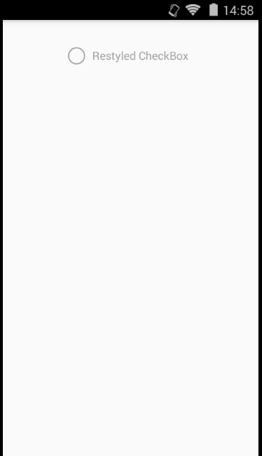
We have the updated look, but the transition between states it a bit sudden and it would be nice if we could make this feel a little smoother. As I’ve already mentioned, the API we’ll use to do this is only available on API 21 and later, so this sudden transition what legacy users will experience. It’s not ideal, but it’s a graceful degradation nonetheless.
We’ve covered StateListAnimator before on Styling Android and shown how we can animate items by embedding animations in our state transitions. However there is another tool that we can use that really opens things up when it comes to animating VectorDrawable: AnimatedStateListDrawable.
An AnimatedStateListDrawable is used in a similar way to a traditional StateListDrawable that we have already defined, the main difference is that in addition to declaring drawables for the static states, we can also define transition animations which will be run whenever the state changes.
We’ll create our AnimatedStateListDrawable in res/drawable-v21 so that it will be used for API 21 and later devices (note how we give it the same name as the state list drawable that we defined earlier):
<?xml version="1.0" encoding="utf-8"?>
<animated-selector
  xmlns:android="http://schemas.android.com/apk/res/android">

  <item
    android:id="@+id/checked"
    android:drawable="@drawable/toggle_checked"
    android:state_checked="true" />

  <item
    android:id="@+id/unchecked"
    android:drawable="@drawable/toggle_unchecked" />

  <transition
    android:drawable="@drawable/toggle_unchecked_checked"
    android:fromId="@id/unchecked"
    android:toId="@id/checked" />

  <transition
    android:drawable="@drawable/toggle_checked_unchecked"
    android:fromId="@+id/checked"
    android:toId="@+id/unchecked" />

</animated-selector>
The parent element is animated-selector and the two item elements are almost identical to those in the legacy state list drawable, with the addition of a unique id for each. Each of the transition elements declare the start and end states, and the drawable which will be used for this transition. It will probably not come as too much of a surprise to learn that these drawables are actually AnimatedVectorDrawable.
The AnimatedVectorDrawable to transition from the unchecked to the checked state is(this is using AnimatedVecorDrawable bundles format):
<?xml version="1.0" encoding="utf-8"?>
<animated-vector xmlns:android="http://schemas.android.com/apk/res/android"
  xmlns:aapt="http://schemas.android.com/aapt"
  android:drawable="@drawable/toggle_checked">

  <target android:name="tick">
    <aapt:attr name="android:animation">
      <objectAnimator
        android:duration="@android:integer/config_shortAnimTime"
        android:interpolator="@android:interpolator/accelerate_cubic"
        android:propertyName="trimPathEnd"
        android:valueFrom="0"
        android:valueTo="1"
        android:valueType="floatType" />
    </aapt:attr>
  </target>

  <target android:name="circle">
    <aapt:attr name="android:animation">
      <objectAnimator
        android:duration="@android:integer/config_shortAnimTime"
        android:interpolator="@android:interpolator/accelerate_decelerate"
        android:propertyName="strokeColor"
        android:valueFrom="#A0A0A0"
        android:valueTo="#1E9618"
        android:valueType="intType" />
    </aapt:attr>
  </target>
</animated-vector>
There are two animations here. The first is to animate the trim path end of the tick which will give the illusion that the tick is being drawn. An explanation of trim path animations can be found here. The second animation will animate the circle colour from grey to green.
The second AnimatedVectorDrawable to transition from the checked to the unchecked state is:
<?xml version="1.0" encoding="utf-8"?>
<animated-vector xmlns:android="http://schemas.android.com/apk/res/android"
  xmlns:aapt="http://schemas.android.com/aapt"
  android:drawable="@drawable/toggle_checked">

  <target android:name="tick">
    <aapt:attr name="android:animation">
      <objectAnimator
        android:duration="@android:integer/config_shortAnimTime"
        android:interpolator="@android:interpolator/decelerate_cubic"
        android:propertyName="trimPathEnd"
        android:valueFrom="1"
        android:valueTo="0"
        android:valueType="floatType" />
    </aapt:attr>
  </target>

  <target android:name="circle">
    <aapt:attr name="android:animation">
      <objectAnimator
        android:duration="@android:integer/config_shortAnimTime"
        android:interpolator="@android:interpolator/accelerate_decelerate"
        android:propertyName="strokeColor"
        android:valueFrom="#1E9618"
        android:valueTo="#A0A0A0"
        android:valueType="intType" />
    </aapt:attr>
  </target>
</animated-vector>
Again there are two animators, and each is simply a reversal of the corresponding animation from the first AnimatedVectorDrawable.
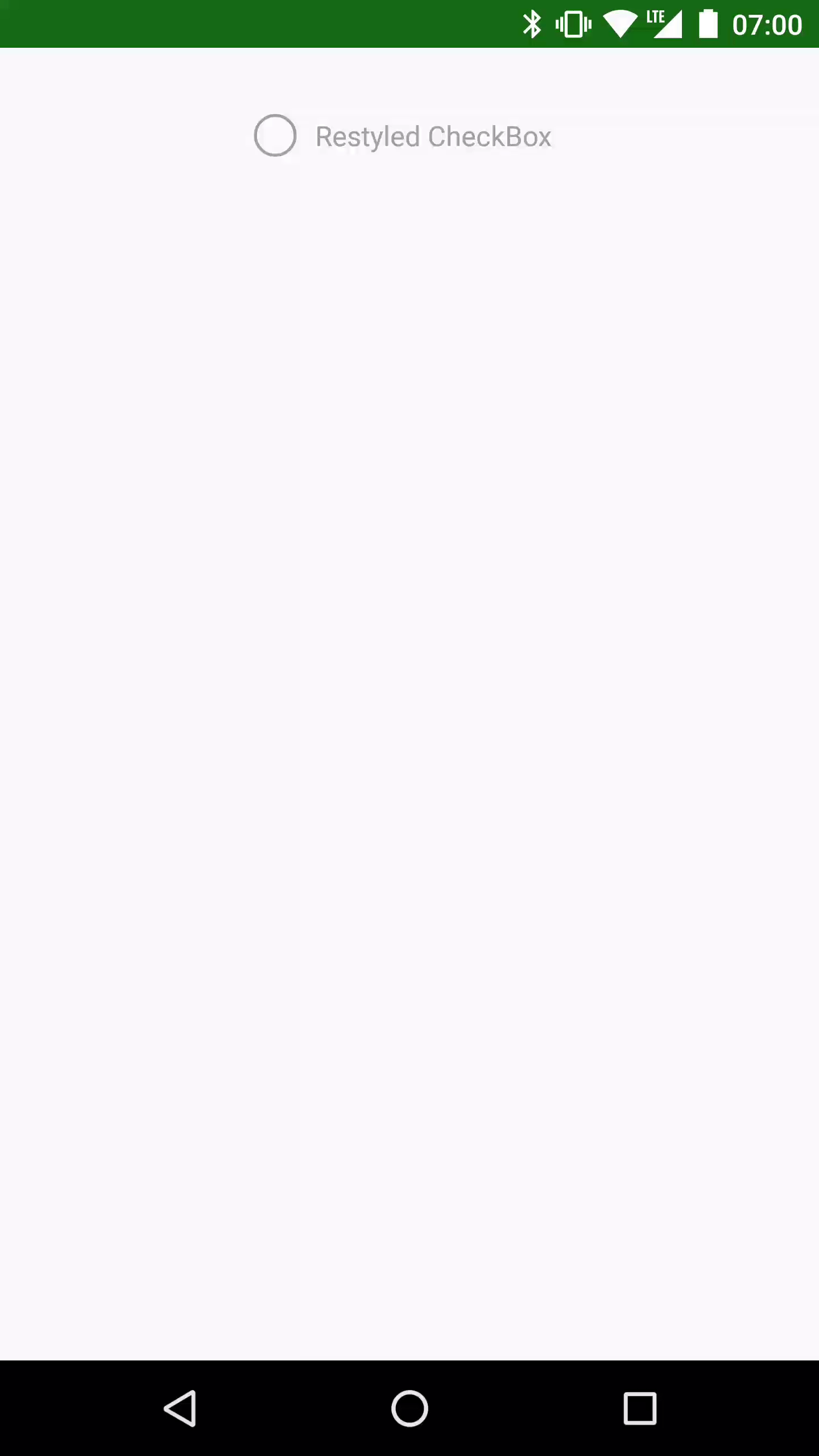
If we were to now run this on the API 19 device nothing would change, but if we now run it on an API 21+ device:
That’s all there is to it: getting some smooth transitions is simply a case of creating the necessary AnimatedVectorDrawable assets, and then wiring them up to the view state using AnimatedStateListDrawable.
The source code for this article is available here.
© 2017, Mark Allison. All rights reserved.
Copyright © 2017 Styling Android. All Rights Reserved.
Information about how to reuse or republish this work may be available at http://blog.stylingandroid.com/license-information.
