In the previous series on Bluetooth LE we got a simple app working which read temperature and humidity values from a Texas Instruments SensorTag, and displayed them. Functionally the app worked quite well but, because the series was focused on BLE topics, we neglected the UI somewhat. In this series we’ll take a look at various techniques that we can employ to make our app feel much nicer, and provide a richer and, hopefully, more engaging experience for the user.
Let’s begin with a quick review of the current UI architecture of the app. The source code that we’re going to base this series on is the same code with which we finished the last series, but to avoid confusion I’ve forked a new repo, and the starting source can be found here.
The communication mechanism between our Activity and the Service responsible for communicating with the SensorTag has already been covered, the only thing that we need to know is that we’ll receive Message events when the state of the Service changes and, once we’re connected to the SensorTag, when new data arrives.
The Activity itself is a state machine which will switch between two Fragments depending on the state of the Service. If we are connected to a SensorTag then DisplayFragment will be displayed, otherwise DeviceListFragment will be displayed.
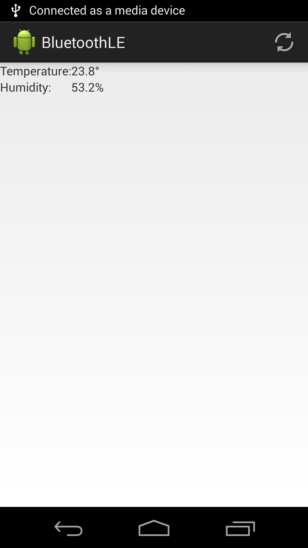
Let’s begin by focusing our attention on DisplayFragment. While this won’t be the first thing that the user sees when they start our app, it’s the area where they will (hopefully!) spend the most time, so let’s give it some UI love. The current UI is functional, but both dull and quite difficult to read:
The first thing that we’ll do is make our app portrait only. We can and should support all orientations, but for the sake of creating a simple example, let’s keep things portrait only:
<?xml version="1.0" encoding="utf-8"?>
<manifest xmlns:android="http://schemas.android.com/apk/res/android"
		  package="com.stylingandroid.ble">

	<uses-permission android:name="android.permission.BLUETOOTH"/>
	<uses-permission android:name="android.permission.BLUETOOTH_ADMIN"/>

	<application
		android:allowBackup="true"
		android:icon="@drawable/ic_launcher"
		android:label="@string/app_name"
		android:theme="@style/AppTheme">
		<activity
			android:name="com.stylingandroid.ble.BleActivity"
			android:label="@string/app_name"
			android:screenOrientation="portrait">
			<intent-filter>
				<action android:name="android.intent.action.MAIN"/>

				<category android:name="android.intent.category.LAUNCHER"/>
			</intent-filter>
		</activity>
		<service android:name=".BleService">
		</service>
	</application>

</manifest>
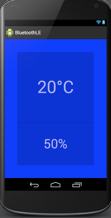
Next we’ll look at the general layout. We obviously need to make things bigger, but let’s also think about making it more visually appealing. We’ll remove the label TextViews, increase the font sizes, centre things, and place some grey boxes around the TextViews. We’ll enclose the whole lot in a FrameLayout with a blue background. We’ll do something interesting with this in later on in the series:
<?xml version="1.0" encoding="utf-8"?>

<FrameLayout
	xmlns:android="http://schemas.android.com/apk/res/android"
	xmlns:tools="http://schemas.android.com/tools"
	android:layout_width="match_parent"
	android:layout_height="match_parent"
	android:id="@+id/parent_container"
	android:background="#0000FF"
	android:padding="@dimen/display_margin">

	<LinearLayout
		android:orientation="vertical"
		android:layout_width="match_parent"
		android:layout_height="match_parent"
		android:background="@color/background">

		<TextView
			android:layout_width="match_parent"
			android:layout_height="0dp"
			android:layout_weight="5"
			android:id="@+id/temperature"
			android:textColor="@color/text"
			tools:text="20°C"
			android:gravity="center"
			android:layout_gravity="center_horizontal"
			android:textSize="@dimen/display_large_text"/>

		<View
			android:layout_width="match_parent"
			android:layout_height="1dp"
			android:background="@color/divider" />

		<TextView
			android:layout_width="match_parent"
			android:layout_height="0dp"
			android:layout_weight="3"
			android:textColor="@color/text"
			android:id="@+id/humidity"
			tools:text="50%"
			android:gravity="center"
			android:layout_gravity="center_horizontal"
			android:textSize="@dimen/display_medium_text"/>

	</LinearLayout>
</FrameLayout>
There are a few resource files which support this. Firstly there are some dimension values in res/xml/dimens.xml:
<resources>
	<dimen name="display_margin">48dp</dimen>
	<dimen name="display_medium_text">48sp</dimen>
	<dimen name="display_large_text">64sp</dimen>
</resources>
And there are also some colour definitions in res/xml/colours.xml:
<?xml version="1.0" encoding="utf-8"?>
<resources>
	<color name="text">#A0FFFFFF</color>
	<color name="background">#30000000</color>
	<color name="divider">#40000000</color>
</resources>
There’s nothing particularly complicated here, so I haven’t bothered going in to detail. But the basic layout looks like this:
So we have our basic layout, but we can improve it further. In the next article in this series we’ll look at using custom typefaces to bring some additional visual appeal to our app, and also look at an alternate to the static text labels (for “Temperature” and “Humidity” which we removed earlier).
The source code for this article is available here.
© 2014, Mark Allison. All rights reserved.
Copyright © 2014 Styling Android. All Rights Reserved.
Information about how to reuse or republish this work may be available at http://blog.stylingandroid.com/license-information.


