
ConstraintLayout is an extremely powerful thing, but is also somewhat complex because it has a number of different ways of working. For a while I struggled with one specific use-case which I felt must be possible, but could never quite get working as I wanted, and often had to go with a solution which felt slightly hacky. During some tinkering I came across the approach that we’ll explore in this post.
The specific use-case is where we have a form consisting of a set of input controls plus a label for each of them. The length of the labels will all be different and the requirement was to right align all of the labels to the widest one. The controls would then be positioned to the right of these controls. What makes this tricky is that the widest label can vary between languages. For example if a form had fields for forename and surname, then the label for Forename would be slightly wider than that of Surname because it has one more letter. However for the Italian translation these labels would be Nome and Cognome respectively – so the label the surname label will actually be longer than the forename label:
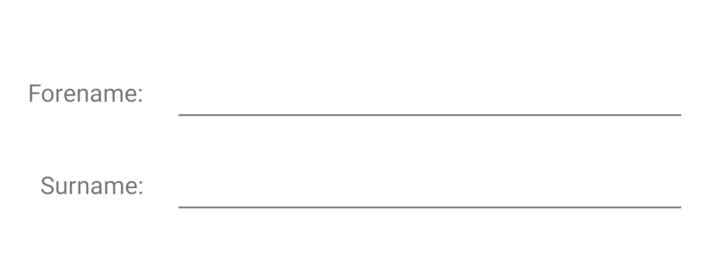
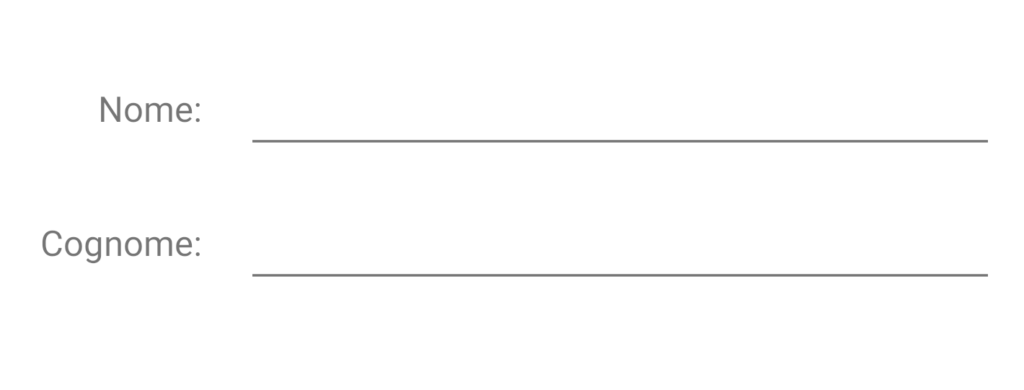
If the widest label is known when we’re designing our layout then it is a simple case of constraining the other labels to it, but this example shows that the widest label is not constant when we have different translations of our app.
These two examples actually show the precise behaviour that we’re looking for. In both cases the wider of the two labels is aligned to the parent start and the EditText fills the remaining space from the end of the label. The narrower of the labels is aligned to the end of the wider label, and this creates a consistent vertical line between all of the labels and all of their respective input fields. While the position of this line is very similar for the English and Italian translations that is simply because the widths of the widest label is much the same
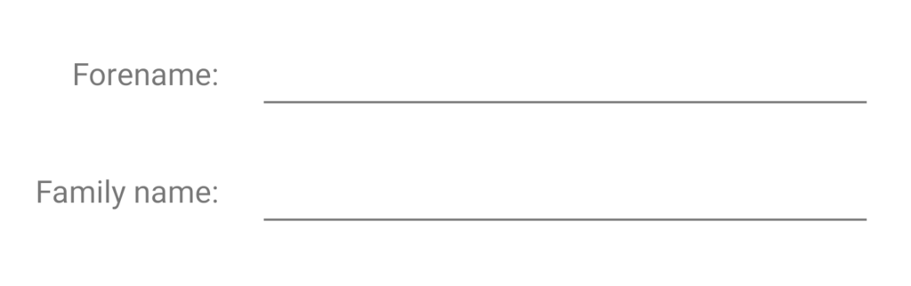
One hacky way of achieving this in ConstraintLayout is to define a Guideline at a specific offset from the start of the parent, and align the end of all of the labels to this. However this doesn’t scale well because the offset of this Guideline from the parent will be hard-coded. We could set this guideline offset to around 90dp would probably work for these two translations, but not for others. Moreover if we were to get copy changes then it could also cause us problems. If the English label was switched from “Surname:” to “Family name:” then that would break things because the label with the updated string would extend past our Guideline.
A more maintainable solution would be to nest the labels within a child layout which has android:layout_width="wrap_content". The labels could all be aligned to the end of their new parent and the width of the parent would match the widest label. Nesting layouts in this way feels like we’re going against best-practice of minimising nested layouts because they are less performant, and make animations harder. So although it is better than the Guideline approach, I would still prefer to avoid it.
Fortunately there is a nice way of achieving precisely what we want without resorting to hacks, and without nesting layouts. It just means that we use components of ConstraintLayout in ways that aren’t immediately obvious. Those that are familiar with ConstraintLayout may already be aware of Barrier but for those that aren’t: A Barrier is a ConstraintLayout helper which behaves as a virtual collection of Views within the ConstraintLayout. The Barrier is assigned a barrierDirection which controls to which edge of the group it is applied, and the Barrier position is determined by whichever View extends furthest in that direction. So for our example:
    .
    .
    .
This will position the Barrier and the end of the widest View out of @id/forename_label and @id/surname_label .
So that enables us to easily position the input controls to the end of the widest of the labels. What is a little counter-intuitive is that it also enables us to position the label Views as well. If we constrain the start of each label to the parent, we can constrain the end to the Barrier even though the position of the Barrier is a function of the widths of the label Views. Just doing this alone will centre all of the labels to whichever is the widest:
    .
    .
    .

    .
    .
    .

    .
    .
    .
This feels somewhat counter-intuitive because it just doesn’t feel right that we should be able to position a View relative to another whose position depends on it. It feels like we have a circular dependency here and so this should not be possible. However, on Android measurement and layout are done in separate passes, so the ConstraintLayout solver is able to overcome this seemingly circular dependency because it first measures all of the Views during the measurement pass, then it is able to set the position of the Barrier before it sets the positions of the label Views during the layout pass. The solver builds a dependency graph so knows to calculate the position of the Barrier before it attempts to position the label Views whose position depends upon it.
By adding this we get almost the behaviour that we’re after but if you look closely the ends of the strings (the colon symbols) are not vertically aligned:
There’s one more thing that we need to do to properly end align all of the labels to the widest one, and that is set the horizontal bias of each to 1.0:
    .
    .
    .

    .
    .
    .

    .
    .
    .
The horizontal bias controls the position within the two horizontal constraints the View will be positioned: a value of 0.0 will position it alined to the start; a value of 0.5 (the default) will centre it between the start and end; and a value of 1.0 will align it to the end. It is this last case that we’re after.
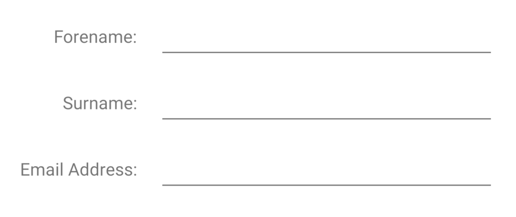
Adopting this technique means that our layout will behave correctly for different translations, and even properly adapt to copy changes:
We can also add additional Views to the layout:
    .
    .
    .

    .
    .
    .
Provided we add it to the Barrier and set its end constraint and horizontal bias as we’ve already discussed then everything behaves itself even if the new label is much wider than the others:
The knowledge that a Barrier can be used to position one of its constrained Views is the key enabler here and essentially offers similar behaviour to a nested child layout where we can wrap the labels in this child layout, then position the labels relative to this new parent. Only without the performance hit and animation limitations.
The source code for this article is available here.
© 2020, Mark Allison. All rights reserved.
Copyright © 2020 Styling Android. All Rights Reserved.
Information about how to reuse or republish this work may be available at http://blog.stylingandroid.com/license-information.