In the previous article we created a custom control which applies highlights to our text based upon a regular expression. We got this working so that we could control it programatically. In this article we’ll look at how to control things from the XML layout.
The final source from the previous article can be found here.
The HighlightedTextView control that we have created can be controlled from an XML layout, but only up to a point. It inherits from android.widget.TextView, and all attributes of TextView that we can set from an XML layout will also apply to HighlightedTextView. But what about the two attributes that are specific to HighlighedTextView: the regex pattern, and the highlight style? In order to make these attributes accessible from an XML layout, we first need to declare them as styleable. Let’s create a file in res/values/attrs.xml:
Strictly speaking we don’t need to first
We are declaring a styleable named HighlightedTextView which we’ll later use to access these attributes from the XML layout. Within this styleable we are declaring attributes for “pattern” as a string, and “highlightStyle” which can have any combination of the flags set, with multiple flags separated by “|” characters (e.g. “bold|italic”).
Now that we have these defined, we need to actually get these values at runtime. To do this we need to modify one of the constructors of HighlightedTextView:
	public HighlightedTextView( Context context, AttributeSet attrs, int defStyle )
	{
		super( context, attrs, defStyle );
		TypedArray ta = context.obtainStyledAttributes( attrs, R.styleable.HighlightedTextView, defStyle, 0 );
		CharSequence text = ta.getString( R.styleable.HighlightedTextView_android_text );
		if( text != null )
		{
			updateText( text );
		}
		String pattern = ta.getString( R.styleable.HighlightedTextView_pattern );
		if( pattern != null )
		{
			setPattern( pattern );
		}
		int style = ta.getInteger( R.styleable.HighlightedTextView_highlightStyle, -1 );
		if( style >= 0 )
		{
			setHighlightStyle( style );
		}
		ta.recycle();
	}
The key line in this is line 4 which gets the necessary styles from the XML layout. It references R.styleable.HighlightedTextView which is the identifier for the styleable declaration that we made earlier. The parameters are returned in an android.content.res.TypedArray object which we interrogate in lines 5, 10, & 15, and then apply accordingly. It is important to call recycle() on our TypedArray object so that the resources can be reused.
That’s it, our control will now use values from the XML layout as well as being able to be set programatically. To test this, we first need to change MainActivity to remove the programmatic setting of these attributes:
package com.stylingandroid.customcontrol;

import android.app.Activity;
import android.os.Bundle;

public class MainActivity extends Activity
{
	@Override
	public void onCreate( Bundle savedInstanceState )
	{
		super.onCreate( savedInstanceState );
		setContentView( R.layout.main );

//		HighlightedTextView htv = (HighlightedTextView)findViewById( R.id.HighlightedText );
//		htv.setPattern( "([Hh]ighlight)" );
	}
}
Now we can set our attributes from the XML layout in res/layout/main.xml:
There are two changes here:
- On line 3 we are defining an XML namespace named “sa” which maps to the package name of our project.
- On line 8 we are declaring our attributes using the “sa” namespace.
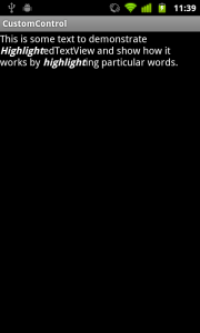
To clearly see that this is working, we’ve set the highlightStyle to “italic”. If we run this:

We now know how to create a custom control and control it from our XML layouts. But what about if we want to apply styles and themes to this control? We’ll cover than in the next article.
The final source from this article can be found here.
© 2011, Mark Allison. All rights reserved.
Copyright © 2011 Styling Android. All Rights Reserved.
Information about how to reuse or republish this work may be available at http://blog.stylingandroid.com/license-information.

Hi,
I was hoping you would be able to answer a question for me.
I have a library of controls that I extended from the Android controls such as Spinner and TextView. I have a project that I want to use these controls in. I add the control into the main.xml file
When I run the app it crashes in setContentView. I have not been able to find out what the exact error message is yet. I have included the jar file for my library in my current project. I am using Eclipse Indigo.
Is there something that I am missing?
Any help or tips would be greatly appreciated.
Thank you,
Greg
Sorry, this is a personal blog written in my spare time and I simply do not have the time to provide free developer support. I would suggest trying stackoverflow.com (I sometimes hang out there when time permits), but you’ll need to provide a stack trace or error message before the good folks there will be able to help you.