In May 2016 a new project was pushed to the official Google Github repo named flexbox-layout. It is an Android layout manager which offers similar behaviour to the CSS flexible box layout module. In this series we’ll take a look at FlexboxLayout and try and gain some insights in to how it works and how to get the best out of it.
Before we dive in it is worth mentioning that the format of this series is goiing to be a little different to normal. Normally I like to annotate working code, but in this case the requirements are a little different. The code itself isn’t actually going to change a great deal, but we’re going to be exploring the effects of changing XML asttributes on the layout itself and the child items. To achieve this there is a companion app which has been published to Google Play Store which allows you to control the various attributes. The source code of the app will be published in due course, but in the meantime I courage you to download the app and play along as we go!
It is also worth mentioning that I shall be approaching the explanations in this series very much from an Android perspective – that is, I’ll be using the standard Android layouts as a point of reference and highlighting where FlexboxLayout can give similar results.
To use FlexboxLayout in your project first add a dependency to your build.gradle:
dependencies {
    compile 'com.google.android:flexbox:0.1.2'
}
Then it is simply a case of including it in your XML layouts (or programatically, if necessary) – I won’t go in to more detail here as the examples on the Github repo should be more than sufficient.
In very basic terms, FlexboxLayout is closest to LinearLayout because it positions its children sequentially – each child is positioned after the previous one. One thing that we need to do with LinearLayout is set the orientation, and that brings us neatly on to the first attribute of FlexboxLayout that we’re going to look at:
flexDirection
This controls the direction of flow when laying out the children and is, as already suggested, similar to how orientation works for LinearLayout. The values row and column are equivalent to horizontal and vertical orientations respectively. However there are also two other values we can use row_reverse and column_reverse these do exactly the same thing only they lay the children out in the opposite direction. For example, row will start at the left and will place each subsequent child to the immediate right of the previous one:

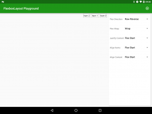
Conversely row_reverse will start at the right and place each child to the immediate left of the previous one:
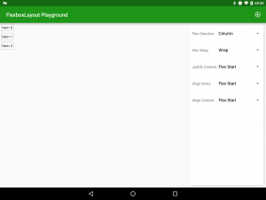
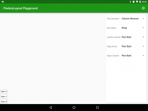
There are a couple of terms which we need to define here as they will be referenced throughout the remaining definitions. The main axis is the direction of flow defined by the flexDirection and the cross axis is the axis perpendicular to the main access. So for row and row_reverse the main axis would the horizontal axis and the cross axis would be the vertical axis. Remember these – you’ll need them later!
flexWrap
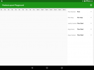
The first major difference between FlexboxLayout and LinearLayout is the behaviour when the flowed children reach the bounds of the layout itself. For LinearLayout the children are simply clipped so that once the layout bounds have been exceeded, adding subsequent child Views will simply position them outside of the layout. With FlexboxLayout we can control this behaviour using the flexWrap attribute. If we set this to nowrap then when we add children after we have filled the layout along the main axis, they will be added at the end and preceding children will be shrunk to make room. There is some finer-grained control that we can do on this, and we’ll discuss this when we look at child attributes later in the series.
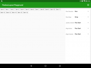

justifyContent
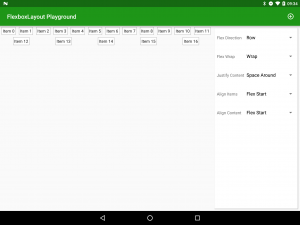
The way that child items are positioned along the main axis is controlled by justifyContent. At a superficial glance this may appear similar to flexDirection, until we look at it a little closer. flexDirection controls the order of the child items whereas justifyContent controls the relative positioning. The possible values are flex_start, flex_end, center, space_between, & space_around:

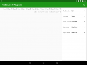
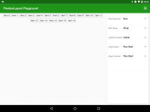
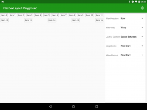
alignItems
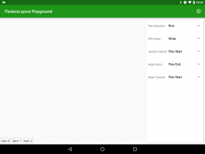
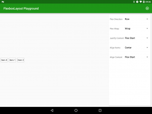
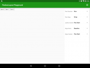
alignItems controls the positioning and sizing of items along the cross axis. The possible values are stretch, flex_start, flex_end, center, and baseline:

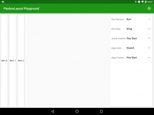
alignContent
This is where it can get slightly confusing because alignContent appears be the same as alignItems but actually there is a subtle difference which has a major effect on behaviour! Whereas alignItems controls how items are positioned within their own line, alignContent controls the line itself. In Android-like terms it’s similar to TableRow within TableLayout: Using alignContent is similar to applying layout attributes to TableRow; whereas alignItems is similar to applying layout attributes to the child views representing the individual table cells. The possible values are stretch, flex_start, flex_end, center, space_between, & space_around:

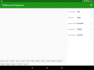
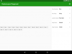
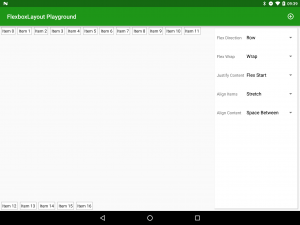
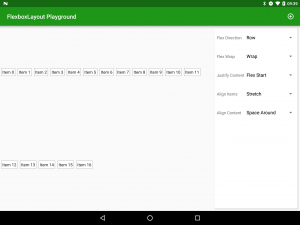
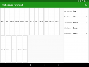
The best way to get an understanding of alignItems & alignContent really is to play with it. In my app, set flexDirection to Row, set Flex wrap to Wrap, add some additional cells (by clicking the AppBar “Add” action) until it wraps on to a second row, set alignContent to stretch to enable you to visualise the line dimensions, and then play with different values of alignItems.
So that’s pretty powerful and flexible (yeah, I know!) stuff. But there’s a lot more. In the next article we’ll look at how we can control individual child items as well.
The app is available in the Google Play Store, and the source code for the app will be published at the conclusion of this series.
© 2016, Mark Allison. All rights reserved.
Copyright © 2016 Styling Android. All Rights Reserved.
Information about how to reuse or republish this work may be available at http://blog.stylingandroid.com/license-information.


Hello, Mr Allison, Sir. Is there a way to send you a pull request with some corrections to the text of this article? There’s a couple of issues that would be easier fixing than explaining what they are.
My posts are not under source control so there is no way to make a Pull Request. The only mechanism to suggest corrections is to email me at the address which is published in the About page.