In May 2016 a new project was pushed to the official Google Github repo named flexbox-layout. It is an Android layout manager which offers similar behaviour to the CSS flexible box layout module. In this series we’ll take a look at FlexboxLayout and try and gain some insights in to how it works and how to get the best out of it. In this article we’ll look at some real world examples that can be achieved using FlexboxLayout.
One of the use-cases which initially springs to mind for FlexboxLayout is that of displaying content in tabular form, but that isn’t quite as straightforward as it may first appear. The reason for this is that we cannot easily control when FlexboxLayout will wrap on to a new line.
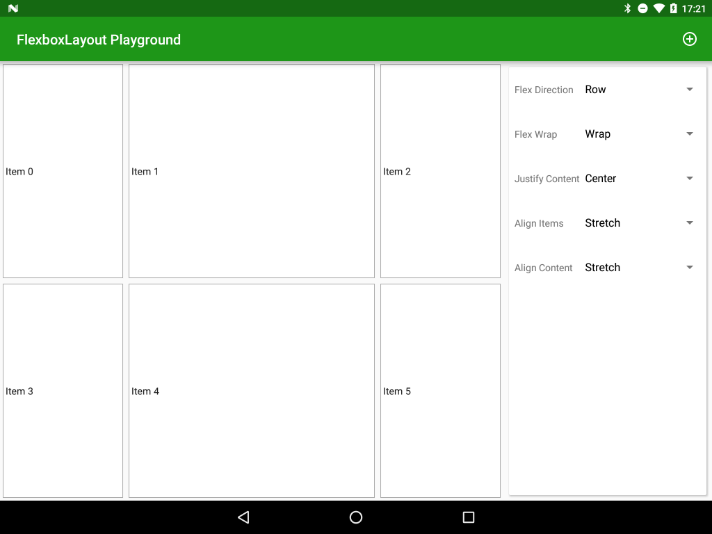
One way that we can achieve this is to use layout_flexBasisPercent on each child to ensure that the value of this attribute for all children in a given row total 1.0. In the following example items 1 & 4 both have layout_flexBasisPercent set to 0.5, and items 0, 2, 3 & 5 have layout_flexBasisPercent set to 0.2 and layout_flexGrow set to 1. Even though the totals of the layout_flexBasisPercent values for items 0 + 1 + 2 is only 0.9, item 3 would exceed the line width so we wrap. Because of the layout_FlexGrow values items 0, 2, 3 & 5 are expanded to fill the empty space.
The behaviour that we’re getting here is quite similar to what we could get with PercentLayout, but the subtlety of how item 3 would wrap shows a fundamental difference in how FlexboxLayout works compared to PercentLayout.
An alternative would be to use a separate FlexboxLayout for each row and populate each row with it’s children. By setting a common a style on each FlexboxLayout row we could apply common behaviour to each row. Essentially that is how the CSS flexbox model (from which FlexboxLayout was derived) is used in HTML. However within Android having a separate ViewGroup for each row is quite inefficient and FlexboxLayout gives us little performance improvement over TableLayout / nested LinearLayouts in that regard.
Even though it would diverge from the CSS flexbox model what may benefit the Android implementation would be to have an attribute on FlexLayout (perhaps flexLineItems) which would force a wrap after that value was exceeded for each flex line; and a layout_wrapAfter="true" option for child Views. Having such additions would give much external control over the wrapping make tabular data much easier within a single FlexboxLayout. Such additions would provide GridLayout like behaviour. I have actually opened an issue on the Git repo of FlexboxLayout in the hope that such a feature may be added – feel free to add a reaction to the issue.
So, for now, FlexboxLayout doesn’t really provide us with any performance benefits over TableLayout and nested LinearLayouts in terms of the number of ViewGroups required, so what are some use-cases where it could be used effectively?
The first is where you have content which is all uniformly sized, you could simply keep adding items to a wrapping FlexboxLayout and it would automatically wrap on to new lines when necessary. This might be really useful in something like an image gallery where all of the images are the same size, or a table of uniformly sized CardView items. In such cases you would simply get the relevant number of rows or columns (depending on flowDirection) would vary depending on the available size on different devices. it feels like such cases are the most obvious use for FlexboxLayout at present, but it’s only at version 0.1.2 (at the time of writing) so there may be many additions to come!
Having said all of that, at Google IO 2016 (which, at the time of writing, was last week) a shiny, new layout named ConstraintLayout was announced which, despite being in alpha release, already looks to be far more feature-rich and geared toward the needs of a typical Android app. I’ll be diving deeper in to ConstraintLayout in a future series.
So that’s it on FlexboxLayout for now. While it is certainly worth monitoring where it goes from here, it currently does not really offer much over the existing layouts in terms of performance and functionality. Moreover with the new kid on the block, ConstraintLayout, FlexboxLayout will need to adapt quite considerably to actually address some of the gaps in the other Android layout managers before it would be worthy of consideration for a production project.
The app is available in the Google Play Store, and the source code for the app is available here.
© 2016, Mark Allison. All rights reserved.
Copyright © 2016 Styling Android. All Rights Reserved.
Information about how to reuse or republish this work may be available at http://blog.stylingandroid.com/license-information.


