One of the big Android announcements at Google I/O 2019 was the introduction of gesture navigation on Android Q. Initially it may feel like this is purely a system-level change and does not affect apps directly, but closer inspection reveals that apps may need to change to properly accommodate this. The touch areas that the system now uses to detect these user gestures will overlap with the app UI, so apps which also have touch handling active near the edges of the display may need to accommodate the system gesture handling. In this series we’ll take a look at how this new behaviour affects apps, and provide some guidance for migrating various common app behaviours to play nicely with the navigation gestures.
There are two main areas that app developers need to give consideration to. The first we’ve already touched on: there may be cases where our apps are using touch handling near the edges of the display; and the second is some changes in how apps are expected to behave with respect to the system chrome.
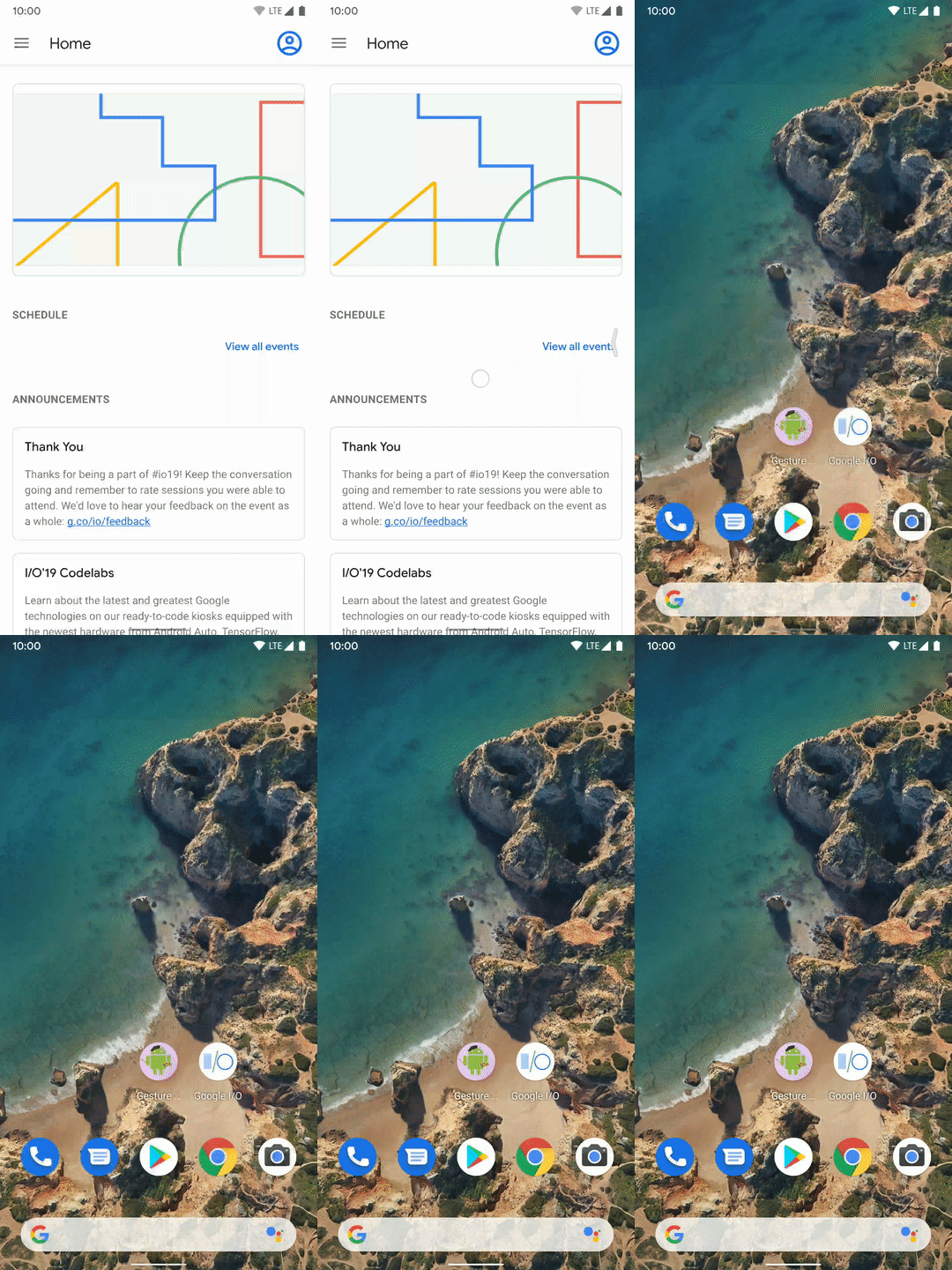
Let’s start by looking at how the new gestures actually work, so that we can understand how it might affect our apps. The Back button is now replaced by a bezel swipe from either left of right edge of the display:

A visual cue is provided by the system with the display of a back icon, and releasing causes the back. There’s noting that you need to do internally to handle this, the usual onBackPressed() callback will be made to the Activity. However, this could affect any components which use horizontal swipes, such as NavigationDrawer and carousel controls, or even ViewPager. The latter two aren’t so much of a problem because generally users will swipe nearer the middle of these, and not right at the bezel. These already play quite nicely when used with NavigationDrawer which relies upon a bezel swipe to open the drawer. But NavigationDrawer itself will require special consideration when used with the new gesture navigation, and we’ll cover this in the next article in this series.
The swipe from the right edge may, at first, appear a little counter-intuitive, and it certainly struck me as such when I first learned of it. However, if one considers it as swiping in either direction from the left or right edge is essentially a ‘swipe away’ gesture then it makes more sense.
In iOS there is certainly a horizontal flow when navigating within an app, but this is not the case in Android where a new Activity will generally appear above the old one. Therefore swiping away in either direction works with this visual navigation model.
Swiping from the top edge has long been a reserved gesture of the system that is used to pull down the system tiles and notifications drawer.
Home and recents buttons are both handled with gestures at the bottom of the screen:

Swiping left and right along the bottom edge will switch between apps in the recents list; swiping up and holding will display a carousel of the recents list; and swiping up and releasing will be the same behaviour as the “Home” button. As before, the events triggered by these will be the same as with 2-button or 3-button navigation bars.
The key thing that we need to be mindful of is that swipes up from the bottom edge are reserved by the system. This probably won’t be much of an issue for most apps. Possible areas of contention are for layouts which contain a vertical scrolling component. But as with horizontal scrolling, users will generally scroll in the middle of the scrolling component rather than at the edge. For layouts which have buttons at the bottom, such as with a bottom navigation bar, interactions will generally be handled as taps rather than swipes, and the touch handling system will generally distinguish between the two and dispatch them to the correct consumer. The difference between a tap and a swipe should be enough to disambiguate behaviours.
That brings us on to the other area that is worth of consideration: On Android Q apps are expected to work edge-to-edge and draw behind the system components such as the system status and navigation bars.
This can be a little tricky to get working correctly because there are cases when we might have controls at the top and bottom of the display, such as an AppBar at the top and a bottom navigation bar at the bottom, which we do not want to draw behind the system bars because it will look muddled if we have controls being overlaid by system controls, and can also make the touch handling more open to mistakes, and therefore user frustration.
In this article we’ve looked at the overall changes in behaviour in the system, and considered some areas where we may need to consider these within the scope of our application. In the remainder of the series we’ll look at some of the more practical aspects and consider some real-world use-cases where we may need to make certain allowances.
© 2019, Mark Allison. All rights reserved.
Copyright © 2019 Styling Android. All Rights Reserved.
Information about how to reuse or republish this work may be available at http://blog.stylingandroid.com/license-information.


Hello
Thanks for this article i was really very curious to know about mobile gesture. i am using one plus 6t mobile phone, and its Android 9 updated version. there Mobile Gesture is just awesome but i don’t know about gesture in details. but now with the help of your article now i got the information i was looking for.
Thanks
Hi Mark Allison, thank you so much for this blog. It was extremely informative.
Gesture navigation is an amazing thing that I knew from my friend its works with body temp and all, This blog has massive information on gesture navigation. keep posting.