In a recent series of articles, we covered he basic layout types supported by Android. Since those articles were written Google have released the Android 4.0 SDK and there is a new addition: GridLayout. In this series of articles we’ll have a look at GridLayout and explore the way it works to get a feel for how to use it effectively.
The first thing that strikes you if you look at the GridLayout API is that it offers similar functionality to TableLayout although it goes about it in a rather different way. In fact, it is somewhat more like a hybrid of TableLayout and LinearLayout. Let’s start with a simple example which is similar to what we did when we covered TableLayout:
[xml]
[/xml]
The first thing to point out is that we are not specifying android:layout_width or android:layout_height attributes for any of the TextView widgets within the GridLayout. This is because GridLayout uses a different layout model to other layouts as we shall see.
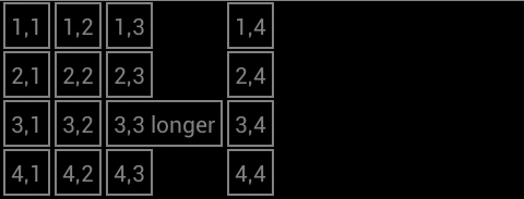
if we run this, we’ll see:
Whil this is pretty close to what we got with TableLayout, there is a difference which is highlighted by the longer text in row 3, cell 3: The cells are not automatically stretched to fill the column as they are in TableLayout. Normally we would look at android:layout_width in conjunction with android:layout_weight to control to cell sizes, however GridLayout bases it’s layout model upon the android:layout_gravity of the cells. Normally gravity is used to align the content within a control, but GridLayout uses this to determine the size of cells.
This is easy enough to fix, but it demonstrates a key aspect of how GridLayout works, which we see more of later: How GridLayout sizes each cell is dependent on the layout_gravity of both the cell itself and its siblings in the same row or column. Let’s demonstrate this by adding android:layout_gravity=”fill_horizontal” to each cell in the third column:
[xml].
.
.
.
.
.
.
.
.
.
.
.
[/xml]
This gives us the same as the TableLayout example:
It is important to remember that GridLayout does still support android:layout_width and android:layout_height, but default to WRAP_CONTENT for both. However, you can get in to all kinds of problems if you start mixing your layout metaphors, so I would strongly advise leaving android:layout_width and android:layout_height set to their defaults, and control cell widths using android:layout_gravity instead.
This shows some of the parallels with TableLayout, but what about LinearLayout? Similarly to LinearLayout GridLayout supports an android:orientation attribute which controls the order in which GridLayout populates the cells. The default orientation is horizontal, which means that it fills the cells in the first row with the first n children, the cells in the second row with the next n children, and so on (where n is the number of columns). If we change this to “vertical” it will fill the first column with the first m children, the second column with the next m children, and so on (where m is the number of rows). So, by simply changing our GridLayout declaration:
[xml].
.
.
[/xml]
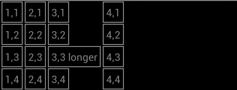
we can change the order in which the cells get populated:
Note that we have lost the cell stretching of the third column because the relevant cells that we modified earlier now constitute the third row rather than the third column. Let’s revert the orientation of the GridLayout before we continue:
[xml].
.
.
[/xml]
Another feature of GridLayout is the ability precisely position cells using the layout_row and layout_column attributes of each child (the cell and column values that you must use here are zero-based, so the first column or cell is 0 and not 1). An important thing to remember about this technique is that if you explicitly set the position of a cell, GridLayout it will effectively move the current position and GridView will continue positioning cells from there. For example, it we switch the position of the cell containing the text “1,3” the the row below:
[xml][/xml]
We don’t specify an explicit column because we simply want to more the cell down a row. The specific cell is in the position that we have specified, and the subsequent cells are positioned after it:

Supposing that we wanted to swap two cells using this technique, we must remember that as well as changing the individual cells that we want to swap, we also need to change the cells that immediately follow those cells:
If we want to swap two cells using this technique we can do this providing we set the required position of each cell, and then reset the position of the following child. So to swap the cells containing text “1,3” and “2,3” we need to set the cell locations of both of these cells, and reset the position of the cells which follow each of these:
[xml].
.
.
[/xml]
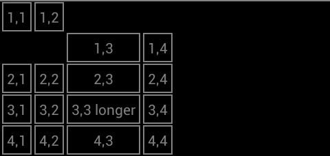
Which gives us:

This is all well and good, but why did we need to specify android:layout_column values for TextView 2,3? The reason is that as GridLayout positions each cell, it positions TextView 2,2 as normal, as it comes to position TextView 2,3 it finds that cell is already occupied by TextView 1,3, so it moves to the next cell (2,4). If we only specify the row for TextView 2,3 then it will only change the row and try and position in the wrong column on the right row, so we need to explicitly set the correct column. This seems a little cofusing, I know, but have a play with it in the Graphical Layout view in ADT and it should begin to make sense.
In the next part of this series we’ll look at how we can span multiple columns or rows with a single cell.
There is now a follow-up article to this series which explains how to use the GridLayout implementation in the support library.
The source code for this article can be found here.
© 2011 – 2013, Mark Allison. All rights reserved.
Copyright © 2011 Styling Android. All Rights Reserved.
Information about how to reuse or republish this work may be available at http://blog.stylingandroid.com/license-information.


OH GOD FINALLY!! I’ve been searching for this for the longest time! Hurray for Google!
Very nice, main developer.android page does not has any good example. This example is really, I started development on Android few weeks ago. I was struggling with grid view today, thanks for good post.
Right, this is a very nice example with details that android.developer doesn’t have, it’d be nice if they had a library of contributions like this one.
Little help here: http://stackoverflow.com/questions/10812552/heterogeneous-gridlayout
This is a great tutorial, thanks very much! However, it does not work for me. When I add the “fill_horizontal” on all the col 3 entries, col 3 cells remain unchanged (instead of expanding to the width of the widest entry and centering contents of each cell), and col 4 completely right-justifies. I started with new Android project and replaced code in activity_main.xml with xml code listed above. I am using an emulator in Eclipse.
Oh, my fault! I forgot to set up styles.xml. Works great now, thanks a million!
I got what i had look for last 3 days. Thanks…
Thank you so much
Your post is very helpful!Thx!If it is possible that I may translate this article into Chinese and share on my blog?It will be very appreciate!
Yes, you may translate the article in accordance with the licensing terms of this site which can be viewed here.