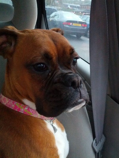
A little while ago I was asked about how to create images with irregularly shaped outlines such as those in WhatsApp which are shaped like a speech bubble. In this series we’ll look at some techniques for doing precisely that.
Before we continue, I must confess to losing track of who asked me about this. If that person is reading this, then please get in touch and I’ll give you proper credit for inspiring the series.
We’ll start work a very simple irregular shape: a rectangle with rounded corners. It is worth pointing out that rounded corners can be achieved using the new RoundRectShape Drawable which was introduced in API 20, however it will not allow us to achieve some of the effects that we’re going to look at later in the series so we’ll stick with the manual approach.
The first technique that we’re going to use for this is one that we have touched on before on Styling Android in the posts on Dynamic Icons – that of using an alpha mask.
The concept is actually quite simple. We combine two images: the first is the image that we want to display in a rounded rectangle and the second defines the rounded rectangle itself. We then combine them using a Porter Duff alpha mode which will enable us to use just the transparency information from the mask.
Here are the two images that we’re going to use:
First is Betty, our model for this series, and the second is the mask image which defines the rounded corners. The only reason for colouring the mask green is to make it absolutely clear that the colour information from the mask image is not used – we won’t see Betty turn green during this transformation!
The code is pretty straightforward:
public Bitmap combineImages(Bitmap bgd, Bitmap fg) {
    Bitmap bmp;

    int width = bgd.getWidth() > fg.getWidth() ?
        bgd.getWidth() : fg.getWidth();
    int height = bgd.getHeight() > fg.getHeight() ?
        bgd.getHeight() : fg.getHeight();

    bmp = Bitmap.createBitmap(width, height, Bitmap.Config.ARGB_8888);
    Paint paint = new Paint();
    paint.setXfermode(new PorterDuffXfermode(PorterDuff.Mode.SRC_ATOP));

    Canvas canvas = new Canvas(bmp);
    canvas.drawBitmap(bgd, 0, 0, null);
    canvas.drawBitmap(fg, 0, 0, paint);

    return bmp;
}
We create a new Bitmap which matches the largest dimensions of both the mask and the source images, we first draw the mask image and then draw the image of Betty using a Paint object which has a PorterDuffXFerMode of SRC_ATOP which effectively applies the transparency information from the background image (i.e. the mask) to the image that we’re correctly drawing (i.e. Betty). The result looks like this:
That’s all well and good. We’ve achieved the result that we set out to, but there are a couple of issues with this approach.
Firstly the mask has to be the same dimensions as the source image. We could perform some manual scaling of the mask, but we would be likely to get some blocking appear if we we’re scaling the mask up. Also we are likely to see distortion of the rounded corners of the aspect ratio of the mask does not match that of the source image.
The other big problem is that this is pretty inefficient. In order to achieve the effect that we desire we’ve had to load two separate images in to memory and then combine them in to a third image. If the images are quite large, then we risk the dreaded OutOfMemoryError when we try and perform this operation.
While this technique has some issues there will certainly be cases (for example, where the irregular outline is rather more complex, and difficult to achieve using the techniques that we’ll cover in this series) where it is a viable solution. Which is why we have covered it here.
There is, however, a more efficient way of obtaining the effect that we desire and in the next article in this series we shall take a look at that.
The source code for this article is available here.
© 2014, Mark Allison. All rights reserved.
Copyright © 2014 Styling Android. All Rights Reserved.
Information about how to reuse or republish this work may be available at http://blog.stylingandroid.com/license-information.


Hi,
When will you publish part 2 in this series because I am working on something where the size of my images are not the same so I am getting some funky behaviour like top image is not properly aligned and is notably smaller than bottom image etc..
Thanks in advance.
I always publish new articles on a Friday morning (UK time), so part 2 of this series will be on Friday, and the remaining 2 articles will be published on the next two Fridays after that.
Hi Mark,
images links are broken in the article.
Bye,
Francesco
Can you confirm what browser you’re using? It’s fine for me in Chrome, but is broken using Link Bubble.I think I have found the problem. Could you please retry?