In the previous article we looked at using layout_weight to give us some nice control over how we layout children within a parent layout. In this article we’ll cover some more aspects of layout_weights.
Continuing on from where we left off in the last article, there’s another thing that we can do what provides us with even more control over things. So far, we have used layout_weights to divide up a Layout proportionally based upon of the total value of all layout_widths of its children. In the last example, the weights were 2 and 1 respectively, so the total is 3, and 2/3 of this goes to the top layout and 1/3 to the second. We can override this by adding a weightSum to the parent layout:
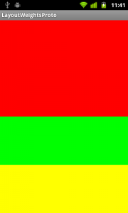
Here we are giving the parent layout a weightSum of 4, and colouring it yellow. If we run this:

The children are split as before, but because we gave the parent a weightSum of 4, the red child gets 2/4 (i.e. half the space), the green child gets 1/4 (half the remaining area), and the parent shows through the bottom quarter proving that it still fills the screen.
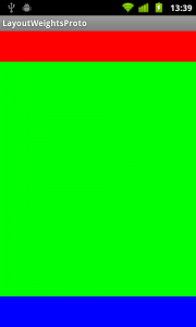
Next we’ll consider how we can use layout weights in a slightly different way. Suppose that we want a layout where we have a fixed-size header at the top, a fixed-size footer at the bottom, and a body which will expand to fit the are left in the middle. While we could do this with absolute positioning for individual devices, layout weights allow us to do this automatically on all devices:
Here we are setting a fixed height for the header and footer children (although wrap_content would work equally well if they had children of their own), and setting a layout_weight on the centre, green body section. Because it is the only child with a layout_weight set, it will be expanded to fit the area remaining after the other children have been positioned:

Let’s conclude with another potential gotcha when using layout widths. Let’s switch to a horizontal LinearLayout containing two TextViews, each with a layout_width set to 1, but with text of very different lengths in each:
We would expect both of the TextView controls to be given half of the display, but when we run this we get:

The TextView with the longer text is being allocated much more of the display despite us giving them equal layout widths. This is because when calculating the layout, the width of the two text controls is calculated first, and the remaining space is then divided between them equally. Because the second TextView is wider (due to it’s longer text) then it appears to be taking up most of the space. There is an easy fix, for this: We simply need to set the layout_width of both controls to 0dp to prevent their widths being used in the layout calculation:
The available space is then divided between them equally, forcing the second TextView on to two lines:

That concludes our exploration of layout weights. As with part 1, I have not bothered to publish the final source because these examples are pretty standalone.
A Portuguese translation of this article by Lucio Maciel can be found here.
© 2011 – 2012, Mark Allison. All rights reserved.
Copyright © 2011 Styling Android. All Rights Reserved.
Information about how to reuse or republish this work may be available at http://blog.stylingandroid.com/license-information.

Ok!! The 0dp width was a mystery for me for a long time… rsrsrs. Thanks.
That’s useful!
You’re an evil genius Mark. I had the exact situation where I have a fixed header and fixed footer and wanted to fill the space in between! Fantastic blog post, it helped me escape the relativeLayout with fixed values problem!
Wanted to say thanks really helped me learn how to use layout_weight
Thanks Allison.
Thank you, that helped me a lot!
Excellent work man!!!! thanx 🙂
Thanks!!!! This helped me a lot. Thanks for sharing.
Cool..like your blog very much….
Hey,if this article is under the same fields as the ‘Layout Weights – Part 1’,it would be better. 😛
Really helpful. Thanks