At the time of writing I am working with the good folks at Novoda on an on-demand video streaming app for UK broadcaster Channel 4. One of the designs which I was asked to implement was a standard indeterminate ProgressBar with a material styling. While this was easy for Lollipop and later, the app needs to support earlier devices so the challenge was to come up with a lightweight approximation of the material ProgressBar which would work on older devices. In this post we’ll take a look at the solution to that problem.
Let’s first take a look at a Lollipop indeterminate ProgressBar:
While the bar styling itself is pretty easy to achieve, the problem lies in the indeterminate animation which looks rather complex. A short bar runs from left to right, but the length of this bar varies during its travel.
My first approach was to try and back-port the material indeterminate implementation. However this proved difficult because it uses an AnimatedVectorDrawable which is not available pre-Lollipop. The solution that I came up with is quite sneaky, but gives a remarkably close approximation to what we’re trying to achieve.
The solution involves creating our own ProgressBar implementation (which subclasses the standard ProgressBar) which completely bypasses the standard indeterminate logic and implements its own on top of the standard primary and secondary progress behaviours which are already built in to ProgressBar. The trick is because of how this is rendered – first the background, then the secondary progress, then the primary progress. If we have the background and the primary progress colour the same, and the secondary progress a different colour, we can give the illusion that a segment of the bar is being drawn.
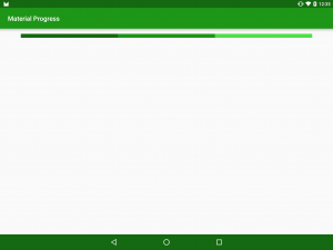
An example will show this. If we set the background colour to a light green, the secondary progress colour to a mid green and the progress colour to a dark green we get this:
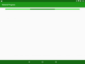
However, if we set the primary colour to match the background colour the section of the secondary progress which is visible gives the illusion that we have drawn a segment:
We can specify the start and end points of this by simply setting the secondaryProgress and progress values of the ProgressBar respectively.
So let’s take a look at how we can implement this in code:
public class MaterialProgressBar extends ProgressBar {
    private static final int INDETERMINATE_MAX = 1000;
    private static final String SECONDARY_PROGRESS = "secondaryProgress";
    private static final String PROGRESS = "progress";

    private Animator animator = null;

    private final int duration;

    public MaterialProgressBar(Context context, AttributeSet attrs, int defStyleAttr) {
        super(context, attrs, defStyleAttr);

        TypedArray ta = context.obtainStyledAttributes(attrs, R.styleable.MaterialProgressBar, defStyleAttr, 0);
        int backgroundColour;
        int progressColour;
        try {
            backgroundColour = ta.getColor(R.styleable.MaterialProgressBar_backgroundColour, 0);
            progressColour = ta.getColor(R.styleable.MaterialProgressBar_progressColour, 0);
            int defaultDuration = context.getResources().getInteger(android.R.integer.config_mediumAnimTime);
            duration = ta.getInteger(R.styleable.MaterialProgressBar_duration, defaultDuration);
        } finally {
            ta.recycle();
        }
        Resources resources = context.getResources();
        setProgressDrawable(resources.getDrawable(android.R.drawable.progress_horizontal));
        createIndeterminateProgressDrawable(backgroundColour, progressColour);
        setMax(INDETERMINATE_MAX);
        super.setIndeterminate(false);
        this.setIndeterminate(true);
    }

    private void createIndeterminateProgressDrawable(@ColorInt int backgroundColour, @ColorInt int progressColour) {
        LayerDrawable layerDrawable = (LayerDrawable) getProgressDrawable();
        if (layerDrawable != null) {
            layerDrawable.mutate();
            layerDrawable.setDrawableByLayerId(android.R.id.background, createShapeDrawable(backgroundColour));
            layerDrawable.setDrawableByLayerId(android.R.id.progress, createClipDrawable(backgroundColour));
            layerDrawable.setDrawableByLayerId(android.R.id.secondaryProgress, createClipDrawable(progressColour));
        }
    }

    private Drawable createClipDrawable(@ColorInt int colour) {
        ShapeDrawable shapeDrawable = createShapeDrawable(colour);
        return new ClipDrawable(shapeDrawable, Gravity.START, ClipDrawable.HORIZONTAL);
    }

    private ShapeDrawable createShapeDrawable(@ColorInt int colour) {
        ShapeDrawable shapeDrawable = new ShapeDrawable();
        setColour(shapeDrawable, colour);
        return shapeDrawable;
    }

    private void setColour(ShapeDrawable drawable, int colour) {
        Paint paint = drawable.getPaint();
        paint.setColor(colour);
    }
    .
    .
    .
}
The key method here is createIndeterminateProgressDrawable() which is replacing the layers in the LayerDrawable (which will be rendered as the ProgressBar) with those of the appropriate colours.
The other thing worth noting is that we are hardcoding this as an indeterminate ProgressBar in the constructor – this is purely to keep the example code simple and easier to understand. In the production code this has some additional code to enable the control to operate as a standard ProgressBar as well as an indeterminate one.
So now that we can draw a segment, how do we go about animating it? That bit is surprisingly easy – we animate the progress and secondary progress values of the ProgressBar, but use different interpolators for each end of the line segment which results in the segment length changing during the progress of the animation:
public class MaterialProgressBar extends ProgressBar {
    .
    .
    .
    @Override
    public synchronized void setIndeterminate(boolean indeterminate) {
        if (isStarted()) {
            return;
        }
        animator = createIndeterminateAnimator();
        animator.setTarget(this);
        animator.start();
    }

    private boolean isStarted() {
        return animator != null && animator.isStarted();
    }

    private Animator createIndeterminateAnimator() {
        AnimatorSet set = new AnimatorSet();
        Animator progressAnimator = getAnimator(SECONDARY_PROGRESS, new DecelerateInterpolator());
        Animator secondaryProgressAnimator = getAnimator(PROGRESS, new AccelerateInterpolator());
        set.playTogether(progressAnimator, secondaryProgressAnimator);
        set.setDuration(duration);
        return set;
    }

    @NonNull
    private ObjectAnimator getAnimator(String propertyName, Interpolator interpolator) {
        ObjectAnimator progressAnimator = ObjectAnimator.ofInt(this, propertyName, 0, INDETERMINATE_MAX);
        progressAnimator.setInterpolator(interpolator);
        progressAnimator.setDuration(duration);
        progressAnimator.setRepeatMode(ValueAnimator.RESTART);
        progressAnimator.setRepeatCount(ValueAnimator.INFINITE);
        return progressAnimator;
    }
}
By making the ProgressBar a little bigger than normal, and slowing down the animation we can see this:
Let’s return it to normal dimensions and speed and compare it to a standard Lollipop indeterminate ProgressBar implementation:
They are by no means identical – the Lollipop implementation actually has a second, shorter animation phase. However, this legacy implementation is a close enough approximation to use on pre-Lollipop devices by having separate layouts the standard one containing our legacy implementation and the one in `res/layout-v21` containing a standard ProgressBar.
The source code for this article is available here.
© 2015, Mark Allison. All rights reserved.
Copyright © 2015 Styling Android. All Rights Reserved.
Information about how to reuse or republish this work may be available at http://blog.stylingandroid.com/license-information.


