Google released Material Components 1.3.0-alpha02 on 16th July 2020. One component that has received a lot of love in this release is the humble slider. There are some nice additions on top of the basic functionality, and in this post we’ll explore them a little.

Licensed under CC 2.0
A Slider is a useful control for allowing the user to specify values without having to use the keyboard. The basic use case for it is vey similar to the Android Framework SeekBar or the AppCompatSeekBar widgets. For these there are various uses: such as scrubbing to a specific location during audio or video playback; or specifying a value within a given range. However, there are some additional use-cases that Slider provides us, as we’ll see later in this article
We’ll begin by creating a very simple slider control and seeing how it looks and behaves.
Basic Behaviour
Creating a Material Slider is very straightforward:
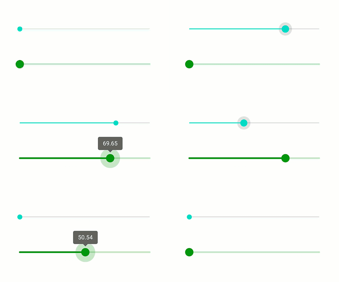
We specify a range of 0-100 on both controls using the valueFrom and valueTo attributes. Doing this gives us the following behaviours (AppCompatSeekBar is on top, and Slider is on the bottom):

While these look very similar there are some important differences. Firstly, the Slider is styled using the colours defined within my theme whereas AppCompatSeekBar is using default colours from the AppCompat library. Secondly, the Slider is slightly larger making it a little clearer to the user. Probably the most important difference is the addition of a label to the Slider when the user drags the position. This makes it easier for the user to understand the precise value they are selecting. While we can certainly add a separate View to our layout to display this value, the tooltip label makes the UI less cluttered. We can disable that if it is not required. Adding app:labelBehaviour="gone" will achieve this.
However there are two other label behaviours. The first is the default that we can see in the previous example – this is app:labelBehaviour="floating" which floats the label over the view. The other option is app:labelBehaviour="withinBounds". This renders the same as floating but the difference is how it affects the size of the Slider. With floating the measured height of the control does not include the label, whereas withinBounds does include the label in the measured height. This can be important depending on whether we want to ensure that the label does not obscure any other controls within our layout.
Discrete Slider
The variant of Slider that we’ve looked at thus far is known as a continuous Slider. That means that the value it returns can be any value within the range. However there are cases where we may want to limit this. For example, fractional values are returned by this continuous Slider, but we may require the value to be limited to integers or even larger steps. To achieve this we can use a discrete slider – which returns a discrete set of values. We can change a continuous Slider to a discrete one by adding a single attribute:
Adding app:stepSize="10" makes the Slider only return values that are multiples of 10. This changes the UX slightly:

Firstly there are tick marks which indicate the discrete values that will be returned. These are quire subtle, but can be seen clearly on the track. The second difference is that the selection is no longer smooth, but jumps between the discrete values as we can see by the label value. The user has a clear indication that the selection is from a discrete set of values.
RangeSlider
We can also use another variant of Slider. So far we have seen how to select a single value using a Slider, but the user can select a range using a RangeSlider.
When we first configured Slider we used valueFrom and valueTo to specify that range of values that the slider returns. a RangeSlider allows the user to specify a range. For example: if we were providing a search facility within a shopping app, we might want the user to be able to specify a price range. We can achieve this using a RangeSlider which supports both continuous and discrete modes:
There is a required attribute here: app:values – without this RangeSlider falls back to standard Slider behaviour. We must supply an array of values in this attribute:
- 20
- 60
- 20
- 60
- 100
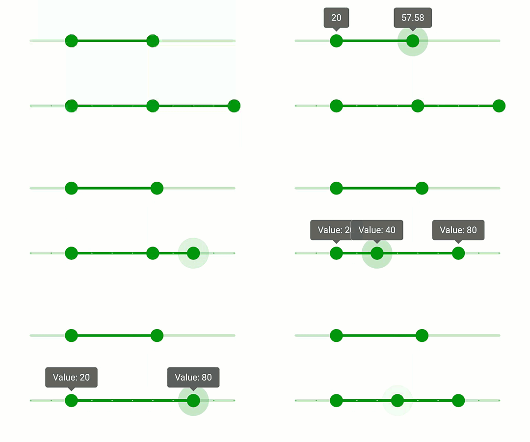
These arrays have two and three values respectively, and the continuous RangeSlider gets the range with two values whereas the discrete RangeSlider gets the range with three values. This gives us some interesting new behaviours:

The top example shows a simple two value range which permits the user to specify a range with upper and lower bounds. The overall range that we set for the RangeSlider constrains the max and minimum values that the user can specify.
The lower example is even more interesting. As well as being a discrete RangeSlider, the three values in the array create three thumb points in the control. As well as just an upper and lower boundary to the range the user can also specify a point somewhere within the upper and lower bounds. The user cannot drag the middle thumb point outside of the bounds set by the upper and lower points. The label of thumb point being dragged is always drawn on top of the other labels that it might overlap. This is important so that the user knows the value they are currently selecting.
We can retrieve the selected values by calling the getValues() method of RangeSlider. This returns an array of values whose size is the same as the size of the array we specified in app:values.
Label Formatting
The more observant may have notices that there is a difference in the label formatting of the double and triple valued RangeSliders. The continuous double valued RangeSlider uses the default label format whereas the discrete triple valued one has the prefix Value:. This brings us on nicely to the fact that we can customise the label:
class MainActivity : AppCompatActivity() {

    private lateinit var binding: ActivityMainBinding

    override fun onCreate(savedInstanceState: Bundle?) {
        super.onCreate(savedInstanceState)

        binding = ActivityMainBinding.inflate(layoutInflater)
        setContentView(binding.root)

        binding.discreteRange.setLabelFormatter {
            getString(R.string.label_format, it)
        }
    }
}
LabelFormatter is a SAM interface with a single getFormattedValue() method which has been converted to a lambda in this case. I have used a format string resource for this:
    Material Slider
    Value: %1$.0f
We must do this programmatically. I’m pretty sure that a format string such as this would fit the majority of use cases, so it would be nice if we could specify one using an XML attribute. However, applying one programmatically is pretty trivial.
Conclusion
Slider and RangeSlider are really nice iterations on SeekBar. They provide the same functionality plus much more. I am particularly impressed by the attention to detail – such as drawing the active label on top of passive ones. This is a well designed and implemented control, and I fully intend to use it!
The source code for this article is available here.
© 2020, Mark Allison. All rights reserved.
Copyright © 2020 Styling Android. All Rights Reserved.
Information about how to reuse or republish this work may be available at http://blog.stylingandroid.com/license-information.


Very nice! In the two-value range slider, is it possible to drag the two handles to the same value? If so, which handle is grabbed when you then tap on it, or can you slide it both ways (i.e. slide left, it becomes the minimum)?
Yes, that’s exactly how it works.
how to get value of slider?
Serious. I cant figure it out.
slider.addOnChangeListener(new View.OnChangeListener() {});
gives:
Cannot find OnChangeListener
Try using `Slider.OnChangeListener` instead of `View.OnChangeListener`.