
Material Design Components version 1.3.0-alpha02 for Android introduced a new MaterialTimePicker component. It is an easy to use component, but, at the time of writing (mid-December 2020), there is one gotcha. In this article we’ll take a look at how to use it. We’ll also look at the gotcha with an easy workaround.
Overview
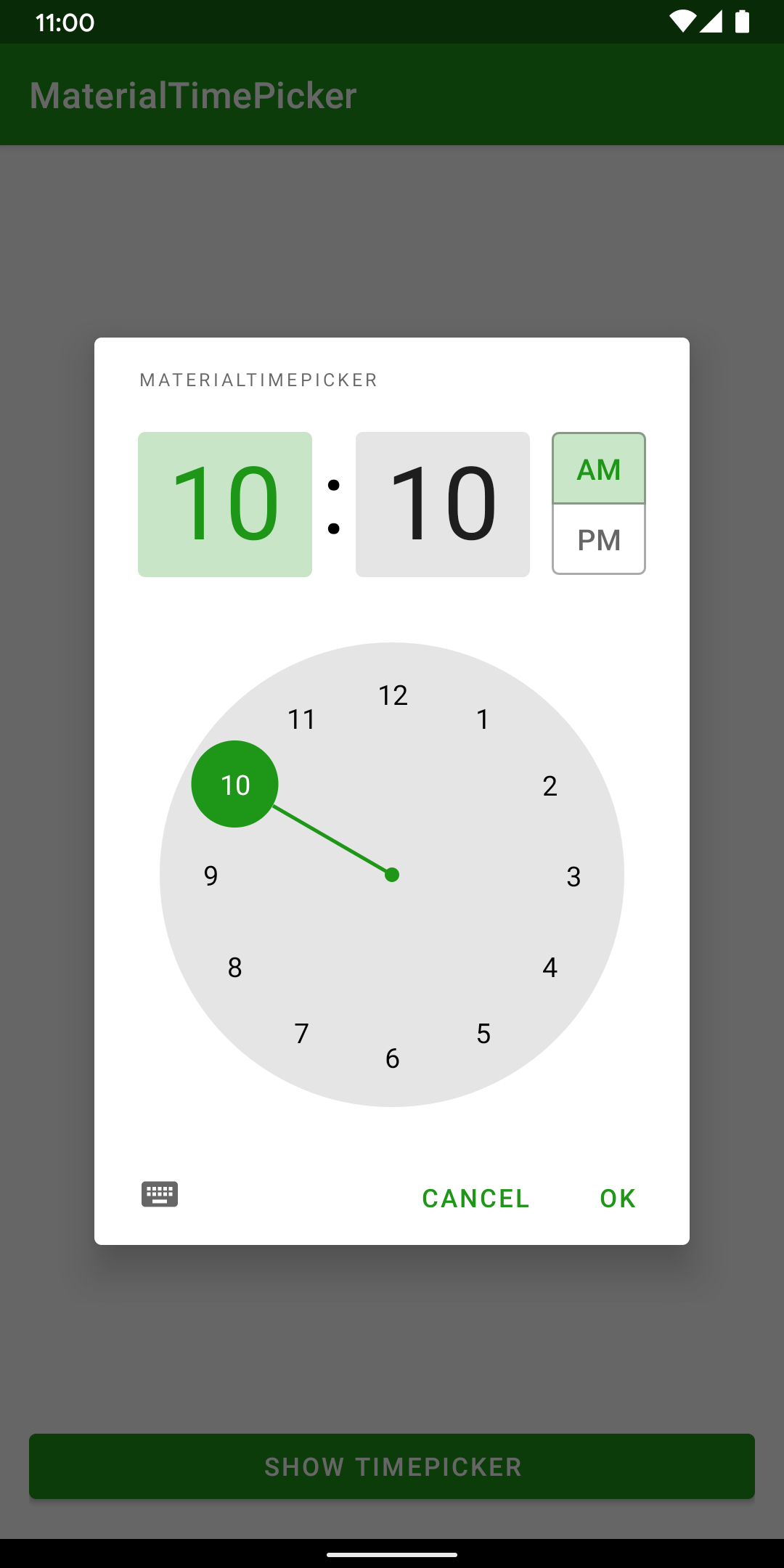
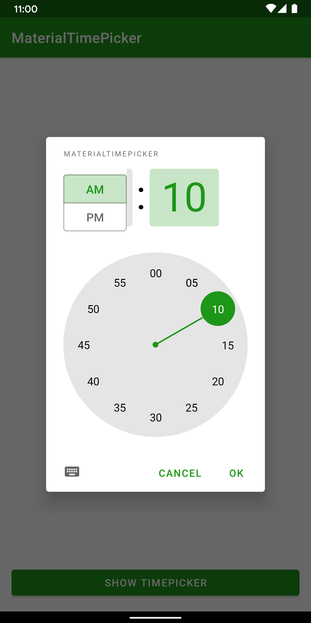
The primary use-case for MaterialTimePicker is as a dialog which pops up to allow the user to specify a time. The dialog itself can take one of two forms. The first shows a clock face upon which the user can change the hour & minute. There is also a chip selector to specify AM or PM:
The second shows just the hours and minutes fields, but these are editable. This uses the same AP/PM chip selector:
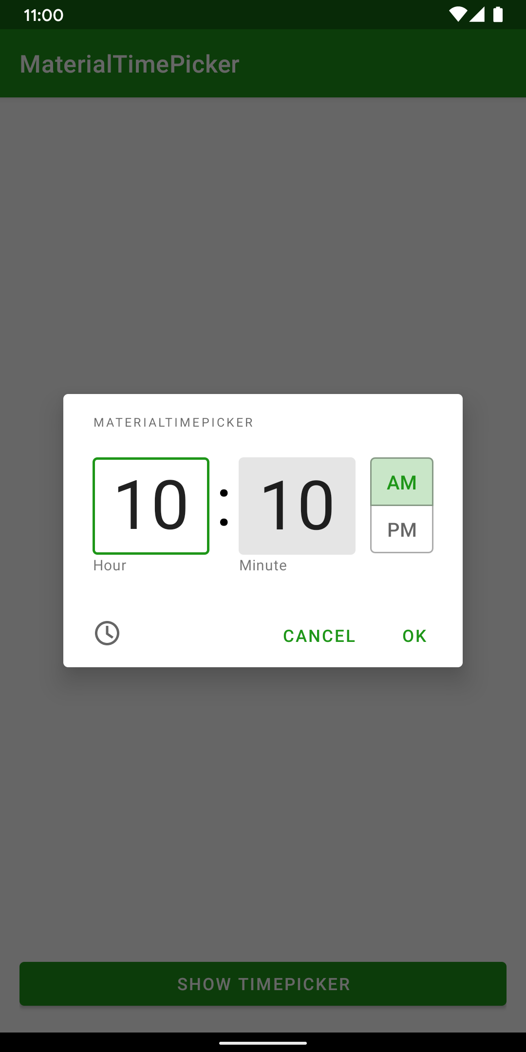
The user can toggle between the two modes by tapping the button in the bottom left corner of each dialog.
Implementation
To construct an instance of this MaterialTimePicker dialog we can use a simple builder pattern:
@AndroidEntryPoint
class TimePickerFragment : Fragment(R.layout.time_picker_fragment) {

    private val viewModel: TimePickerViewModel by viewModels()

    override fun onViewCreated(view: View, savedInstanceState: Bundle?) {
        super.onViewCreated(view, savedInstanceState)

        TimePickerFragmentBinding.bind(view).also { binding ->
            binding.lifecycleOwner = this
            binding.viewModel = viewModel
            binding.showTimepicker.setOnClickListener {
                val currentTime = viewModel.currentTime()
                MaterialTimePicker.Builder()
                    .setHour(currentTime.hour)
                    .setMinute(currentTime.minute)
                    .setTitleText(R.string.app_name)
                    .setInputMode(viewModel.inputMode.value ?: INPUT_MODE_CLOCK)
                    .build()
                    .apply {
                        addOnPositiveButtonClickListener {
                            viewModel.setSelectedTime(hour, minute)
                        }
                        addOnDismissListener {
                            viewModel.setInputType(inputMode)
                        }
                    }
                    .show(parentFragmentManager, "")
            }
        }
    }
}
The builder allows us to set the initial hour and minute values along with the input mode. The input mode controls whether the clock or keyboard form will be displayed. Once we have built the dialog, we can add listeners for different events.
In this example I have added a positive button listener which sets the currently selected time on the viewModel. There is also a dismiss listener which stores the input mode. If the user taps the button to show the dialog again then the input mode is maintained.
MaterialTimePicker does not persist the input mode. Every time a new instance is created it defaults to clock mode. To create a nice user experience, I would consider persisting the input mode as the user dismisses the dialog. We can then use the persisted value when creating future instances. This allows us to provide consistent behaviour according to the users’ preference.
Themeing
By deafult, MaterialTimePicker will use colour, typography and shapes from the current theme. In the pictures above, the green colouring is from my app theme. I needed to do nothing specific to get this behaviour.
I will not do a deep dive into the theming here because the official documentation already covers this extremely well. But it is worth noting that If you have a well defined app theme, then you’ll get a nice look and feel automatically.
Gotcha
At the start of this article, I mentioned that there is currently a gotcha which can break the layout of MaterialTimePicker. I only discovered this very recently when I was finalising the sample code project to accompany this article. I updated all of the app dependencies to the current latest, and ran a final test only to see this:
The positioning of the AP/PM selector chips is no longer correct. After a bit of juggling with dependency versions of various libraries, I found that the latest version of ConstraintLayout (2.1.0-alpha2) is causing this. I have filed a bug for this. The ConstraintLayout team are usually pretty responsive to these kinds of bugs, so I expect a fix quite soon.
The workaround for this is pretty straightforward. Simply revert ConstraintLayout to version 2.1.0-alpha1 and we get the correct layout again:
Conclusion
MaterialTimePicker is a well designed and easy to use component. There’s one potential problem if we use a specific ConstraintLayout version. It can be a little confusing at first which is why I have documented it here. But it is very easy to work around, and a fix to Constraint won’t be far off, I think.
The source code for this article is available here.
© 2020, Mark Allison. All rights reserved.
Copyright © 2020 Styling Android. All Rights Reserved.
Information about how to reuse or republish this work may be available at http://blog.stylingandroid.com/license-information.
