At Google IO 2018 ConstraintLayout 2.0 was announced and the biggest new addition was MotionLayout which gives us an amazing new tool for layout animations. Nicolas Roard has already published an excellent introduction to MotionLayout and I would highly recommend giving that a read to understand the basics and components of MotionLayout. In this short series we’ll look at how we can use MotionLayout to create a behaviour that we should all be familiar with: a Collapsing Toolbar.
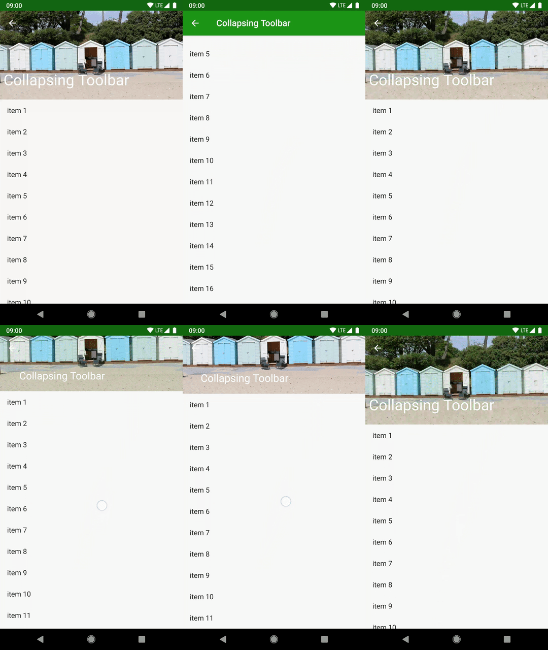
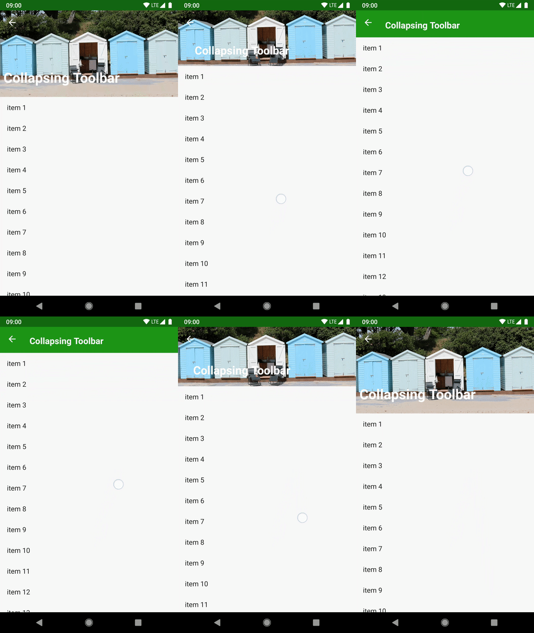
 Previously we got the basic Collapsing Toolbar behaviour working using MotionLayout and for a first attempt it was actually pretty close to what we get using a CollapsingToolbarLayout inside a CoordinatorLayout. However there is a subtlety in that animation that wasn’t captured by the MotionLayout implementation. While the movement and scaling of the title text was pretty close, the fading of the background image of the beach huts was not quite the same. Let’s first look at the CoordinatorLayout version and note how the image does not start fading to the accent colour until the toolbar is almost fully collapsed:
Now if we look at the MotionLayout implementation we can see that the fade is uniform during the whole transition. That is: As soon as the toolbar start collapsing, then the image starts fading and the fading completes as the toolbar reaches its fully collapsed state:
This is actually really easy to fix because of another important feature of MotionLayout: Keyframes. We’ve already discussed how a MotionLayout transition is an animation between to fixed layouts which are defined using different ConstraintSets. What Keyframes allow us to do is define intermediate points between those two fixed layout states, and control the value of a specific attribute at that point.
The transition that we defined previously transitions the imageAlpha attribute of the ImageView between 255 at the expanded position to 0 at the collapsed position and MotionLayout interpolates between these values during the course of the transition. So we actually get a smooth transition which begins as soon as the toolbar starts collapsing, and completes as the toolbar reaches its fully collapsed state. SO that pretty much explains the behaviour we’re seeing with the MotionLayout implementation.
With Keyframes we can actually alter that behaviour so that it occurs much later in the transition. To achieve this we first need to remove the imageAlpha customAttribute from the expanded ConstraintSet:
  <ConstraintSet android:id="@+id/expanded">
    <Constraint
      android:id="@id/toolbar_image"
      android:layout_height="200dp"
      app:layout_constraintEnd_toEndOf="parent"
      app:layout_constraintStart_toStartOf="parent"
      app:layout_constraintTop_toTopOf="parent" />
And do the same for the collapsed ConstraintSet:
  <ConstraintSet android:id="@+id/collapsed">
    <Constraint
      android:id="@id/toolbar_image"
      android:layout_height="?attr/actionBarSize"
      app:layout_constraintEnd_toEndOf="parent"
      app:layout_constraintStart_toStartOf="parent"
      app:layout_constraintTop_toTopOf="parent" />
That has removed the alpha fade from the transition altogether, but we are going to replace it with a KeyFrameSet which is a child of the Transition element:
<?xml version="1.0" encoding="utf-8"?>
<MotionScene xmlns:android="http://schemas.android.com/apk/res/android"
  xmlns:app="http://schemas.android.com/apk/res-auto">

  <Transition
    app:constraintSetEnd="@id/collapsed"
    app:constraintSetStart="@id/expanded">

    <OnSwipe
      app:dragDirection="dragUp"
      app:touchAnchorId="@id/recyclerview"
      app:touchAnchorSide="top" />

    <KeyFrameSet>
      <KeyAttribute
        app:framePosition="60"
        app:target="@id/toolbar_image">
        <CustomAttribute
          app:attributeName="imageAlpha"
          app:customIntegerValue="255" />
      </KeyAttribute>
      <KeyAttribute
        app:framePosition="90"
        app:target="@id/toolbar_image">
        <CustomAttribute
          app:attributeName="imageAlpha"
          app:customIntegerValue="0" />
      </KeyAttribute>
    </KeyFrameSet>
  </Transition>
  ...
</MotionScene>
The KeyFrameSet contains two KeyAttribute entries. Each one defines a state at a given position within the transition the first is at framePosition 60, which is 60% of the way though the transition, and the second is at framePosition 90 which is, unsurprisingly, 90% of the way through the transition. Both of these specifies a target view by its ID (in both cases this is @id/toolbar_image). Each then defines a CustomAttribute element which is exactly the same as we defined previously to define the start and end states.
What now happens is that the image alpha will not change until the transition is 60% completed (i.e. it is over halfway to its collapsed state), and will then begin to fade out, and be completely faded when the toolbar is 90% collapsed:
This is now much closer to the behaviour that we see with CoordinatorLayout. It’s still not identical, but it shows how we can get some much finer-grained control over the internals of the transition animation, and this kind of tweaking would be much trickier to do using CoordinatorLayout.
Keyframes are actually extremely powerful and Nicolas Roard has written a deep dive on them. Rather than simply repeat what Nicolas has already written, we’ll look at some ways in which we can apply them in different ways.
We are not limited to just two keyframes as we have used so far, but we can actually have many more to create much more subtle animations. Essentially they can be used to create custom easing curves (generally know to Android devs as Interpolators). For example if we have start and end imageAlpha of 255 and 0, we can then add a keyframe at 25% with a value of 205, and another at 75% with a value of 50. This would give us something similar to an accelerate_decelerate interpolator.
Moreover we can also change the dynamics of the movement. The movement and scaling of the title text is uniform across the entire transition, but by adding a single keyframe without changing the ConstraintSets we can get it to get close to its final position much faster without changing the speed at which it scales:
<?xml version="1.0" encoding="utf-8"?>
<MotionScene xmlns:android="http://schemas.android.com/apk/res/android"
  xmlns:app="http://schemas.android.com/apk/res-auto">

  <Transition
    app:constraintSetEnd="@id/collapsed"
    app:constraintSetStart="@id/expanded">

    <OnSwipe
      app:dragDirection="dragUp"
      app:touchAnchorId="@id/recyclerview"
      app:touchAnchorSide="top" />

    <KeyFrameSet>
      <KeyAttribute
        app:framePosition="60"
        app:target="@id/toolbar_image">
        <CustomAttribute
          app:attributeName="imageAlpha"
          app:customIntegerValue="255" />
      </KeyAttribute>
      <KeyAttribute
        app:framePosition="90"
        app:target="@id/toolbar_image">
        <CustomAttribute
          app:attributeName="imageAlpha"
          app:customIntegerValue="0" />
      </KeyAttribute>
      <KeyPosition
        app:type="pathRelative"
        app:framePosition="50"
        app:target="@id/title"
        app:percentX="0.9" />
    </KeyFrameSet>
  </Transition>
This will cause it to travel 90% of the way to its final destination by the 50% point of the transition. As a result it appears to fly ahead of the collapsing toolbar, but then drop in to position at the completion of the collapse:
Although this is now something of a departure from the CoordinatorLayout transition, it goes to show how using Keyframes can help us alter the dynamics of a transition and allow different aspects of the same transition to behave independently which is precisely what we have done in this last example.
One final things worth mentioning is that sometimes it can help us to visualise the transitions and we can do this by enabling the showPaths attribute on the layout:
<?xml version="1.0" encoding="utf-8"?>
<androidx.constraintlayout.motion.widget.MotionLayout xmlns:android="http://schemas.android.com/apk/res/android"
  xmlns:app="http://schemas.android.com/apk/res-auto"
  xmlns:tools="http://schemas.android.com/tools"
  android:layout_width="match_parent"
  android:layout_height="match_parent"
  app:layoutDescription="@xml/collapsing_toolbar"
  tools:context=".MainActivity"
  tools:showPaths="true"
  app:showPaths="true">
  ...
</androidx.constraintlayout.motion.widget.MotionLayout>
The tools:showPaths="true" will have more relevance once we get the editing tool in Android Studio (which should hopefully be in the alphas of Android Studio 3.4). But for now adding app:showPaths=”true” will show us the paths that MotionLayout has calculated for the three Views who will be affected by the transition: The title TextView (top, left of centre), the toolbar beach huts ImageView (top centre), and the RecyclerView (centre):
It’s worth noting that we can see the keyframe we added to the TextView which is the red dot just below the top of the path. If you follow the title text as it moves, it is clear to see that the line always passes between the letters ‘n’ and ‘g’, and it reaches the keyframe dot relatively quickly. Displaying the paths in this way can help us to understand how our keyframes are affecting a specific part of the transition. Just remember to turn it off in your release builds – I would suggest defining a boolean in resources which is used in the layout, then you can always force this to false in release builds.
That’s where we’ll leave it for now. But I’m sure that most people will agree that MotionLayout is not only extremely flexible and powerful, but it also opens up some really interesting possibilities for layout animations which are controlled by user interaction.
The source code for this article is available here.
© 2018, Mark Allison. All rights reserved.
Copyright © 2018 Styling Android. All Rights Reserved.
Information about how to reuse or republish this work may be available at http://blog.stylingandroid.com/license-information.


Very nice article. I really love the example. Just note. The type was KeyPosition was renamed to keyPositionType in 2.0.0 alpha 2
Thank you for your tutorial I try to replace the RecyclerView by a NestedScrollView.
If I scroll the scrollView the autocomplete animation work only sometimes but if I scroll the ImageView the autocomplete animation works great.
Do you know how to use a NestedScrollView and the app:onTouchUp=”autoComplete” work together ?