
Regular readers of Styling Android may have guessed that I rather enjoy animating things. MotionLayout offers amazing scope for animations and it’s possible to create some really interesting animations using it. We’ve looked at how to implement a Collapsing Toolbar previously on Styling Android, but we’re not limited to just mimicking existing behaviours which can be achieved using other Android APIs, MotionLayout gives us some real scope to get funky. In this article we’ll push the boundaries a bit and explore some interesting techniques that we can use with MotionLayout.
Before we begin, it is worth pointing out that it is easy to go over the top when it comes to animations. While it is tempting to keep adding more and more complex components to animations, sometimes knowing when to stop adding additional components, or even remove those which aren’t fitting with the overall flow, is the key to achieving animations which feel natural. Moreover, the most effective animations are often those which combine quite simple component animations which complement each other, and create something which appears far more difficult to achieve than it actually is.
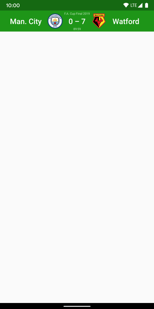
Let’s begin by looking at the overall effect that we’re going to achieve. Here is a Toolbar which might appear in a sports app that displays information about a football (soccer to those in the US) match in progress:
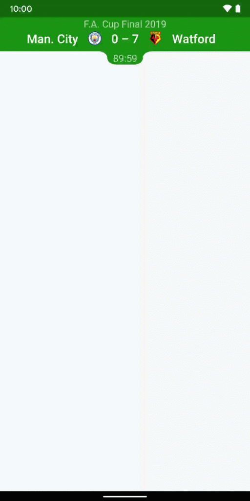
(I should point out that I’m not at all bitter about the result of the 2019 F.A. Cup Final. Not in the slightest.)
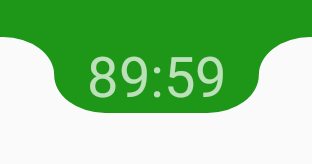
While there is quite a lot going on in the animation, everything sort of moves together, and so the overall effect feels pretty fluid. The actual green rectangular block that is the Toolbar does not actually change size, but the current match time text (89.59) moves outside the bounds of the Toolbar and there is a sort of bubble shape that expands from the bottom of the Toolbar to contain it. This is the part of the animation that is probably the most interesting, so the majority of this article will focus on that.
I’m not going to give a full description of the mechanics of MotionLayout as the previous article covers that already. The key thing is that we effectively define two static states with each one represented as ConstraintSet. The expanded state looks like this:
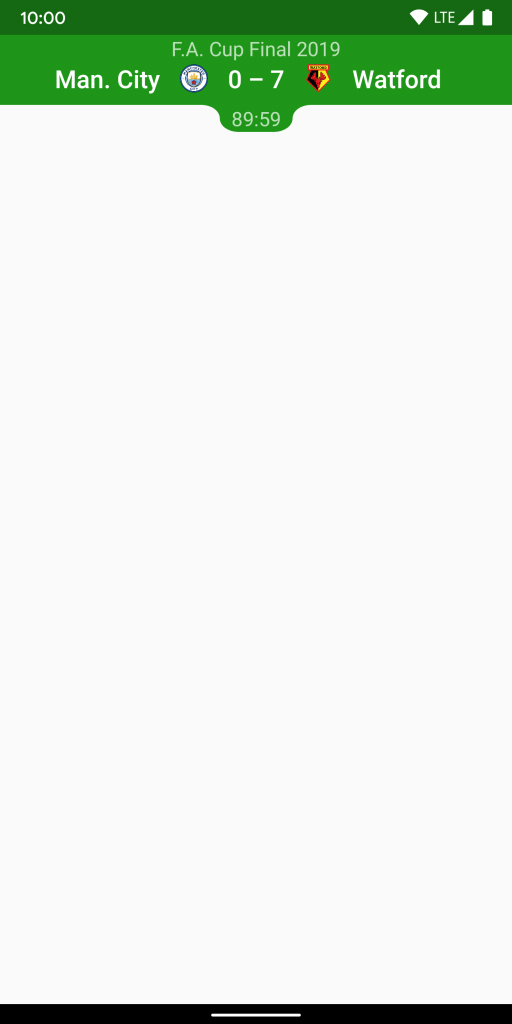
And the collapsed state looks like this:
The MotionLayout itself is declared as follows:
Although MotionLayout is a subclass of ConstraintLayout there are no constraints declared in this layout file – they are all in the declared in the layoutDescriptor file named @xml/collapsing_toolbar.
This file contains the MotionScene for our MotionLayout:
        ...


        ...
This declares constraints for the expanded and collapsed each in its own ConstraintSet, and associates this will a drag gesture so that dragging transitions between the two states. For anyone unfamiliar with this: the earlier MotionLayout article covers this in more detail.
Most of the animations which we apply to the individual views are scaling them. If you look at the earlier animated GIF showing how the animation looks, and focus on the text F.A. Cup Final 2019 at the top, it is simply getting larger and smaller, and the constraints within the ConstraintSets are:
    ...

        ...


        ...


        ...


        ...
Although there are some small differences in the layout_constraint* attributes, the key thing here is the the Transform which is going to scale the text between the collpased and expanded states. MotionLayout will automagically do this scaling for us. What we get for free is that if we constrain other Views to the bottom of this View they will move as the scaling is applied to this View. So the visual effect is that the Views below it move as it grows and shrinks. In the GIF look at how the team names and score move as the size of the title text changes.
We use the same technique to scale the team logos, and the match time text (89:59). I won’t cover those individually, but check the accompanying source code to see this.
The match time text is worth looking at, though:
    ...

        ...


        ...


        ...


        ...


        ...


        ...
The same kind of scaling is being done, but in the collapsed state it is inside the Toolbar, but in the expanded state it is below it.
On its own, that’s not going to work very well for the expanded state because the text itself is light, and the background below the Toolbar is also light. So we need that green ‘bubble’ to drop down below the Toolbar to ensure that the text has a contrasting background.
The bubble itself is a VectorDrawable:
It consists of some arcs and horizontal lines, and actually looks like this:

The shape should be visible in the static expanded state image that we looked at earlier, and a green tint is applied in the layout. Where it gets interesting is how this gets applied in the MotionScene:
    ...

        ...


        ...


        ...


        ...
In the collapsed state both the top and bottom of this View are constrained to the bottom of the Toolbar. It will have no height as a result.
In the expanded state both the top and bottom of this View are constrained to the top and bottom of the match time TextView. It will have a height to match the match time TextView as a result.
When MotionLayout transitions between the collapsed and expanded states, the height of the bubble will change and this gives the illusion of the bubble growing from the bottom of the Toolbar. We could actually get a subtlety different effect of we kept the bubble aligned to the match time TextView. But I, personally, prefer this effect because it make the bubble appear to grow rather than slide out from inside the Toolbar – I think if feels a little more organic.
We’re done. If we put all of this together we get the following:
This specific implementation may not be appropriate for some cases because the match time will overlay whatever is positioned below the Toolbar, but I think that the shape changing toolbar expansion is an interesting idea which is why I have shared it here.
The source code for this article is available here.
© 2019, Mark Allison. All rights reserved.
Copyright © 2019 Styling Android. All Rights Reserved.
Information about how to reuse or republish this work may be available at http://blog.stylingandroid.com/license-information.
