Muselee is a demo app which allows the user to browse popular music artists. It is not intended to be a fully-featured user app, but a vehicle to explore good app architecture, how to implement current best-practice, and explore how the two often go hand in hand. Moreover it will be used to explore how implementing some specific patterns can help to keep our app both maintainable, and easy to extend.

Previously we added a LiveData wrapper around our ConnectivityMonitor to enable lifecycle components to observe network connectivity state changes. Now we need to hook this up so that we can update the UI whenever the device loses connectivity. But we will also need to consider how we need to change our UI to better communicate this in a clear yet relatively unobtrusive manner, and also provide a mechanism for the user to potentially rectify the situation in some situations. The first thing to do is hook the ConnectivityLiveData in to our ViewModel:
class TopArtistsViewModel @Inject constructor(
    @Named(TopArtistsModule.ENTITIES) private val topArtistsProvider: DataProvider,
    val connectivityLiveData: ConnectivityLiveData
) : ViewModel(), CoroutineScope {
    .
    .
    .
}
Thanks to the work that we did previously in our Dagger 2 ApplicationModule this simply gets injected and there is no risk of leaking the Context.
In TopArtistsFragment we can now start observing this:
override fun onResume() {
    super.onResume()
    topArtistsViewModel.connectivityLiveData.observe(this, Observer { newState -> connectivityChange(newState) })
    topArtistsViewModel.topArtistsViewState.observe(this, Observer { newState -> viewStateChanged(newState) })
}
The connectivityChanged() method will get called whenever connectivity status changes. The current UI is based around displaying appropriate messages if a network transaction fails, so we need to provide a different UI to signify lost connectivity. We’ll use a SnackBar which can be shown if there is no connectivity, but hidden when we have connectivity:
private fun connectivityChange(connectivityState: ConnectivityState) {
    if (connectivityState == ConnectivityState.Connected) {
        connectivitySnackbar.dismiss()
    } else {
        connectivitySnackbar.show()
    }
}
While a simple Snackbar meets the criteria for indicating lost connectivity in a relatively unobtrusive way, we can also improve the UX somewhat more. There may be cases when the lost connectivity could be rectified by the user. For example if the user has put the device in to flight mode; or if cellular data connectivity is unavailable and WiFi has been turned off. Either of these cases may be rectified by the user through the device settings. However we can surface a mechanism for quickly nagivating to the correct settings page by adding an action to the Snackbar:
private val connectivitySnackbar: Snackbar by lazy {
    Snackbar.make(topArtistsRecyclerView, R.string.no_connectivity, Snackbar.LENGTH_INDEFINITE)
        .setAction(R.string.network_settings) {
            startActivity(Intent(Settings.ACTION_WIRELESS_SETTINGS))
        }
}
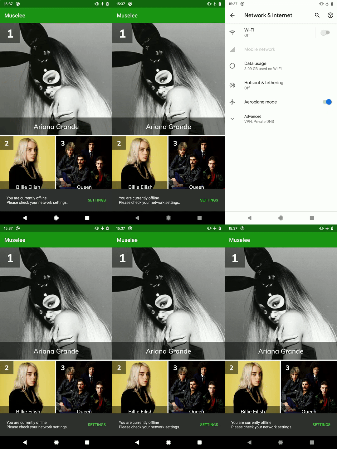
When the user taps on the “Settings” action they are taken directly to the appropriate Settings page:

That’s helpful, but it’s always a little awkward having to divert the user to an external system component because the user may not hit back and return to the app. It would be much nicer if we could actually make this appear within the app. While we cannot do that, there is a nice new feature in Android Q that can provide a more continuous user experience, and that is by using a settings popup instead. As well as doing this for network connectivity settings, we can also surface NFC and audio volume settings in a similar manner. The mechanism we use to do this is almost identical to what we just did for the main settings page, we just use a new action:
private val connectivitySnackbar: Snackbar by lazy {
    Snackbar.make(topArtistsRecyclerView, R.string.no_connectivity, Snackbar.LENGTH_INDEFINITE)
        .setAction(R.string.network_settings) {
            val intent = if (BuildCompat.isAtLeastQ()) {
                Intent(Settings.Panel.ACTION_INTERNET_CONNECTIVITY)
            } else {
                Intent(Settings.ACTION_WIRELESS_SETTINGS)
            }
            startActivity(intent)
        }
}
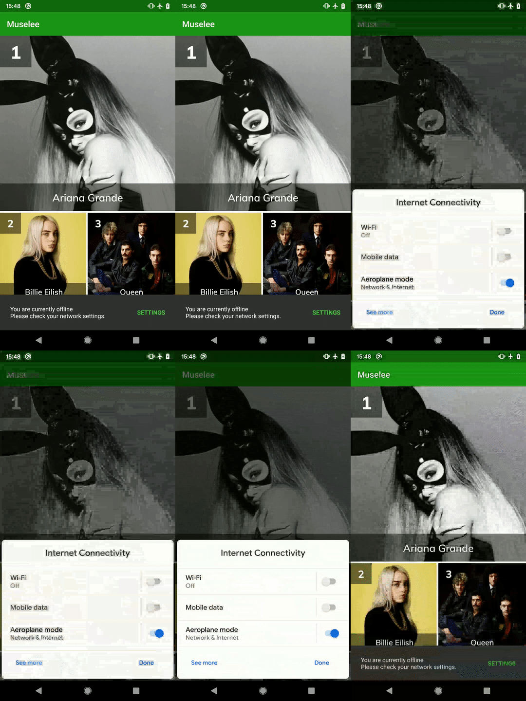
Using the Settings.Panel.ACTION_INTERNET_CONNECTIVITY action gives us a nuch less obtrusive popup:

Although what is happening at device level is much the same – we are still passing control off to Android Settings, the way that this is presented to the user gives much more of an impression that they are not leaving the app. Moreover the “Done” button on the popup gives an immediate path back without the user having to navigate back (although they still can do that).
This is a really nice addition to Android Q and is also really easy to implement particularly if you are already employing the traditional method of allowing the user to navigate to the correct Settings page.
That concludes our look at how we can improve our connectivity monitoring, and surfacing it to the user whilst taking advantage of some of the niceties offered by Android Q. All of the example code that we’ve looked at over the three articles is still fully backwardly compatible to API 21, but the user experience on newer devices and particularly Android Q devices will be nicer.
The source code for this article is available here.
© 2019, Mark Allison. All rights reserved.
Copyright © 2019 Styling Android. All Rights Reserved.
Information about how to reuse or republish this work may be available at http://blog.stylingandroid.com/license-information.

