Previously in this series we have looked at the custom controls that are used in the app that I used for my presentation at AndroidConf Brasil 2011. Now that we’ve got a lot of the dry code out of the way, we can begin to explore the slide layouts to see how we combine those controls in to some nice slides in our presentation.
Without further ado, let’s have a look at the first slide in the presentation which is in res/layout/title.xml:
[xml]
[/xml]
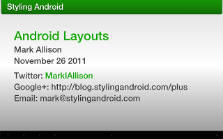
The parent of this is a SlideLayout and within this we simply have some standard TextView objects that we are positioning and styling using standard techniques. In the middle we have a FrameLayout which contains two HighlightedTextView objects. Note that these make use of the “sap” namespace for some of their attributes – specifically the attributes that we described in the last article. These are contained within a FrameLayout because we want to crossfade between them and they both need to be aligned for that to work. The first HighlightedTextView contains the standard text, and is visible from the outset, has gonePhase="1" which mean it will be disappear in phase 1, and has a “fadeout” animation set. The second HighlightedTextView contains the same text, but has both pattern and highlightTextAppearance attributes set to highlight a section of the text, is initialy “gone” but set to be shown in phase 1 with a “fadein” animation. So what’s going to happen here is that initially the first will be shown, containing black text. When we transition to phase 1, there will be a cross-fade (because of the animations) to the second HighlightedTextView which will have a part of the text highlighted green.
It is worth pointing out that the animations do not actually seem to run on the spannable part of the text to which the highlight style has been applied. So for this example, we don’t actually get the cross-fade effect that we’d like. I haven’t had a chance to do a deep dive in to the AOSP code to determine why this is, but thought it worth mentioning in case anyone encountered the same problem.
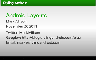
If we run this, we see the slide initially in phase 0:

Now if we touch the screen, we switch to phase 1 and my twitter ID is highlighted in green:

Fundamentally, all of the slides within the entire presentation are operating on that simple principle of hiding and showing HighlightedTextView controls based upon the phase. On occasions different HighlightedTextView controls may start off hidden, be displayed during one phase, and subsequently hidden during a later phase, but the same basic principle occurs throughout.
It is worth having a very quick look at the slides which demonstrate how GridView is laid out. One point worth mentioning is that this is the only place where the layout to illustrate things is not using specific layout type that we’re discussing. This is for no other reason than GridLayout is not available on Honeycomb (which, you’ll remember, is the target version for my presentation to run on a Samsung Galaxy 10.1 Tablet).
Let’s have a look at slide res/layout/gridlayout2d.xml which is the slide where I showed the switch between horizontal GridLayout and verticla GridLayout. This slide is particularly interesting because it contains both phases and a nice animation where the individual cells switch to their new positions in a vertical GridLayout. This part of the layout is quite long, so let’s look at a small section of it to understand how it works:
[xml]
[/xml]
This section of the layout controls the middle cell of the top row. It consists of three separate HighlightedTextView instances which will be displayed in distinct phases. The first is displayed from the start, contains the text “2”, is not highlighted and will be hidden at the transition to phase 1. The second also contains the text “2”, but is highlighted is shown when transitioning to phase 1, and hidden again when transitioning to phase 2. The third contains the text “4”, is highlighted, and is shown with a custom animation during the transition to phase 2.
So when this is run, the text will begin as “2” in an un-highlighted state, transition to a highlighted “2” for phase 1, and then this will be replaced by the highlighted text “4” for phase 3 which will have a “slideupright” animation applied to it.
These basic principles are used for each of the cells, and it is by simply combining small behaviour patterns such as this that we can create some quite complex behaviours.
Next we need to look at the animations that are applied to the individual cells to get them to switch from their position in the horizontal GridLayout to their position in a vertical GridLayout. In the concluding article in this series we’ll look at the animations that are used throughout the Presenter app.
The source code for PresenterLite can be found here.
© 2011, Mark Allison. All rights reserved.
Copyright © 2011 Styling Android. All Rights Reserved.
Information about how to reuse or republish this work may be available at http://blog.stylingandroid.com/license-information.

