In previous articles in this series we have looked at the app that I used for my presentation at AndroidConf Brasil 2011. In this concluding part we’ll have a look at some of the animations that were used throughout the presentation.
I’m assuming a basic familiarity with Android animations for this article. If you are not familiar with Android animation then I recommend reading my series on Animations.
First let’s have a look at the animations that we used for the slide transitions. The most used slide transition is where the new slide moves in from the left with an overshoot. This is achieved using two animations, one for the outgoing slide and one for the incoming one. The animation for the outgoing slide is stored in res/anim/slideoutleft.xml:
[xml][/xml]
The *XDelta values will cause the View being animated to move from it’s current X position a position to the left that is equal to the width of the View – effectively moving it to off the screen to the left if it fills the screen. I have defined a value named fastAnim in res/values/dimens.xml (set to 750) to allow me to control my animation speeds from one place, and so I set the duration to this value. I also use a stock Android overshoot interpolator to give the overshoot “bounce”. Technically the overshoot isn’t required for the outgoing slide as the overshoot for the outgoing slide will actually occur offscreen, but is included here for completeness.
Next we have the animation for the incoming slide which is stored in res/anim/slideinright.xml
[xml][/xml]
This is very similar to the previous animation except that the start position is the width of the View to the right, and the end position is the actual location of the View. In this case the interpolator is required to get the overshoot bounce effect.
Another slide transition that is used to display the penultimate slide which contains a “?” graphic is a zoom / fade in type effect. This is achieved by applying a simple fade out on the outgoingslide, and a zoom and fade in on the incoming slide. The fade is stored in res/anim/fadeout.xml:
[xml][/xml]
This achieves a fade out by animating the alpha (transparency) value from 1.0 (opaque) to 0.0 (fully transparent).
The zoom and fade in animation is stored in res/anim/zoomin.xml:
[xml]
[/xml]
This uses an animation set to run two distinct animations simultaneously. The alpha animation is simply doing the opposite of the fadeout animation, and the scale animation is causing the View to expand from 0 to its full width and height around the centre point. The fact that these run simultaneously gives us a really nice effect.
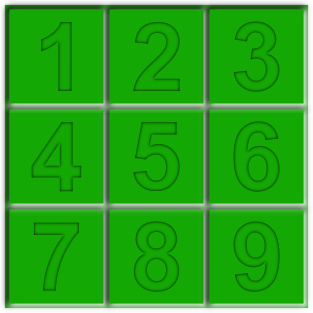
In the previous article in this series we finished with a look at the GridLayout illustration, but did not cover the animations used to perform an animated transition from a horizontal GridLayout to a vertical one. The illustration shows a 3×3 grid of cells which we’ll refer to as they are numbered here:
To convert this to a vertical GridLayout we need to swap calls 2 and 4, cells 7 and 3, and cells 6 and 8. In the previous article we saw how cell 2 changed to cell 4 in phase 2, and we applied an animation to it which is stored in res/anim/slideupright.xml:
[xml][/xml]
If you look at the relative positions of cells 2 and 4, you can see that cell 4 is once cell width below and one cell width to the left of cell 2. This animation starts with an offset of 1 cell width to the left and 1 cell width below, and moves to the final position. So, when this is applied to a View in position 2 it makes the view effectively start at cell 4’s position and move to that of cell 2.
For the cell at position 4, we need to do the opposite so we use the animation in res/anim/slidedownleft.xml:
[xml][/xml]
These same animations are also applied to cells 6 and 8. However the animations for cells 3 and 7 are a little different because cell 7 is two cells to the left of and 2 cells below cell 3. We use exactly the same technique, but we simply adjust the percentage from*Delta values to move two cells instead of one. In res/anim/slideuprightdouble.xml
[/xml]
and res/anim/slidedownleftdouble.xml
[xml][/xml]
That concludes our look at the Presenter app. Hopefully it has given an insight in to how many of the individual techniques that have been covered on Styling Android can be combined.
The source code for PresenterLite can be found here.
© 2011, Mark Allison. All rights reserved.
Copyright © 2011 Styling Android. All Rights Reserved.
Information about how to reuse or republish this work may be available at http://blog.stylingandroid.com/license-information.


1 Comment