There is no hiding from the fact that foldable devices are here. They pose some new challenges when it comes to app development. One of these is the fact that a foldable device’s form factor changes depending on the folded status. Android supports different form factors by design, so this is quite easy to deal with. However, there is a new Jetpack library that makes things easier still: SlidingPaneLayout.
The primary use-case for SlidingPaneLayout is where different screen sizes require different UX. The classic example of this is a List / Detail interface. The list and detail panes are shown side-by-side on larger displays. But the list pane is shown full screen on smaller displays. Clicking on a list item then shows the detail pane full screen. Commonly we implement the list and detail panes as Fragments and then have a master layout that changes based on display size.
SlidingPaneLayout offers much the same functionality, but does much of the heavy lifting for us.
Implementation
The first thing we need to do is include the dependency in our project:
dependencies {
    implementation "androidx.slidingpanelayout:slidingpanelayout:1.2.0-alpha01"
}
At the time of writing, 1.2.0-alpha01 is the latest release of SlidingPaneLayout. This is also the first version of the library to include foldable support, so it’s necessary to use the alpha release for now.
We can now create our layout:
Here we have the list pane implemented using a RecyclerView, and the detail pane as a NavHostFragment.
The key things here are the width values. These are what define the split point between displaying the two panes fullscreen, or side-by-side. If the display is not wide enough to hold both widths, then the list pane will be displayed full screen. Tapping on a list item will bring in the detail pane full screen.
However, if the display is wide enough to include both panes then they will be displayed side-by-side. In this case the layout_weight attribute can become important. Here the detail pane has a weight of 1. The detail pane will fill the remaining space once the list pane has been sized if there are no other constraints. However, on some foldable devices the boundary between to two panes may be the fold line of the display.
The Fragment code is completely agnostic of this – it is all handled by SlidingPaneLayout. Although in some cases it may be necessary to control this programmatically. SlidingPaneLayout implements Openeable so can easily be controlled programmatically, if necessary.
Results
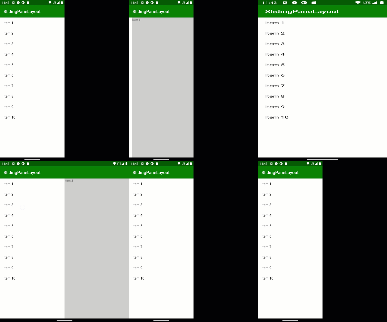
I tested this on a Samsung Z Fold2 and it works really smoothly. However, I was unable to capture video from that device, so had to improvise. This capture is from a “7.6 Fold-in with outer display” emulator instance, which is similar to the Samsung:

There is a little bit of a layout glitch when transitioning between folded and unfolded states, and vice versa. However, this did not happen on the actual device. It does show the different UX models quite nicely, though.
Ponderings
SlidingPaneLayout is incredibly powerful and easy to use. The concept behind foldables also impresses me, and the technology is maturing. However, I was less enamoured with the Samsung Z Fold2. The build quality of the device is excellent, although only time will tell how hard-wearing the hinged section of the display will be. The issue I have is with the aspect ratios of both the folded and unfolded displays.
When folded, the display is very tall, but not very wide – 816 x 2260 pixels – roughly 1:3 aspect ratio. Very few apps actually cope well with this, particularly third-party launcher apps which end up squashing the columns together. Although it is the responsibility of apps to adapt to the display, this feels like a particularly awkward aspect ratio, and many apps simply don’t cope well with it.
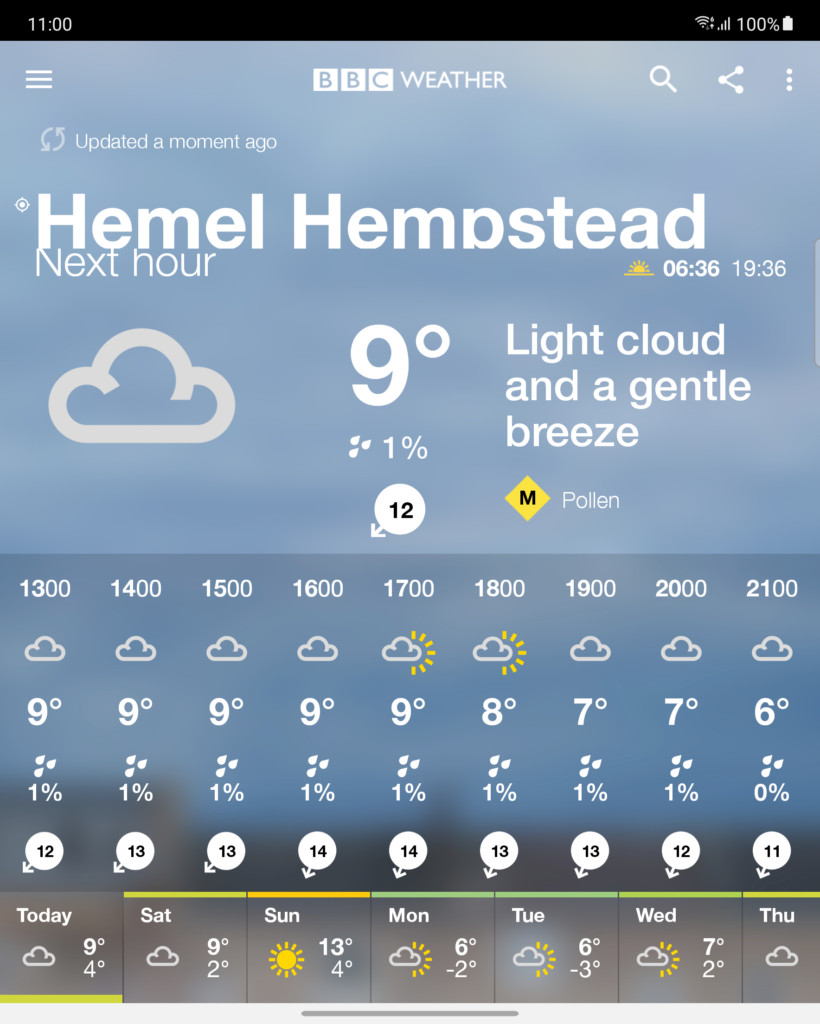
Similarly the unfolded display is also an unusual aspect ratio. It is 1768 x 2208 pixels – roughly 1:1.25. This is not far off square and, once again, this is quite an uncommon aspect ratio, so apps don’t cope well with it. Here is the BBC Weather app:

On the face of it, this looks OK. On closer inspection, the clipped descenders in “Hemel Hempstead” (i.e. the stalk of the letter ‘p’) are a problem. Also “Next hour” is running in to the text above it.
What’s the problem?
The issue here is that technically this is a portrait display because it is taller than it is wide. But it’s not that much taller. So a layout designed for a portrait display doesn’t work as well for a nearly square display.
As I already mentioned, apps can improve their own layouts. But the hardware choices here mean that there are new aspect ratios that apps need to support. This will result in increased development and QA effort required to support such devices. Foldables are still somewhat expensive and are not shipping in huge numbers as a consequence. Many app developers will feel that the additional effort cannot be justified. That may put potential buyers off.
While I have digressed from the main subject of the post, I did feel it worth mentioning. It feels like the device manufacturers need to make more of an effort to conform to more sensible aspect ratios or risk breaking a lot of app UIs.
Conclusion
SlidingPaneLayout is a very easy-to-use tool for handling multiple pane UIs which need different behaviours on different display sizes. Although I have focussed on foldables here, it is also extremely useful when making apps behave well in a multi-window environment. If the app doesn’t get the entire screen, SlidingPaneLayout can ensure that its behaviour adapts to its window size changing.
The source code for this article is available here.
© 2021, Mark Allison. All rights reserved.
Copyright © 2021 Styling Android. All Rights Reserved.
Information about how to reuse or republish this work may be available at http://blog.stylingandroid.com/license-information.


