One of the fundamental principles of Material Design is “motion provides meaning” and one important area where this applies is giving visual feedback to the user when they interact with our app. The standard method of doing this has always been using StateListDrawable to tie the visual appearance of a control to its state (i.e. enabled, disabled, pressed, etc.) and this has been available to use since API 1. While useful, this does not meet the “motion provides meaning” principle because the control appearance jumps between fixed appearances. StateListAnimator was introduced in API 21 along with Material Design and is a really simple way to smoothly transition between visual states. In this series we’ll take a look at how to use StateListAnimator to its full potential.
Before we dive in, let’s quickly recap on StateListDrawable as there is some commonality which will become clear as we proceed. Let’s start with a simple layout:
<?xml version="1.0" encoding="utf-8"?>
<LinearLayout xmlns:android="http://schemas.android.com/apk/res/android"
  xmlns:tools="http://schemas.android.com/tools"
  android:id="@+id/activity_main"
  android:layout_width="match_parent"
  android:layout_height="match_parent"
  android:orientation="horizontal"
  tools:context="com.stylingandroid.statelistanimator.MainActivity">

  <TextView
    android:id="@+id/textView"
    style="@style/Widget.TextView.Boxed"
    android:layout_width="wrap_content"
    android:layout_height="wrap_content"
    android:layout_marginStart="16dp"
    android:layout_marginTop="16dp"
    android:foreground="@drawable/foreground_selector"
    android:text="@string/standard_state_list" />

</LinearLayout>
We have a standard style applied to the TextView which sets a background drawable, some padding, a small elevation, and make it clickable so that the TextView has a pressed state. I won’t display the style here, but it’s in the source code if you want to check it out.
The key thing that we do from the layout is apply a foreground drawable which is a StateListDrawable:
<?xml version="1.0" encoding="utf-8"?>
<selector xmlns:android="http://schemas.android.com/apk/res/android">
  <item android:color="@color/transparentAccent"
    android:state_pressed="true">
    <shape>
      <solid android:color="@color/transparentAccent" />
    </shape>
  </item>

  <item>
    <shape>
      <solid android:color="@android:color/transparent" />
    </shape>
  </item>
</selector>
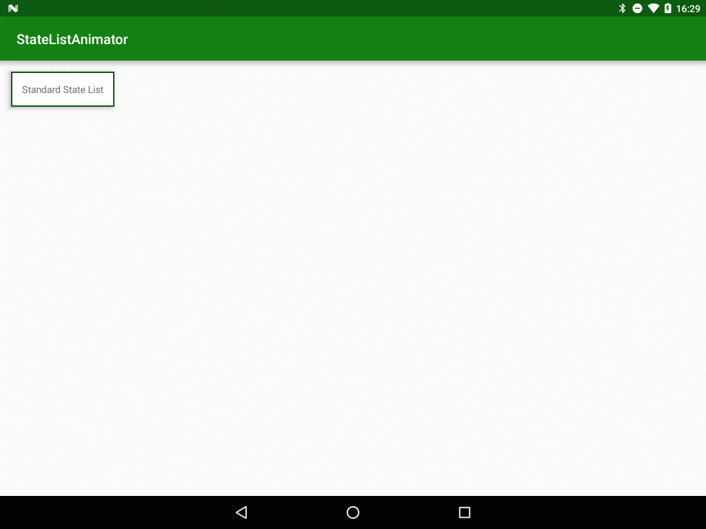
This is where the magic happens – we’ve defined a default state which has a transparent fill, and a pressed state which will apply a colour – in this case a slightly transparent green. If we run this we can see standard behaviour:
It’s functional in that it clearly provides some visual feedback that the TextView has been tapped, but it’s not very inspiring and certainly doesn’t have any motion to it.
So how can we improve upon it? Well the Material Design specs suggest that buttons should be behave in a material-like manner and rise to meet your finger, so we could achieve this by altering the elevation, but doing this alone won’t give us motion – it would just jump again. Also, StateListDrawable is not a View, and so we cannot change the elevation of the View from there. This is where StateListAnimator comes in. It allows us to apply changes as the View state changes, but enables us to run property animators on the View:
<?xml version="1.0" encoding="utf-8"?>
<selector xmlns:android="http://schemas.android.com/apk/res/android">
  <item android:state_pressed="true">
    <objectAnimator
      android:duration="@android:integer/config_shortAnimTime"
      android:propertyName="translationZ"
      android:valueTo="4dp"
      android:valueType="floatType" />
  </item>

  <item>
    <objectAnimator
      android:duration="@android:integer/config_shortAnimTime"
      android:propertyName="translationZ"
      android:valueTo="0dp"
      android:valueType="floatType" />
  </item>
</selector>
This is structured similarly to a StateListDrawable in that it has a selector containing items for each state, but it is the content of each item which is different – we now use objectAnimator instead of a shape as we did previously. These are standard objectAnimators and allow us to animate properties of the View – in this case we’re going to animate translationZ which will alter the elevation. One important thing is that we don’t specify a valueFrom attribute on either animator. As a result the starting value will be the current translationZ value for the View.
Next we need to add a second TextView, and apply this:
<?xml version="1.0" encoding="utf-8"?>
<LinearLayout xmlns:android="http://schemas.android.com/apk/res/android"
  xmlns:tools="http://schemas.android.com/tools"
  android:id="@+id/activity_main"
  android:layout_width="match_parent"
  android:layout_height="match_parent"
  android:orientation="horizontal"
  tools:context="com.stylingandroid.statelistanimator.MainActivity">

  <TextView
    android:id="@+id/textView"
    style="@style/Widget.TextView.Boxed"
    android:layout_width="wrap_content"
    android:layout_height="wrap_content"
    android:layout_marginStart="16dp"
    android:layout_marginTop="16dp"
    android:foreground="@drawable/foreground_selector"
    android:text="@string/standard_state_list" />

  <TextView
    android:id="@+id/textView2"
    style="@style/Widget.TextView.Boxed"
    android:layout_width="wrap_content"
    android:layout_height="wrap_content"
    android:layout_marginStart="16dp"
    android:layout_marginTop="16dp"
    android:text="@string/state_list_animator"
    android:stateListAnimator="@animator/selector_animator" />

</LinearLayout>
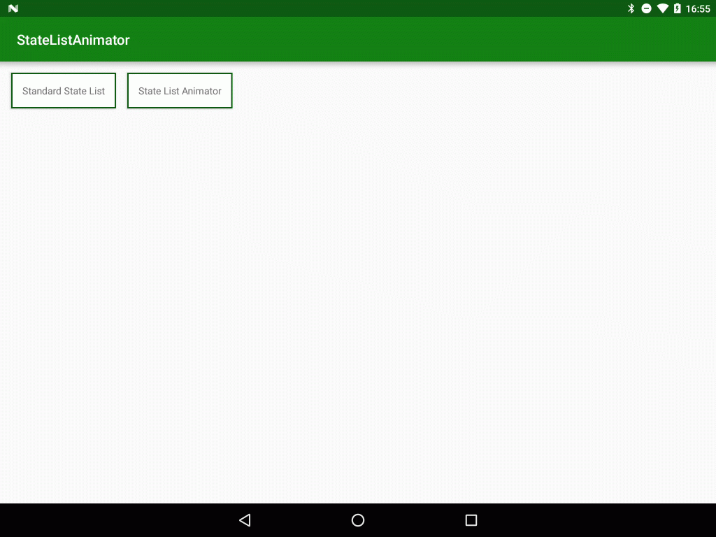
The important thing here is that we don’t apply this as the foreground, there is a specific attribute named stateListAnimator which we need to use to apply this. If we now run this we can see the TextView seeming to rise to meet our touch:
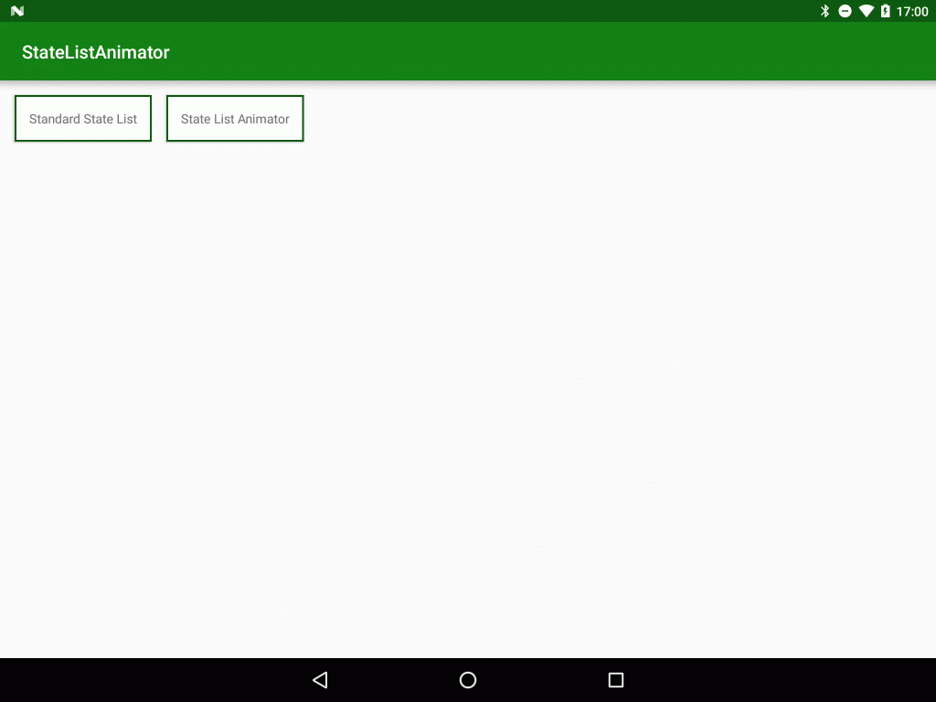
One thing worth adding is we can apply more than one animation but wrapping them inside a set. To demonstrate this, suppose we wanted to further suggest the rising of the TextView b making it slightly larger as it rises. We can achieve this by adding objectAnimators to animate the scaleX and scaleY properties of the TextView:
<?xml version="1.0" encoding="utf-8"?>
<selector xmlns:android="http://schemas.android.com/apk/res/android">
  <item android:state_pressed="true">
    <set>
      <objectAnimator
        android:duration="@android:integer/config_shortAnimTime"
        android:propertyName="scaleX"
        android:valueTo="1.025"
        android:valueType="floatType" />
      <objectAnimator
        android:duration="@android:integer/config_shortAnimTime"
        android:propertyName="scaleY"
        android:valueTo="1.025"
        android:valueType="floatType" />
      <objectAnimator
        android:duration="@android:integer/config_shortAnimTime"
        android:propertyName="translationZ"
        android:valueTo="4dp"
        android:valueType="floatType" />
    </set>
  </item>

  <item>
    <set>
      <objectAnimator
        android:duration="@android:integer/config_shortAnimTime"
        android:propertyName="scaleX"
        android:valueTo="1.0"
        android:valueType="floatType" />
      <objectAnimator
        android:duration="@android:integer/config_shortAnimTime"
        android:propertyName="scaleY"
        android:valueTo="1.0"
        android:valueType="floatType" />
      <objectAnimator
        android:duration="@android:integer/config_shortAnimTime"
        android:propertyName="translationZ"
        android:valueTo="0dp"
        android:valueType="floatType" />
    </set>
  </item>

</selector>
This subtly enhances the rising effect:
The use of property animators here should give a hint as to how flexible and powerful StateListAnimator is, and many more really cool effects can be created using this really useful technique.
The source code for this article is available here.
© 2016, Mark Allison. All rights reserved.
Copyright © 2016 Styling Android. All Rights Reserved.
Information about how to reuse or republish this work may be available at http://blog.stylingandroid.com/license-information.


