Recently on Styling Android we’ve been looking at the ActionBar, but this would not be complete without having a look at how we can customise the look and feel of our ActionBar. Up to know the stuff that we’ve looked at on ActionBar has been relatively straightforward, however getting the styling right can be a little tricky. The main reason for this is simply that there is a sparsity of documentation on this issue and it often requires studying the Android source to determine how to style a particular part of the ActionBar.
Before we begin, it is worth mentioning a couple of great resources. The first is Google Developer Advocate Nick Butcher’s excellent article on Customising the ActionBar. Nick’s post offers some great insights in to how to style the ActionBar, and while it was a great point of reference while writing this series, there are some areas that are not covered.
The second resource worth mentioning is Jeff Gilfelt’s ActionBar Style Generator. This is an on-line tool, based upon Roman Nurick’s Android Asset Studio, which will generate the styles and assets based upon a few values and colours that you enter.
I have used Jeff’s tool to generate the assets’ that we’ll use in this series, but I’ll be generating the styles manually so that we can explain them as we add them during this tutorial.
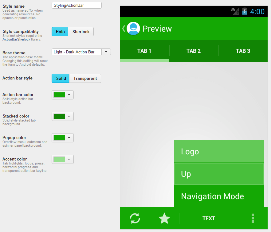
To gain some understanding of how to style the ActionBar, let’s use the code that we finished with at the end of the Basic ActionBar and ActionMode series’ and try and style that in to a StylingAndroid colour scheme. It is worth pointing out that normally, I would stick with the standard grey panels of the Holo Light style, and change the accents to the brand colour. For the purposes of covering how to change everything, I’ll go for a rather more garish colour scheme, but one that allows us to see how the various style attributes affect the overall appearance of the ActionBar. Here’s how I configured Jeff’s tool to generate the assets that we’ll use:
The colour values that I have used are:
- Action bar color: #14a804
- Stacked color: #118504
- Popup color: #14a804
- Accent color: #97e08f
I have elected to use white text because it shows up better against the basic Styling Android green of #14A804. In order to achieve this, we actually need to use a dark theme (which results in light text). It is possible to use a dark theme for the ActionBar while using a light theme for the rest of the app. Let’s look the theme that we created in Basic ActionBar – Part 3 in res/values/styles.xml:
[xml][/xml]
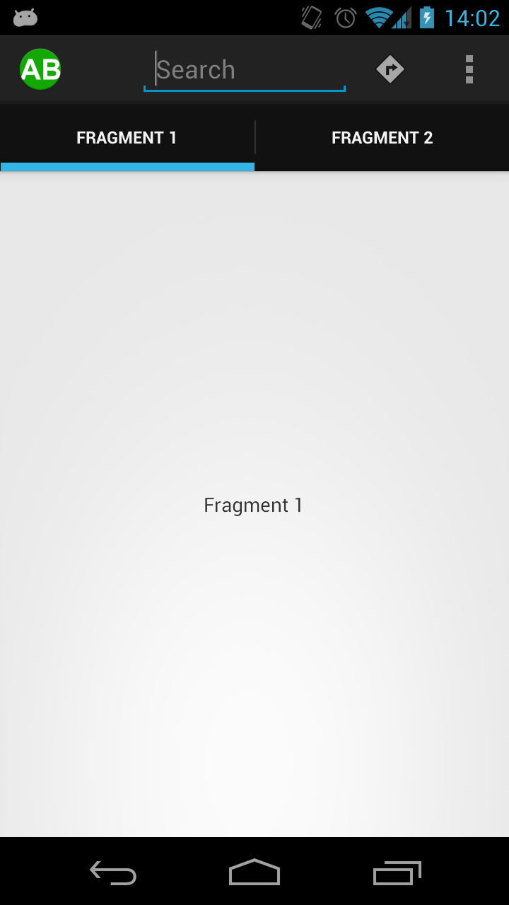
If we run this we can see that we now have a dark Holo ActionBar while the rest of the app has a Holo.Light style:
In the next part of this series we'll look at applying some basic colours to our ActionBar, and then start setting some of the custom assets that we generated to begin styling individual controls.
The source code for this article can be found here.
© 2012, Mark Allison. All rights reserved.
Copyright © 2012 Styling Android. All Rights Reserved.
Information about how to reuse or republish this work may be available at http://blog.stylingandroid.com/license-information.


Thank you, thank you, thank you !!!
Just started tackling this about a month ago (android newbie).. I know how I wanted my design to look and the online android doc.. which was pretty good at explaining android, totally dropped the ball when it came to the action bar.
Also.. the funny thing is, with the SDK, it creates the manifest calling the styles, but it doesn’t work when you change the ‘halo’ backgrounds in the style.xml.
So, while getting my hands dirty, I’m finally figuring out the manifest stuff
awesome documentation !!