In the previous article we used Jeff Gilfelt’s Android ActionBar Style Generator to create some assets and we set up our base Theme. In this article we’ll look at building up our styles to get the ActionBar looking how we would like it.
The first thing that we need to do is set up the basic colour values in res/values/colors.xml that we used in Jeff’s Generator tool:
[xml][/xml]
The ActionBar consists of a number of components such as the overflow menu, navigation tabs or spinners in addition to any custom views or layouts which we may add. We’ll cover those other components in due course, but for now we’ll concentrate on the ActionBar itself. For this we need to create a new style, which we’ll call “ActionBar” in res/values/styles.xml:
[xml] [/xml]Now we must set this style on the ActionBar by adding an actionBarStyle to the theme in res/values/styles.xml:
[xml] .
.
.
[/xml]
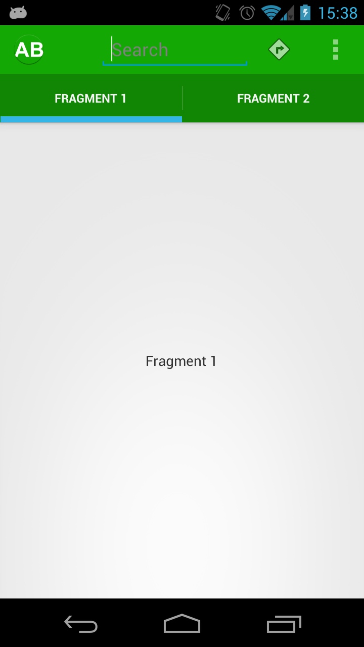
If we run this we can see that the ActionBar itself and the background of the split Tab control are now correctly set, although we still need to work on some of the other components:
It is worth noting that the icons for both the toggle and overflow menus (the direction sign and three vertical dots, respectively) have taken on the hue of the background. This is because these system icons are semi-transparent, and so allow the background colour to show through. For more information on how to use transparency in this manner, please see the series of articles on Transparency.
Another thing worth mentioning is that Jeff’s tool created an asset for a ProgressBar. We’re not using a ProgressBar in the example so we’ll skip this, but if you want to include it just add the following to the ActionBar style that we created earlier:
[xml][/xml]
Then create a new style:
[xml] [/xml]And copy across res/drawable/progress_horizontal_stylingactionbar.xml and the various assets in res/drawable-*/progress*.png.
The next thing that we’ll look at is how to apply the accent colour to the Tb control. Once again we need to define a new style in res/values/styles.xml:
[xml] [/xml]For this to build we’ll need to copy a number of resources from the zip that we downloaded from Jeff’s tool. Firstly res/drawable/tab_indicator_ab_stylingactionbar.xml, and the various files that this references which are in all of the drawable-mdpi, drawable-hdpi, and drawable-xhdpi directories (we’ll need to copy each in to it’s respective folder in our project), and represents the various selection states: tab_selected_stylingactionbar, tab_unselected_focused_stylingactionbar, tab_selected_focused_stylingactionbar, tab_unselected_pressed_stylingactionbar, and tab_selected_pressed_stylingactionbar.
And, once again, we assign this style in the theme:
[xml] .
.
.
[/xml]
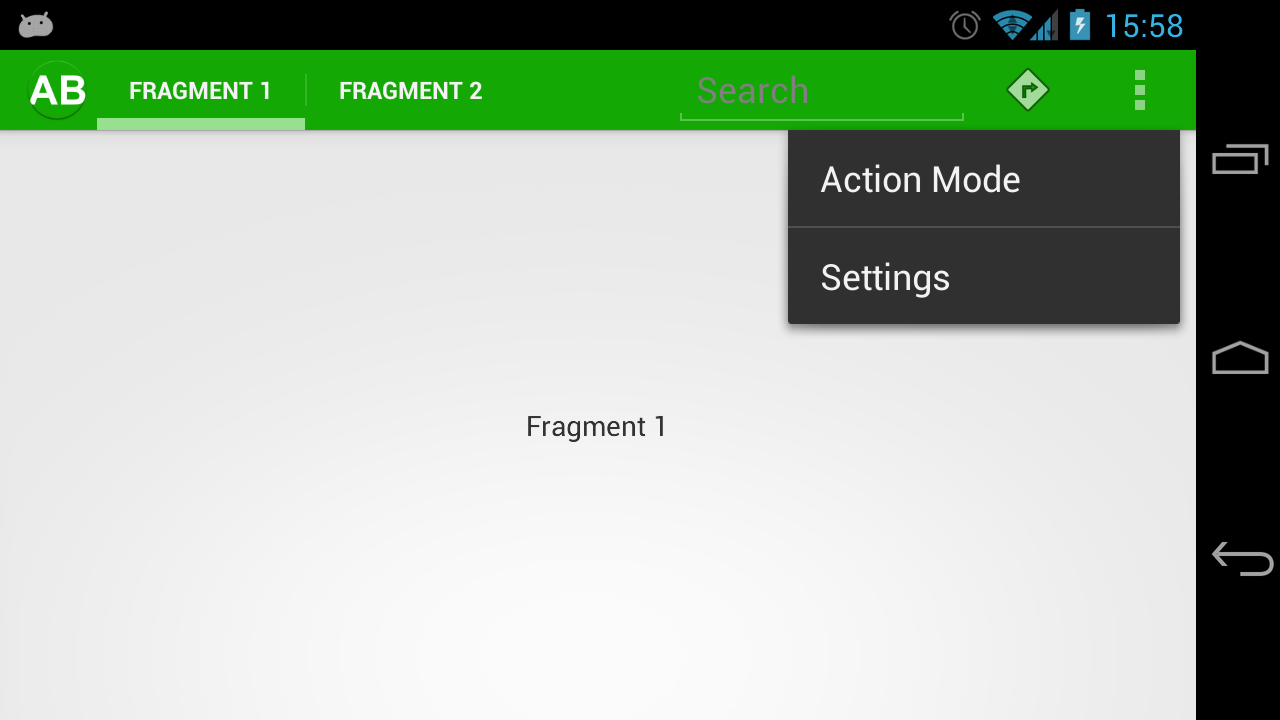
Our Tab control now has the correct accents, and this works in landscape as well:
However, that picture shows that the overflow menu has not got any style applied. In the next article in this series we’ll look at applying our style to the overflow menu and the Dropdown navigation.
The source code for this article can be found here.
© 2012 – 2014, Mark Allison. All rights reserved.
Copyright © 2012 Styling Android. All Rights Reserved.
Information about how to reuse or republish this work may be available at http://blog.stylingandroid.com/license-information.


Is it possible to also change the height of the tabs? If so, how?
yes. it is possible to change the height of tab bar. By default it is the size of actionbar. By changing the android:actionBarSize you can change the height. If you don’t want that then set custom view for actionbar
In JellyBean, this actionBarSize seems to only change the height of the action bar, not the tab bar.
Great post, many thanks & just one small correction. The file referred to as res/drawable/tab_indicator_ab_stylingactionbar.png should be res/drawable/tab_indicator_ab_stylingactionbar.xml
Thank you – very well spotted!
It should be fixed now.
Hi, In Landscape mode how to resize the tabs to use 100% of the screen width instead of all shifting to left.
Boss. Thanks a lot. You have saved my day…
I am really grateful for these tutorials. Thanks a lot for the effort.
I have a question about the compatibility of the styles with API 11+,
for instance, I can’t seem to be able to do these two lines:
@color/stacked_green
@color/sa_green
neither to inherit the @android:style/Widget.Holo.Light.ActionBar.Solid.Inverse in API between 11 – 13,
I hope there’s a way around that you know because I’ve been looking for few days on styling the action bar but I always face a problem with something not working for a lower API.
My application is intended for API 11+.
Thanks