Previously in this series we have applied a few simple styles to the ActionBar. In this article we’ll have a look at styling the overflow menu and the Navigation DropDown.
Let’s begin with the overflow menu. We must first define some new styles in res/values/styles.xml for the menu panel and the ListView selector:
[xml] [/xml]For this we need to create a new XML drawable in res/drawable/selectable_background_stylingactionbar.xml
[xml][/xml]
This requires list_focused_stylingactionbar.9.png to be copied across from each of the drawable-hdpi, drawable-mdpi, & drawable-xhdpi directories in the zip that we downloaded from Jeff Gilfelt’s ActionBar Style Generator tool. Now we need to create another XML drawable in res/drawable/pressed_background_stylingactionbar.xml:
[xml][/xml]
We also need to create a new colour in res/drawable/colors.xml:
[xml]Next we need to copy across menu_dropdown_panel_stylingactionbar.9.png from the drawable-hdpi, drawable-mdpi, & drawable-xhdpi directories in the ActionBar Style Generator zip to their respective directories in our project.
Finally, we need to add the styles that we have created to the theme so they are applied at runtime:
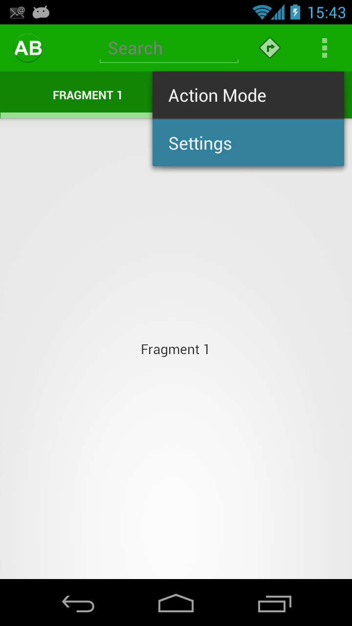
[xml] [/xml]If we run this we would expect the overflow menu to be correctly styled, but in fact it is not:
So, what is going wrong here? Actually this would work perfectly if we were using one of the standard themes such as Theme.Holo.Light, but in our case the styling is not happening because we are using Theme.Holo.Light.DarkActionBar as the basis of our theme. This theme uses a bit of trickery to get the darker colour working, and so we need to use a bit of trickery also. It’s actually not that difficult, and utilises the styles that we have already created, we just need to apply them slightly differently in our theme.
One thing that we’ll come on to later is how to apply styles to MenuItems where we are using a actionViewClass or actionViewLayout. In fact each of the MenuItems can have styles applied, and the overflow menu is no different. What we need to do is to create a new theme which applies the styles that we have already configured:
[xml] [/xml]Then apply this to the widget style in our main theme:
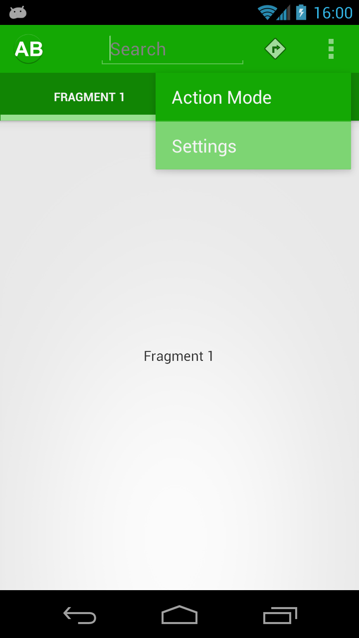
[xml] [/xml]Now we can run it again, and the styling has now been correctly applied to the overflow menu:
Next we’ll look at the Spinner used for DropDown Navigation. What we need to do is pretty similar to what we’ve done before. We need to create a new style:
[xml] [/xml]Then we copy across spinner_background_ab_stylingactionbar.xml from drawable in the ActionBar Style Generator zip to drawable in our projects, and then copy spinner_ab_default_stylingactionbar.9.png, spinner_ab_disabled_stylingactionbar.9.png, spinner_ab_focused_stylingactionbar.9.png, & spinner_ab_pressed_stylingactionbar.9.png from each of the drawable-hdpi, drawable-mdpi, & drawable-xhdpi folders in the zip to their respective folders in our project. Finally we apply this style in our theme:
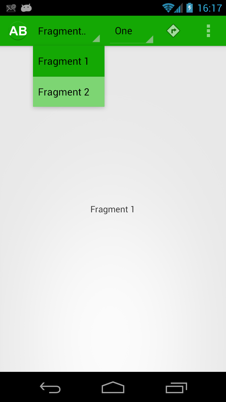
[xml] [/xml]Once again we run this:
This is looking pretty good, but to stay in keeping with the rest of the ActionBar styling we really want white text here. This is easy enough to achieve by creating a couple of new styles which apply the inverse text colour (because we’re using Theme.Holo.Light.DarkActionBar as our base) to both the text of the Spinner itself and the text of the DropDown:
[xml] [/xml]Once again we apply these styles in our theme:
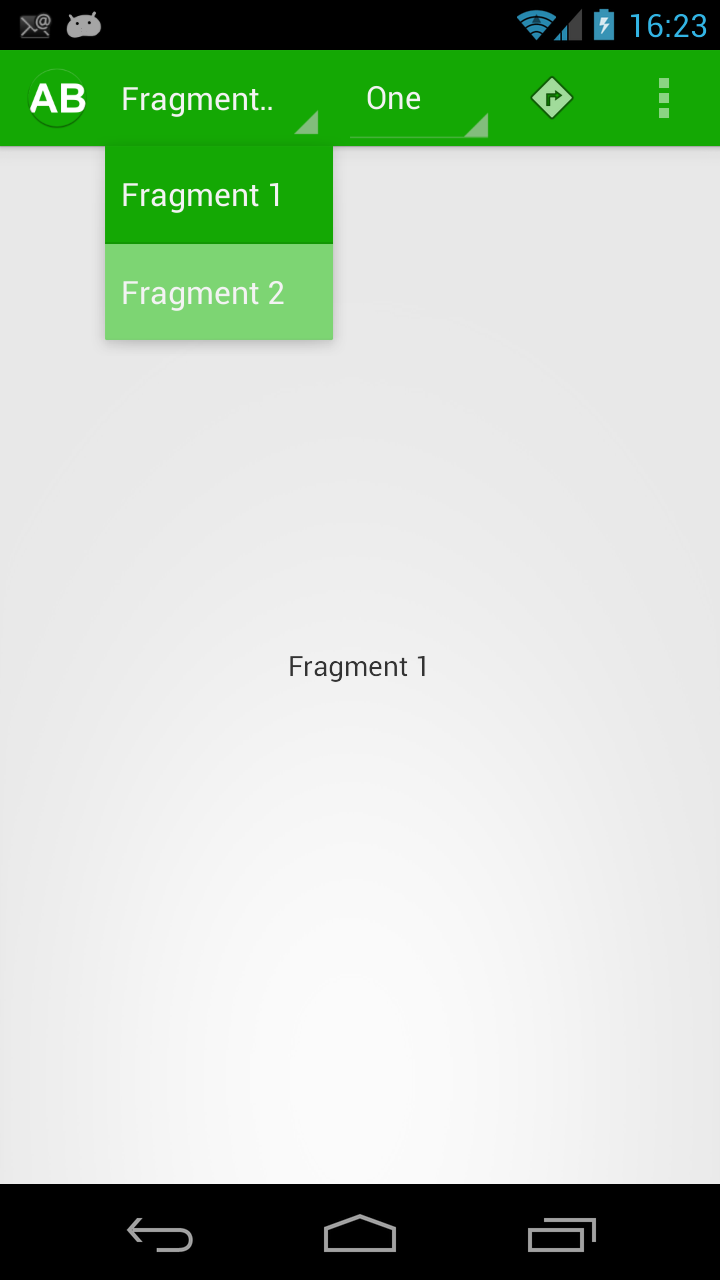
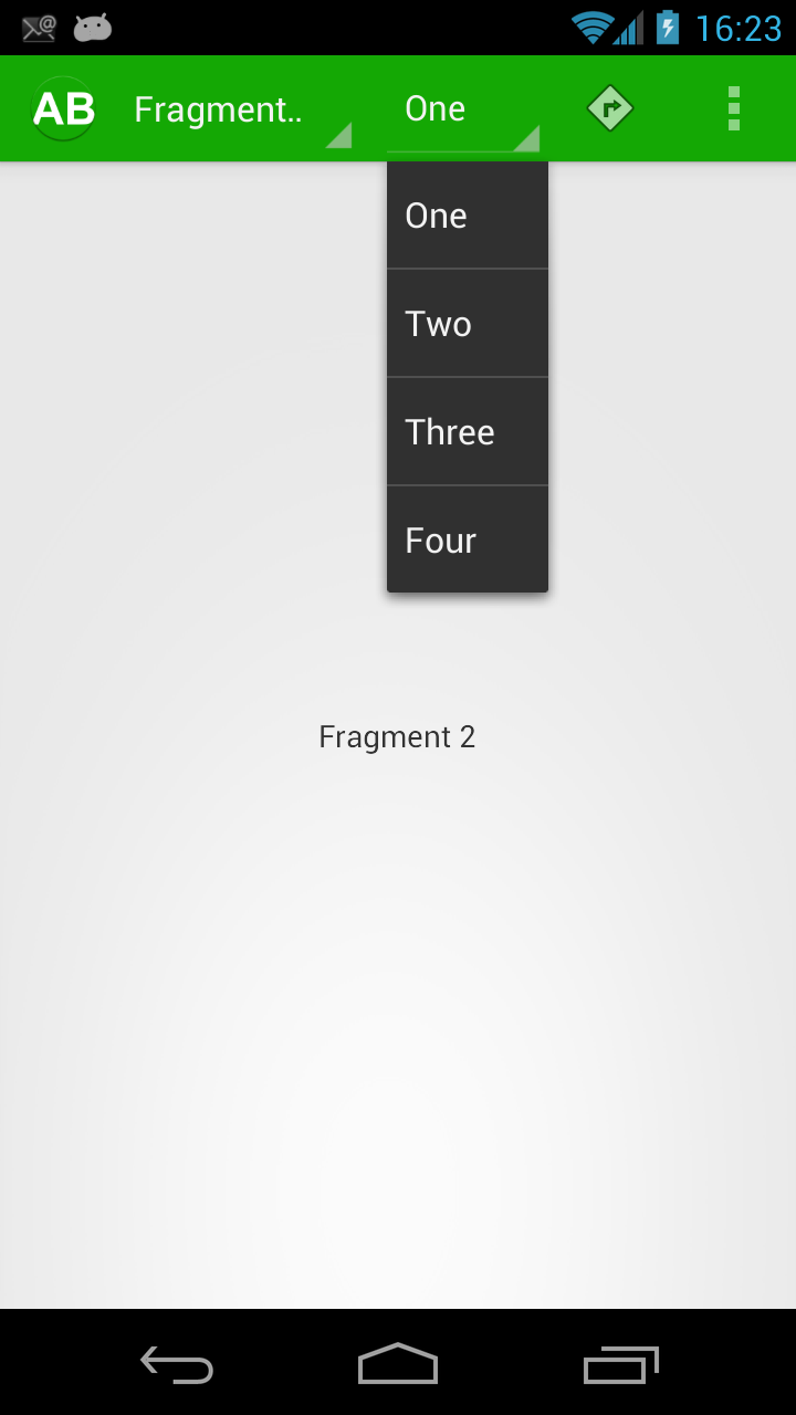
[xml] [/xml]If we run this, we can see that we now have the correcty coloured text:
Everything looks good until we look at the second Spinner that we created:
In the next part of this series we’ll examine why our style hasn’t been fully applied to the second Spinner drop down, and get this properly styled.
The source code for this article can be found here.
© 2012 – 2013, Mark Allison. All rights reserved.
Copyright © 2012 Styling Android. All Rights Reserved.
Information about how to reuse or republish this work may be available at http://blog.stylingandroid.com/license-information.


Very good
Hi,
When applying these style’s to the spinners in the actionbar they also get applied to all spinner’s in my app’s fragment’s.
Is their a way to customise spinner’s in the action bar with one style and the others the default style?
Thanks!
I think the tutorial is great! I’m having one problem however. No matter what I try, I cannot get the overflow text to turn white. I’ve narrowed down my issue to being that I always get an overflow that’s gray with black text. This is true even if I set my theme to the following:
I can get desired text to white if I set the parent of the application theme to Theme.Holo, but that doesn’t do me good for other reasons. Due to the issue i’m experiencing, it’s as if the changes to the widget don’t even get applied. I appreciate any suggestions you may have.
@style/AppTheme.Widget
…
@style/PopupMenuStyle
@style/DropDownListViewStyle
Sorry, looks like the xml didn’t post correctly with my previous post. Regardless, looks like I found a work around:
Override android:itemTextAppearance style with android:textColor” equal to @android:color/white.
Looking into this, it is my belief this became an issue with api 21. Running with api 17, this worked fine without my workaround.