In the previous article we saw some of the difficulties that we can face when applying styles to the ActionBar. In this article we’ll look at the final control on the main ActionBar: The search control.
On the face of it, styling the search control, which we added in this article, should be fairly straightforward. however, if we look at the assets that we created from Jeff Gilfelt’s ActionBar Style Generator tool, we’ll see that we don’t actually have assets for an EditText control. This isn’t actually a huge problem because there is another tool named Android Holo Colors Generator and created by Jérôme Van Der Linden, which can do what we need. Both Jeff and Jérôme’s tools are based upon Roman Nurik‘s Android Asset Studio. While Jeff’s tool is specific to the Actionbar, Jérôme’s will generate assets for many of the standard Android controls, and we can simply add these to our theme as we have been throughout this series.
So we’ll use Jérôme’s tool to generate the EditText asset that we require. We require an asset which matches the highlight colour that we defined rather than the base colour of our theme. The reason for this is that the background colour that we’ve used for our ActionBar is the base colour, and if we use the same colour in Jérôme’s tool, the asset will be invisible against the background.
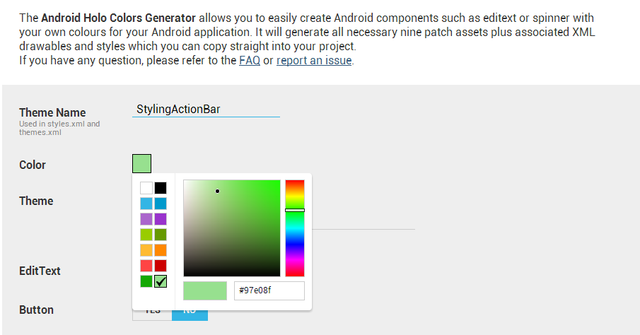
So let’s use the highlight value and specify that we require EditText assets:
We can now click the “Download .ZIP” button and the assets will be generated in to a zip file which is downloaded, in much the same way as we generated the assets using Jeff’s tool. Once we have this zip file, we need to copy all of the drawable assets in to their respective folders within our project. We can ignore the styles and theme generated in the zip because these will be for general setting for the whole project, we we’re doing this styling purely within the ActionBar.
We can specify these assets by overriding the editTextBackground item in our theme. However, if we do this in the theme itself, this does not get applied. The reason for this is, as we saw in the last article, it is our Actionbar widget theme which gets applied to any controls which are added as menu items, so we need to add this to our widget theme:
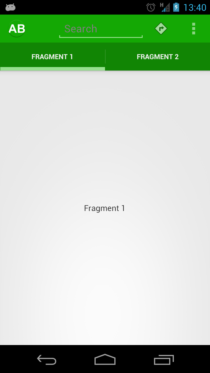
[xml] [/xml]The background is now correctly styled, but the gray hint text does not stand our particularly well:
We can change this by setting textColorHint:
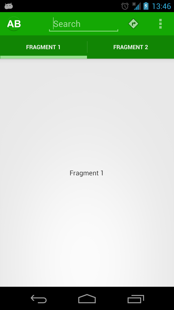
[xml] [/xml]At the same time, I slightly tweaked the colour of the delete_normal.png asset (the graphic used for the “X” in the search control) to match this. The hint text now looks more in keeping with the overall theme:
There’s one more thing that needs doing: the selector when we click on one of the action items is still the default blue:
To add a green selector, we first define a new drawable in res/drawable/selectable_item_background_stylingactionbar.xml:
[xml][/xml]
This is almost identical to the existing selectable_background_stylingandroid.xml drawable except that we have removed the fade animation so that it feels a little more snappy following a touch event. All that remains is to add this to our theme via actionBarItemBackground:
[xml] [/xml]The selection is now correct:
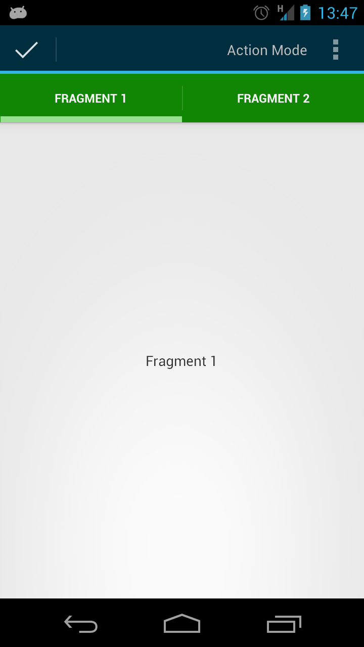
On the face of it, the ActionBar is now completely styled. However, if we enter the ActionMode, we can see that this still has the default styling:
In the concluding part of this series we’ll style the ActionMode as well.
The source code for this article can be found here.
© 2012 – 2013, Mark Allison. All rights reserved.
Copyright © 2012 Styling Android. All Rights Reserved.
Information about how to reuse or republish this work may be available at http://blog.stylingandroid.com/license-information.


