In the previous article we got the styling of our ActionBar almost complete – all that’s left to do is apply a style to the ActionMode. In this article we’ll do precisely that.
Applying a style to the ActionMode is actually quite easy and is simply a case of defining drawables for actionModeBackground (and, if our ActioMode was to split on to a second line actionModeSplitBackground) in our theme. The problem that we have is we do not have assets for these. At the time of writing neither Jeff Gilfelt’s ActionBar Style Generator nor Jérôme Van Der Linden’s Android Holo Colors Generator will create assets which matches those used by the default holo theme which can be viewed here and here. For those who are adept with image manipulation tools such as Photoshop or Gimp it is relatively straightforward to change the colours of these existing assets to match those that we have used elsewhere in this series. However, we’ll use a slightly different approach and define our own shape drawable to do the job. Our example doesn’t require actionModeSplitBackground, so we’ll just focus on actionModeBackground.
Let’s start with the first of those graphics. It has a dark blue background with a light blue stripe across the bottom. We’ll use a technique that we used before to add lines at the edge of a drawable using an inset drawable to pull the unwanted edges outside of the viewable area. Let’s create a new drawable in res/drawable/cab_background_top:
[xml]
[/xml]
This works by creating a dark green solid rectangle with a 3dp light green border. We use the negative offsets in the inset to pull the top, left, and right edges of that border outside the visible area of the rectangle. This results in a dark green rectangle with a light green bottom edge, and this is precisely what we require. We can apply this in our theme:
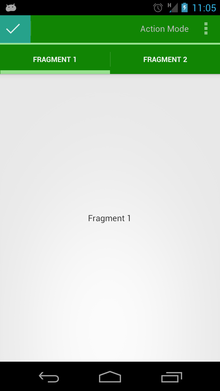
[xml] [/xml]If we run this we can see that the ActionMode is styled as we expect. The only thing that isn’t correctly styles is the selection of the “tick” button on the left hand side:
This is pretty simple to fix, we need to create a style which applied our existing selector drawable:
[xml] [/xml]Then we set assign this style in the theme:
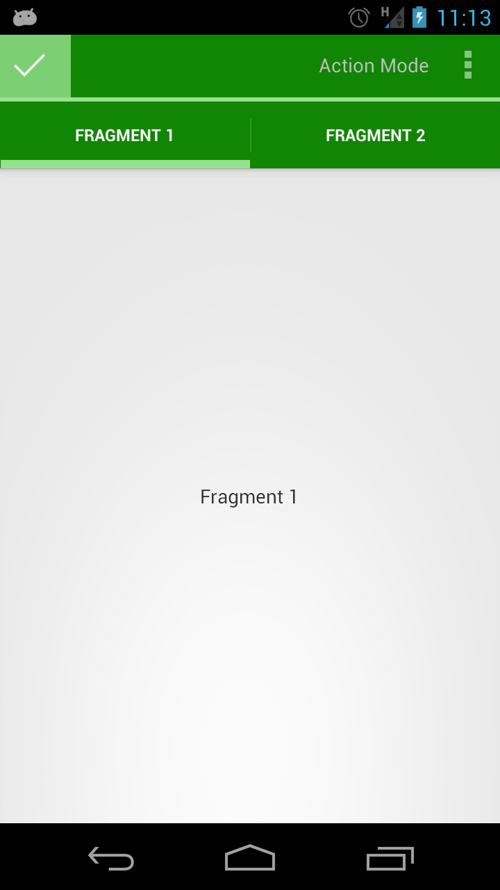
[xml] [/xml]Now we get the correct behaviour on the close button and our styling of the ActionBar is complete:
We’ve made it! It has been a fairly long journey since we first started looking at the ActionBar but, hopefully, this has evolved in to one of the most comprehensive studies of the ActionBar currently available. The ActionBar is a powerful and versatile UI component which, thanks to Jake Wharton’s ActionBarSherlock can be used back to Android 2.X. Applying styles can be problematic, at times, but it is always worth looking at the Android source when you get stuck as often the clues are there in the base theme that you’re using.
The source code for this article can be found here.
© 2012 – 2014, Mark Allison. All rights reserved.
Copyright © 2012 Styling Android. All Rights Reserved.
Information about how to reuse or republish this work may be available at http://blog.stylingandroid.com/license-information.


Thank you for this information on the subject. There were some topic points which have been presented a new way to me, which I didn’t know before.
Hi, thanks to your great guide, this helps me much to skin my App.
i have 2 Problems left for skinning:
is it possible to style the PopupMenu and AlertDialog Header?
i want to change only the Color !
Example -> http://developer.android.com/images/ui/dialogs.png
to look like this -> http://developer.android.com/images/ui/dialog_custom.png
i’m using Theme.Holo and Android SDK 21.1 RC3/Tools 16.0
i have try a lot with styles and themes but nothing worked )c:=
Best regards
Styling an AlertDialog is covered in this article.