In part 1 we set up a basic dialog box project, but it was badly in need of some styling and it didn’t bear much resemblance to a dialog box.
Let’s begin part 2 by making this actually appear in a centralised dialog-style window. To do this, we need to begin defining the “dialog” style that we declared earlier in res/values/styles.xml:
In line 2 we turn off any drawables used to draw a frame on the window; In line 3 we “float” the window so that it does not fill the screen; In line 4 we remove the title bar (as we are going to style one of our text fields to look like a title bar); and in line 5 we turn off the content overlay which in a normal Android activity puts a shadow under the title bar.
We need to apply this by adding a theme to the activity declaration in the manifest (see line 9):
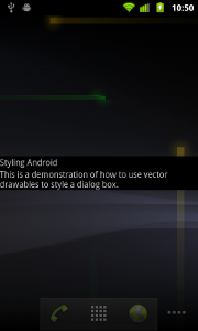
It now looks like this:

We can now define a shape drawable for the background of our dialog box by creating res/drawable/dialog_background.xml:
We are defining a shape which is a rectangle (line 3), which has a background gradient (lines 4 & 5), rounded corners (line 6), and a thin grey border (line 7). Details of the shape drawable can be found here.
We can now set this background in the “dialog” style (line 6):
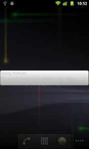
If we run this, we now have the background in place:

The text is not showing up very well, so we need to style the two TextView elements which we declared as using the styles “title” and “body”:
The interesting thing that we’re doing here is defining a new style named “base” and declaring this as a parent of both “title” and “body” styles. The child styles inherit the attributes of their parent, but they can override them. In this case, we are adding some padding to pull things in a little (line 2), and then setting some font size and colour attributes for these styles.
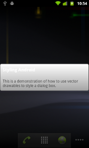
We now have a simple dialog a background and the text formatted:

The title is not very readable because it is white on a light grey background. In part 3 we’ll look at putting a header bar in to make it look more like a dialog box, and we’ll also look at adding a margin around the dialog box to pull it in from the edge.
© 2011 – 2014, Mark Allison. All rights reserved.
Copyright © 2011 Styling Android. All Rights Reserved.
Information about how to reuse or republish this work may be available at http://blog.stylingandroid.com/license-information.

Mine doesn’t look at all like this. I think because by default my application created by Eclipse uses “android:Theme.Light” for the application. I tried removing this, but I wonder how you got the black background in yours.
Thank you for this excellent blog.
You could try changing it to “android:Theme” instead of “android:Theme.Light”. That should change things so that it matches the example. The example code in question was written quite a while ago (when Android 2.3.3 was the state of the art) and much has changed since then, however the legacy themes are still there.