In the previous article we got a basic implementation of the PageTabStrip working with our ViewPager. In this article we’ll look at applying some styles to it.
Actually, there’s not an awful lot that we can do with the styles because there are not many style attributes available to us. PagerTabStrip actually extends PagerTitleStrip and the only styleable attributes available are those which PagerTitleStrip supports:
- textAppearance
- textSize
- textColor
- gravity
These should be pretty self-explanatory with the exception of gravity, which is different from the layout_gravity attribute that we used in the layout to control where the PageTabStrip was positioned within its ViewPager parent. The gravity attribute controls how the text for each page title is aligned within the PageTabStrip. If you have a play with the different settings, there is a very subtle difference between setting the gravity to top and bottom.
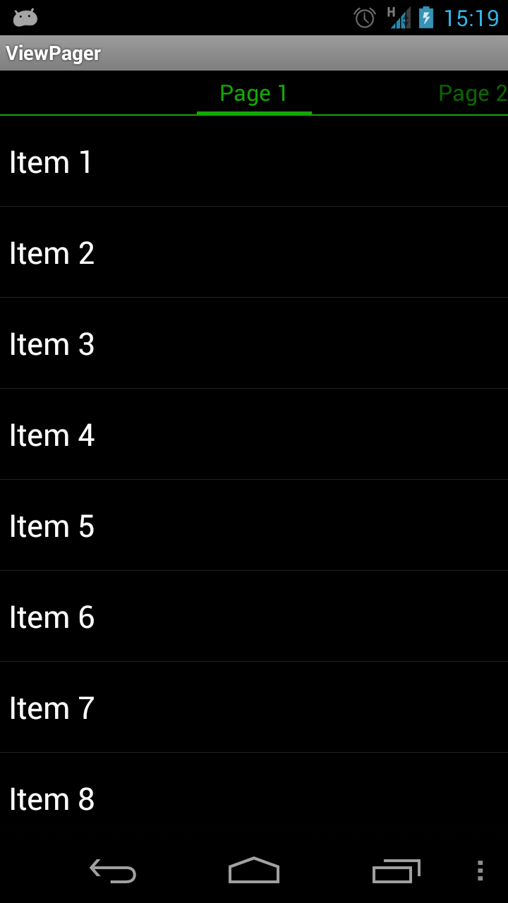
One of the most common things that we’re likely to want to do is to change the colour of the text and indicator bar. The first is fairly obvious: we can use the textColor attribute; but what about changing the indicator colour? Actually we don’t need to because it automatically get set to match the text colour. Let’s prove this by applying a text colour. First we’ll create a new style in res/values/styles.xml:
[xml] [/xml]Next we’ll apply this to the PageTabStrip in our layout in res/layout/main.xml:
[xml]
[/xml]
If we run this we can see that both the text and indicator colours have been changed:
That’s all fine if we’re happy for the colour of the indicator to match the text colour, but what about if we don’t? Unfortunately the only way to do this directly is to make a programatic call on the PagerTabStrip object. First we need to set an id for the PagerTabStrip:
[xml]
[/xml]
Next we get a reference to it and call setTabIndicatorColor:
[java] public class ViewPagerActivity extends Activity{
@Override
public void onCreate( Bundle savedInstanceState )
{
super.onCreate( savedInstanceState );
setContentView( R.layout.main );
ViewPagerAdapter adapter = new ViewPagerAdapter( this );
ViewPager pager =
(ViewPager)findViewById( R.id.viewpager );
pager.setAdapter( adapter );
PagerTabStrip strip = (PagerTabStrip)findViewById(R.id.tabstrip);
strip.setTabIndicatorColor(0xAAFFAA);
}
}
[/java]
This gives us a much lighter green for the indicator:
That’s OK, but what we can’t apply this through a style, can we? On the face of it, no. However, if we wanted to be able to set the indicator colour using a style, we can simply subclass PagerTabStrip, and make that styleable. Let’s start by defining our styleable attribute in res/values/attrs.xml:
[xml][/xml]
This defines an attribute which can be set using a raw colour value, or an R.color.* reference.
Next we’ll create a new class named MyPagerTabStrip:
[java] public class MyPagerTabStrip extends PagerTabStrip{
public MyPagerTabStrip(Context context, AttributeSet attrs)
{
super(context, attrs);
final TypedArray a = context.obtainStyledAttributes(attrs,
R.styleable.MyPagerTabStrip);
setTabIndicatorColor(a.getColor(
R.styleable.MyPagerTabStrip_indicatorColor, Color.WHITE));
a.recycle();
}
}
[/java]
Here we’re getting the color from the attribute value and setting the tab indicator colour accordingly. NOTE: It is vital that you always call recycle on your TypedArray once you’re done with it.
Next we change the layout to use our new control:
[xml]
[/xml]
Then we must remove the manual colour setting from our Activity:
[java] public class ViewPagerActivity extends Activity{
@Override
public void onCreate( Bundle savedInstanceState )
{
super.onCreate( savedInstanceState );
setContentView( R.layout.main );
ViewPagerAdapter adapter = new ViewPagerAdapter( this );
ViewPager pager =
(ViewPager)findViewById( R.id.viewpager );
pager.setAdapter( adapter );
}
}
[/java]
And finally we’ll add a new attribute to our style:
[xml][/xml]
That’s it. If we now run that we’ll get the same result as before except that now the styling is done through the style rather than programatically.
That’s about it with our updated look at ViewPager. The controls that are now baked in to the support library are pretty easy to use, although they are not as rich as those provided in Jake Wharton’s ViewPagerIndicator library. Also there are a lot more options for styling the controls to customise the look and feel in Jake’s library than that are in the support library control.
The source code for this article can be found here.
© 2012, Mark Allison. All rights reserved.
Copyright © 2012 Styling Android. All Rights Reserved.
Information about how to reuse or republish this work may be available at http://blog.stylingandroid.com/license-information.


Hi ,
I want to increase the pager height manually. I have used below code of your post and it takes height automatically. How to increase the height ? Please advice me.
#14A804
#AAFFAA