
The AppBar is an evolution of the ActionBar which provides us with a rich toolbox for defining and customising the behaviour. All apps will have different requirements for their AppBars and each app may have different AppBar implementations in different Activities. In this series, rather than look at the AppBar implementations themselves, we’re going to explore how can integrate and animate different elements of the AppBar to provide smooth UI and UX which implement material design style animations and transitions.
The next thing that would be nice would be to add some motion to our feature image transitions. However, because of the relatively large images being used, simply tracking the movement of the ViewPager will be a little too much movement, In my opinion. What would be much nicer is a rather more subtle movement. The effect that we’re going to go for is a parallax transition which matches the direction of the ViewPager movement, but at a slower speed to soften the effect somewhat.
Before we get stuck in to the details it is worth pointing out that the inspiration for this came from a Google+ post from Kirill Grouchnikov which detailed some upcoming changes in the Google Play Store app. There is a nice movement and cross-fade animation, but I wasn’t keen on the hard edges because the images are only matching the screen width, so I was keen to widen the images so that these hard edges are not vsible.
The first thing we need to do is think about the size of the image. We want each image to be able to move a small amount to the left and right for the transition so we need a little bit of the image on each side to be positioned outside the screen bounds. So we really need to make the image a little larger than the screen itself. Typically we would need to create a custom View to calculate the width based upon the display size. However, the somewhat new (at the time of writing) Percent support library allows us to specify a child whose width is 120% that of its parent ViewGroup. If we then centre this within the parent we’ll get 10% of the image either side falling outside the screen dimensions, and we can use this for our transition.
So the two images that we are using for the fade transition have a common parent which is a FrameLayout. If we replace this with a PercentFrameLayout we can get what we need:
<?xml version="1.0" encoding="utf-8"?>
<android.support.design.widget.AppBarLayout xmlns:android="http://schemas.android.com/apk/res/android"
  xmlns:app="http://schemas.android.com/apk/res-auto"
  android:id="@+id/appbar"
  android:layout_width="match_parent"
  android:layout_height="wrap_content"
  android:fitsSystemWindows="true"
  android:theme="@style/ThemeOverlay.AppCompat.Dark.ActionBar">

  <android.support.design.widget.CollapsingToolbarLayout
    android:layout_width="match_parent"
    android:layout_height="400dp"
    android:fitsSystemWindows="true"
    app:contentScrim="?attr/colorPrimary"
    app:expandedTitleMarginEnd="@dimen/activity_horizontal_margin"
    app:expandedTitleMarginStart="@dimen/activity_horizontal_margin"
    app:layout_scrollFlags="scroll|exitUntilCollapsed">

    <android.support.percent.PercentFrameLayout
      android:layout_width="match_parent"
      android:layout_height="wrap_content"
      android:layout_gravity="center_horizontal"
      android:fitsSystemWindows="true"
      app:layout_collapseMode="parallax">

      <ImageView
        android:id="@+id/toolbar_image_outgoing"
        android:layout_width="0dp"
        android:layout_height="wrap_content"
        android:layout_gravity="center_horizontal"
        android:contentDescription="@null"
        android:scaleType="centerCrop"
        android:visibility="gone"
        app:layout_widthPercent="120%" />

      <ImageView
        android:id="@+id/toolbar_image"
        android:layout_width="0dp"
        android:layout_height="wrap_content"
        android:layout_gravity="center_horizontal"
        android:contentDescription="@null"
        android:scaleType="centerCrop"
        android:src="@drawable/beach_huts"
        app:layout_widthPercent="120%" />
    </android.support.percent.PercentFrameLayout>

    <android.support.v7.widget.Toolbar
      android:id="@+id/toolbar"
      android:layout_width="match_parent"
      android:layout_height="?attr/actionBarSize"
      app:layout_collapseMode="pin"
      app:popupTheme="@style/ThemeOverlay.AppCompat.Light" />

  </android.support.design.widget.CollapsingToolbarLayout>

  <android.support.design.widget.TabLayout
    android:id="@+id/tabs"
    android:layout_width="match_parent"
    android:layout_height="?attr/actionBarSize"
    android:layout_gravity="bottom"
    app:layout_scrollFlags="scroll" />

</android.support.design.widget.AppBarLayout>
So the parent PercentFrameLayout is still what gets collapsed by the CollapsingToolbarLayout (meaning that both images will be collapsed together). We change the android:layout_width of both images to 0dp and then set app:layout_widthPercent="120%" to size each image to be 20% larger than the parent. android:layout_gravity="center_horizontal" then centres the images within the parent giving a 10% overlap either side.
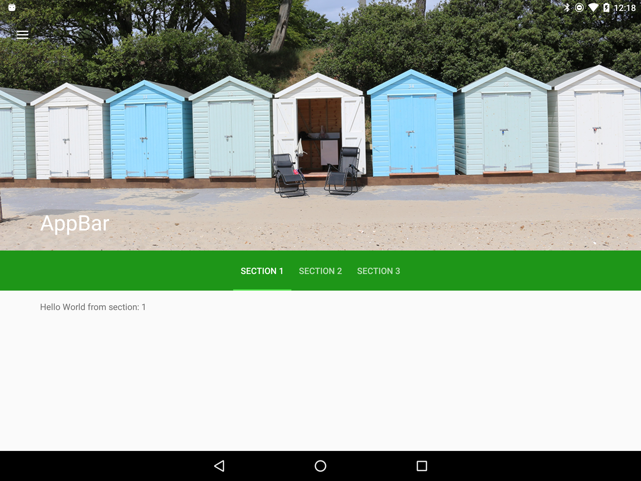
So with remarkably little effort we have gone from an image whose width matches the parent:
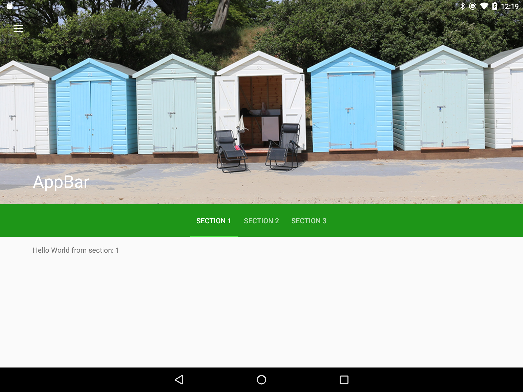
To one which has 10% of it’s width falling off screen on either side:
So now that we have this additional space either side we can actually perform the movement during the transition and we’ll cover than in the next article.
The source code for this article is available here.
© 2015, Mark Allison. All rights reserved.
Copyright © 2015 Styling Android. All Rights Reserved.
Information about how to reuse or republish this work may be available at http://blog.stylingandroid.com/license-information.
