Recently there was a comment on the article Shape Drawables – part 3 asking if is possible to style an AlertDialog, rather than on an Activity, as is covered in that article. The simple answer is yes. However, it is not without it’s problems as we’ll see later.
For those who are unfamiliar with AlertDialogs, have a look at here. Android provides a quick and easy mechanism for creating simple dialog boxes, which I won’t post a tutorial to as the Google tutorial more than adequately covers the basics. It is worth noting that Honeycomb introduces mechanisms for you to easily style and theme AlertDialogs, but this is missing from earlier versions. This article specifically covers how to achieve this on pre-Honeycomb devices
So, let’s jump straight in and create a 2.3.3 project named “AlertDialog” with a package name of “com.stylingandroid.alertdialog” and an Activity named “MainActivity”.
Let’s first modify the layout in res/layout/main.xml to include a button which will show a dialog box when it’s clicked:
Next we need to modify our MainActivity class to wire up this button, and create our dialog box:
public class MainActivity extends Activity
{
	private static final int ALERT_DIALOG = 1;

	@Override
	public void onCreate( Bundle savedInstanceState )
	{
		super.onCreate( savedInstanceState );
		setContentView( R.layout.main );

		( (Button) findViewById( R.id.button1 ) )
			.setOnClickListener( new OnClickListener()
			{
				@Override
				public void onClick( View v )
				{
					showDialog( ALERT_DIALOG );
				}
			}
		);
	}

	@Override
	protected Dialog onCreateDialog( int id )
	{
		Dialog dialog = null;
		if ( id == ALERT_DIALOG )
		{
			AlertDialog.Builder builder = new AlertDialog.Builder( this );
			builder.setMessage( "Hello World" )
				.setCancelable( false )
				.setPositiveButton( "Close",
						new DialogInterface.OnClickListener()
						{
							@Override
							public void onClick( DialogInterface dialog, int which )
							{
								dialog.dismiss();
							}
						}
			);
			dialog = builder.create();
		}
		if ( dialog == null )
		{
			dialog = super.onCreateDialog( id );
		}
		return dialog;
	}
}
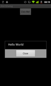
If you have read the Google tutorial on Dialogs then this should be fairly self-explanatory, and if we run this we’ll see the following:

Next we need to look at applying our own style to this. First we need to create a Theme that we’re going to use in res/values/themes.xml:
Now we need to define the “dialog” style that we reference here in res/values/styles.xml:
AlertDialog uses some custom attributes which allow us to specify the backgrounds that are used for the various sections of the dialog box. In this case we are using three distinct drawables, one for the title, one for the body and another for the footer. We’re applying these to each of the Dark, Medium, and Bright themes. Now let’s define out three drawables. First res/drawable/dialog_body.xml:
Next res/drawable/dialog_footer.xml:
And finally res/drawable/dialog_title.xml:
If you’ve read the articles on Shape Drawables, then this should all be fairly self-explanatory with the exception of the “inset” drawable in dialog_title which is because we want to lose the outline on the bottom edge of the title bar as it doesn’t look good against the body background.
Finally we need to apply this theme to our dialog box. As I mentioned at the beginning of this article, the Honeycomb API (level 11) a new constructor has been defined for AlertDialog.Builder which permits us to specify a theme. However, in earlier versions this is missing, so how can we specify a theme? We can use a ContextThemeWrapper which allows us to apply a specify an alternate theme for our current context, and pass this to the control. To implement this we need to modify our onCreateDialog() method in MainActivity:
@Override
protected Dialog onCreateDialog( int id )
{
	Dialog dialog = null;
	if ( id == ALERT_DIALOG )
	{
		ContextThemeWrapper ctw = new ContextThemeWrapper( this, R.style.MyTheme );
		AlertDialog.Builder builder= new AlertDialog.Builder( ctw );
		builder.setMessage( "Hello World" )
			.setTitle( "Alert Dialog" )
			.setIcon( android.R.drawable.ic_dialog_alert )
			.setCancelable( false )
				.setPositiveButton( "Close",
					new DialogInterface.OnClickListener()
					{
						@Override
						public void onClick( DialogInterface dialog, int which )
						{
							dialog.dismiss();
						}
					}
		);
		dialog = builder.create();
	}
	if ( dialog == null )
	{
		dialog = super.onCreateDialog( id );
	}
	return dialog;
}
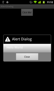
We are creating our ContextThemeWrapper on line 7 specifying our theme, and we are using this in the constructor to our AlertDialog.Builder. We can now run this, and see the theme applied to our dialog:

The backgrounds are looking good, but what about the text? Remember at the start of this article I said that there are problems, we here’s where we hit them. Prior to Honeycomb, text styling is not actually applied to AlertDialogs. This is not insurmountable, but we have a bit more work to do to get text styles applied to our Alert Dialog. We’ll cover this in the next article.
The source for this article can be found here.
© 2011 – 2014, Mark Allison. All rights reserved.
Copyright © 2011 Styling Android. All Rights Reserved.
Information about how to reuse or republish this work may be available at http://blog.stylingandroid.com/license-information.

I used the example above with some changes. Resulting dialog has a title bar which is wider than the body.
Also, I have a list as the body of the dialog box.
You saved my day! thnx a lot!
Hi
Nice Tutorial.
I have any questions.
How change the dialog’s theme of android 4?
And How change text color of dialog’s title?
Thanks
Does not work for Android 4+
Does not work on Android 4+ for me too. Any ideas for styling Android 4 phones as well?
How to Make EditText Box Height Expand
My Layout:
When that EditText box gets to the end, I want it to wrap to the next line. Right now, it just keeps going right moving everything left off screen.
Excelent article! Thank you.