There is a nice micro-animation library at useanimations.com which contains some useful animations which are particularly well suited for animated icons. These are all free to use and downloadable at Lottie animations. For those that already use Lottie they can use these animations as-is. However using them is apps which don’t use Lottie, or in cases where they may need tweaking and you don’t have a designer available that can perform the necessary tweaks in After Effects, it may not be possible to do this. In this occasional series we’ll look at how to create some of these animations as Animated Vector Drawables which will show some useful AVD techniques.

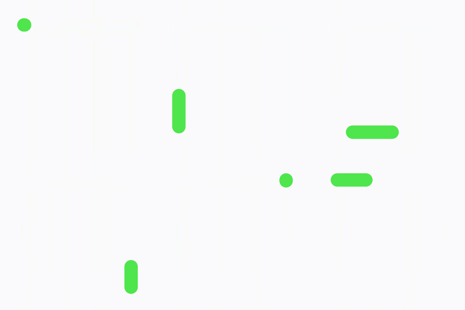
The very first article in this series covered a repeating animation named Loading V2 which represents an ongoing state such as a loading state. Sine that article was written a new loading state icon was added to useanimations.com named Loading V3. Although the name is similar and the type of loading state that it represents is quite similar, the animation itself is quite different. It is essentially a line following a square shape, but the length of the line changes – the trailing edge takes a little time to catch up with the leading edge as it moves between the corners of the square.
Let’s begin by defining the static VectorDrawable that will form the basis oc this animation:
The basis for this animation is the square path that the line segment follows. The path element named box contains pathData that is a simple square. It consists of five distinct drawing commands to render a square path:
The M8,8 moves to coordinates 8,8 on the canvas without drawing anything.
The V56 draws a vertical line from the current position (8,8 as set by the previous command) down to coordinates 8,56 – we don’t need to specify the x coordinate because it will not change when drawing a vertical line. The case of the V denotes absolute coordinates but if we wanted to use relative positioning to the current position we could use a lower case v48 instead which would have exactly the same result. This draws the left edge of the box.
The H56 draws a horizontal line from the current position (8,56 as set by the previous command) across to coordinates 56,56. This draws thew bottom edge of the box.
The V8 draws a vertical line for the current position (56,56 as set by the previous command) up to coordinates 56,8. This draws the right edge of the box.
The Z is a close path – it will draw a line from the current position (56,8 as set by the previous command) back to the first place that we made a mark on the canvas (this was 8,8), and so draws the top edge of the box.
The order of these commands is actually quite important because it will actually govern the direction that the animation will take. The animated GIF shown earlier moves in and anti-clockwise direction, and it is no coincidence that we draw this path in an anti-clockwise direction also.
This renders the following white box:

The rounded corners are the result of the android:strokeLineJoin="round" attribute on the path element and are, again a key part of the animation. Also of importance is the android:strokeLineCap="round" although it actually has no effect when we render the entire box as we have here.
The key to animating this to produce the effect that we saw earlier is to draw segments of this path and we achieve this using trim paths. Trim paths are a really useful technique when it comes to animations because they allow us to draw just a section of the path. For this animation we’ll use trimPathStart and trimPathEnd to control which section of the path gets rendered at any time. They both can take a value between 0 and 1 where 0 is the start of the entire path (in this case 8,8 where the first vertical line starts), and 1 is the end of the path (again at 8,8, but actually where the close path ends). The value of trimPathStart defaults to 0, and that of trimPathEnd defaults to 1, and that is effectively what is rendered by the static VectorDrawable.
If we alter these values, we can draw a section of this path. By setting trimPathStart="0.2" and trimPathEnd="0.8" we get this:

If we consider that a square path consists of four equal length segments, we start at the top left corner, and go in in an anti-clockwise direction, then the top left corner will be at both 0.0 and 1.0 of the entire path, bottom left corner will be at 0.25 of the entire path, the bottom right corner will be at 0.5 of the entire path, and the top right corner will be at 0.75 of the entire path. So by specifying trimPathStart="0.2" and trimPathEnd="0.8" we’ll draw from just before the bottom left corner until just past the top right corner – which is precisely what we’re seeing here. One thing to note is the rounded caps at the ends of this segment – this is the result of the android:strokeLineCap="round" attribute.
With that understanding, then we achieve the animation by animating the values of trimPathStart and trimPathEnd to render different sections of the entire path at different points throughout the animation.
The AnimatedVectorDrawable to do this is quite small:
It assigns an animator named chaser to the box path that we created in the static VectorDrawable.
The animator is where is gets a little more verbose:
This may, at first, appear a little daunting, but let’s break it down a little. The parent objectAnimator contains two propertyValuesHolders each of which controls how the value of a specific property will change during the animation. The first of these controls the trimPathEnd value (which is the leading edge of the line segment), and the second is the trimPathStart value (which is the trailing edge of the line segment). Each of these contains a collection of keyFrame elements which specify what the value of that property will be at specific points of the animation and the animator will interpolate value between these key frame points.
The animation we require is achieved by using these key frames to control where the start and end points of the line segments will be at any given point within the animation. If you look back at the animated GIF at the beginning of this article (it’s also repeated below) you’ll see that when the segment is at the top left corner it is a small dot, then the leading edge starts moving down towards the bottom left corner, but the trailing edge remains at the top left corner briefly before it starts following.
For the trimPathEnd value, this starts immediately, but for trimPathEnd the first keyFrame holds the value at 0 until fraction 0.05 of the animation length. After that point it starts its journey to the bottom left corner.
Look back at the animated GIF and look at the behaviour as we reach the bottom left corner. The leading edge arrives first and the line segment compresses down to a dot as the trailing edge arrives.
The first keyFrame for trimPathEnd controls how the value will reach 0.25 (the bottom left corner of the path) at 0.2 of the length of the animation length, and the second keyFrame will hold the value at 0.25 until 0.25 of the animation length. For the trimPathStart value we already looked at how this lags behind the trimPathStart value, and the second keyFrame for this controls how it reaches a value of 0.249 at 0.25 of the animation length. It is important to keep the value very slightly short of the trimPathEnd value otherwise the line will disappear momentarily while the start and end values of the trim path are the same.
By offsetting the start and end of the trim path as they traverse the left edge of the path, allows us to create this effect of starting from a dot at the top left corner, the line segment growing and then shrinking back to a dot at the bottom left corner. We then repeat the same process for the other three edges – the concept is identical, just the values and fractions change for each corner. So although the animator initially looked quite daunting, it’s actually the same behaviour repeated four times, and understanding the first quarter of each propertyValuesHolder is sufficient to understand what’s going on in the rest.
Once we get to the end of the animation, we’re back to a dot at the top left corner, and we specify android:repeatCount="infinite" and android:repeatMode="restart" in the parent objectAnimator to get it to repeat indefinitely.
When we run the animation we get this:

The source code for this article is available here.
© 2019, Mark Allison. All rights reserved.
Copyright © 2019 Styling Android. All Rights Reserved.
Information about how to reuse or republish this work may be available at http://blog.stylingandroid.com/license-information.

