
The AppBar is an evolution of the ActionBar which provides us with a rich toolbox for defining and customising the behaviour. All apps will have different requirements for their AppBars and each app may have different AppBar implementations in different Activities. In this series, rather than look at the AppBar implementations themselves, we’re going to explore how can integrate and animate different elements of the AppBar to provide smooth UI and UX which implement material design style animations and transitions.
Let’s first consider the basic AppBar model that we’re looking to achieve. The main body content will be a ViewPager enabling the user to swipe between sections. In the AppBar we want a TabBar which will also control the ViewPager. Also in the AppBar we want an image which is specific to the current section of the ViewPager which changes as the use changes sections. We want the image to disappear, leaving the TabBar, when the user scrolls up so that it is not obscuring the main content. This will provide a nice balance of interesting, content-driven UI which can be removed to provide more access to the actual content.
That may sound rather complex, but hopefully it will become clear as we progress through the series.
I’ve created the basic project from an Android Studio Navigation Drawer Activity template project. I’ve tidied up and refactored the code a little, but I won’t go in to it in detail here as it is not what we’re interested in – it just felt appropriate to have a nav drawer in place so that we have the appropriate hamburger menu on the Toolbar. We’re also using the design support library (for material goodness, and many of the components we’ll be using). This has dependencies on both appcompat-v7 and support-v4 libraries, and the latter will give us the ViewPager implementation.
Let’s begin by looking at our main Activity layout:
<?xml version="1.0" encoding="utf-8"?>
<android.support.v4.widget.DrawerLayout xmlns:android="http://schemas.android.com/apk/res/android"
  xmlns:app="http://schemas.android.com/apk/res-auto"
  xmlns:tools="http://schemas.android.com/tools"
  android:id="@+id/drawer_layout"
  android:layout_width="match_parent"
  android:layout_height="match_parent"
  android:fitsSystemWindows="true">

  <android.support.design.widget.CoordinatorLayout
    android:id="@+id/main_content"
    android:layout_width="match_parent"
    android:layout_height="match_parent"
    android:fitsSystemWindows="true"
    tools:context=".MainActivity">

    <include layout="@layout/app_bar_main" />

    <android.support.v4.view.ViewPager
      android:id="@+id/container"
      android:layout_width="match_parent"
      android:layout_height="match_parent"
      app:layout_behavior="@string/appbar_scrolling_view_behavior" />

  </android.support.design.widget.CoordinatorLayout>

  <android.support.design.widget.NavigationView
    android:id="@+id/nav_view"
    android:layout_width="wrap_content"
    android:layout_height="match_parent"
    android:layout_gravity="start"
    android:fitsSystemWindows="true"
    app:headerLayout="@layout/nav_header"
    app:menu="@menu/nav_drawer" />

</android.support.v4.widget.DrawerLayout>
The highlighted section is the bit we’re interested in – it is the ViewPager, and the main AppBar layout wrapped inside a CoordinatorLayout. We’ve looked at CoordinatorLayout before on Styling Android and its purpose in this case will become apparent as we progress.
Now let’s take a look at the AppBar layout. We used an include in the main layout because, in a real project, we would, most likely, want to re-use the same AppBar across multiple Activities and an inclusion here makes that much easier.
<?xml version="1.0" encoding="utf-8"?>
<android.support.design.widget.AppBarLayout
  xmlns:android="http://schemas.android.com/apk/res/android"
  xmlns:app="http://schemas.android.com/apk/res-auto"
  android:id="@+id/appbar"
  android:layout_width="match_parent"
  android:layout_height="wrap_content"
  android:fitsSystemWindows="true"
  android:theme="@style/ThemeOverlay.AppCompat.Dark.ActionBar">

  <android.support.v7.widget.Toolbar
    android:id="@+id/toolbar"
    android:layout_width="match_parent"
    android:layout_height="?attr/actionBarSize"
    app:popupTheme="@style/ThemeOverlay.AppCompat.Light" />

  <ImageView
    android:id="@+id/toolbar_image"
    android:layout_width="match_parent"
    android:layout_height="400dp"
    android:adjustViewBounds="true"
    android:contentDescription="@null"
    android:fitsSystemWindows="true"
    android:scaleType="centerCrop"
    android:src="@drawable/beach_huts" />

  <android.support.design.widget.TabLayout
    android:id="@+id/tabs"
    android:layout_width="match_parent"
    android:layout_height="?attr/actionBarSize"
    android:layout_gravity="bottom"
    app:layout_scrollFlags="scroll" />

</android.support.design.widget.AppBarLayout>
So, this is pretty simple – we have our Toolbar, then our ImageView, and then the TabBar. One thing worth of note is the use of the fitSystemWindows attribute – this is to allow the image to display behind the status bar when the Toolbar is expanded.
We wire this all up in our Activity using a simple PagerAdapter (it’s in the source so I won’t bother listing it here):
public class MainActivity extends AppCompatActivity implements NavigationView.OnNavigationItemSelectedListener {

    @Override
    protected void onCreate(Bundle savedInstanceState) {
        super.onCreate(savedInstanceState);
        setContentView(R.layout.activity_main);

        Toolbar toolbar = (Toolbar) findViewById(R.id.toolbar);
        setSupportActionBar(toolbar);

        SectionsPagerAdapter sectionsPagerAdapter = new SectionsPagerAdapter(getSupportFragmentManager());

        ViewPager viewPager = (ViewPager) findViewById(R.id.container);
        viewPager.setAdapter(sectionsPagerAdapter);

        TabLayout tabLayout = (TabLayout) findViewById(R.id.tabs);
        tabLayout.setupWithViewPager(viewPager);

        DrawerLayout drawer = (DrawerLayout) findViewById(R.id.drawer_layout);
        ActionBarDrawerToggle toggle = new ActionBarDrawerToggle(
                this, drawer, toolbar, R.string.navigation_drawer_open, R.string.navigation_drawer_close
        );
        drawer.setDrawerListener(toggle);
        toggle.syncState();

        NavigationView navigationView = (NavigationView) findViewById(R.id.nav_view);
        navigationView.setNavigationItemSelectedListener(this);
    }
   .
   .
   .
}
If we run this we get our basic AppBar layout:
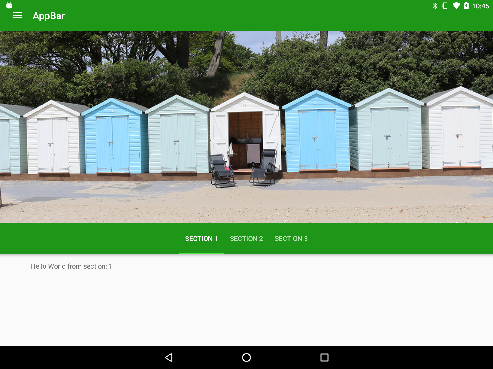
OK, that’s a nice start, but the AppBar takes up most of the screen and the actual content area of the ViewPager is pretty small – even though it’s got nothing in it, in a real app this would be the main content. So what we want to do is collapse the image when the user scrolls up. This is the point where the relevance of the CoordinatorLayout should become apparent – it will marshall the scrolling across multiple components and enable us to collapse the Toolbar when we scroll. So all we need to do is update our AppBar layout to implement this behaviour:
<?xml version="1.0" encoding="utf-8"?>
<android.support.design.widget.AppBarLayout
  xmlns:android="http://schemas.android.com/apk/res/android"
  xmlns:app="http://schemas.android.com/apk/res-auto"
  android:id="@+id/appbar"
  android:layout_width="match_parent"
  android:layout_height="wrap_content"
  android:fitsSystemWindows="true"
  android:theme="@style/ThemeOverlay.AppCompat.Dark.ActionBar">

  <android.support.design.widget.CollapsingToolbarLayout
    android:layout_width="match_parent"
    android:layout_height="400dp"
    android:fitsSystemWindows="true"
    app:contentScrim="?attr/colorPrimary"
    app:expandedTitleMarginEnd="@dimen/activity_horizontal_margin"
    app:expandedTitleMarginStart="@dimen/activity_horizontal_margin"
    app:layout_scrollFlags="scroll|exitUntilCollapsed">

    <ImageView
      android:id="@+id/toolbar_image"
      android:layout_width="match_parent"
      android:layout_height="match_parent"
      android:adjustViewBounds="true"
      android:contentDescription="@null"
      android:fitsSystemWindows="true"
      android:scaleType="centerCrop"
      android:src="@drawable/beach_huts"
      app:layout_collapseMode="parallax" />

    <android.support.v7.widget.Toolbar
      android:id="@+id/toolbar"
      android:layout_width="match_parent"
      android:layout_height="?attr/actionBarSize"
      app:layout_collapseMode="pin"
      app:popupTheme="@style/ThemeOverlay.AppCompat.Light" />

  </android.support.design.widget.CollapsingToolbarLayout>

  <android.support.design.widget.TabLayout
    android:id="@+id/tabs"
    android:layout_width="match_parent"
    android:layout_height="?attr/actionBarSize"
    android:layout_gravity="bottom"
    app:layout_scrollFlags="scroll" />

</android.support.design.widget.AppBarLayout>
There are a couple of things worth pointing out, here. Firstly we’ve added the CollapsingToolbarLayout which is providing the specific behaviour required based upon scrolling events being passed on by the CoordinatorLayout. The exact behaviour is what we declare in the app:layout_scrollFlags attribute. The CollapsingToolbarLayout enables us to define a contentScrim colour which is what will be used to blend with the status bar when the Toolbar is collapsed, and also offsets for the title text when the Toolbar is expanded.
Secondly, we have swapped the order of the Toolbar and the ImageView. This is to enable us to move the title text with the expanding and collapsing toolbar.
Thirdly, we have defined different collapseMode values for the Toolbar and ImageView to control that the ImageView will do a parallax collapse and the Toolbar (i.e. the title text) will remain pinned even when collapsed.
Let’s see this in action:
That demonstrates the power of CollapsingToolbarLayout – just adding some simple wrapping and a couple of attributes to define the behaviour that we want and we get something which already looks pretty good. However, there’s much more that we can do and in the next article we’ll look at changing the feature image when the user moves between ViewPager sections.
The source code for this article is available here.
© 2015, Mark Allison. All rights reserved.
Copyright © 2015 Styling Android. All Rights Reserved.
Information about how to reuse or republish this work may be available at http://blog.stylingandroid.com/license-information.

This article is great. However, does the appbar collapse when you scroll up from viewpager? I follow your instruction but my appbar doesn’t collapse when I scroll up the listView inside the viewPager
If you use a standard ListView I don’t think it will work correctly because your scrolling container needs to implement NestedScrollingChild to work correctly with CoordinatorLayout. You’ll need to subclass ListView to implement NestedScrollingChild to get it to work correctly.RecyclerView should work out of the box, though.
I used recycleView to accomplished that but I need to make a cursorAdapter like for my recycleView. I never knew that I can implement NestedScrollingChild to do so. Thanks for your reply!
My AppBar is somehow under the system notification bar. I see from your image https://blog.stylingandroid.com/wp-content/uploads/2015/10/part1-static.png it doeas the same but in the video it is right. I ca not find the problem here. Any ideas?
One of the best article on app bar layout, I have read. Thanks for writing it.