
Version 25.0.0 of the Design support library was published by Google in October 2016 along with the release of the Nougat 7.1 developer preview. A new widget that was introduced in that release named BottomNavigationView which provides a simple way to implement the bottom navigation bar pattern which has been added to the Material Design Guidelines. In this post, we’ll take a look at this new control.
 Before we get stuck in to the code there are a few points worth mentioning: Firstly, I’m not going to enter in to the whys and wherefores of a bottom navigation bar on Android – Styling Android is much more about ‘howtos’ than ‘shouldyous’ – so I’ll leave that discussion for others. If you have decided that a bottom bar navigation is right for your app, then this post will give the basics about how to go about it. And it’s really quite straightforward.
Secondly, it is worth pointing out that the Javadocs for BottomNavigationView includes a snippet of sample code which *should* show how to use it. Unfortunately (at the time of writing) this looks as though it has been lifted directly from a sample app and won’t work because of an explicit namespace an package name included in the source.
Thirdly, the sample code uses ConstraintLayout for no other reason than I rather like it, despite it still being in beta. BottomNavigationView does not require this, and the sample code can be used in any kind of layout.
Ok, let’s get stuck in! Here is a layout which includes the BottomNavigationView:
<?xml version="1.0" encoding="utf-8"?>
<android.support.constraint.ConstraintLayout xmlns:android="http://schemas.android.com/apk/res/android"
  xmlns:app="http://schemas.android.com/apk/res-auto"
  xmlns:tools="http://schemas.android.com/tools"
  android:id="@+id/activity_main"
  android:layout_width="match_parent"
  android:layout_height="match_parent"
  tools:context="com.stylingandroid.bottomnavigationview.MainActivity">

  <FrameLayout
    android:id="@+id/fragment_container"
    android:layout_width="0dp"
    android:layout_height="0dp"
    app:layout_constraintTop_toTopOf="parent"
    app:layout_constraintBottom_toTopOf="@+id/navigation_view"
    app:layout_constraintLeft_toLeftOf="parent"
    app:layout_constraintRight_toRightOf="parent"/>

  <android.support.design.widget.BottomNavigationView
    android:id="@+id/navigation_view"
    android:layout_width="match_parent"
    android:layout_height="wrap_content"
    app:layout_constraintBottom_toBottomOf="parent"
    app:layout_constraintLeft_toLeftOf="parent"
    app:layout_constraintRight_toRightOf="parent"
    app:menu="@menu/navigation"/>

</android.support.constraint.ConstraintLayout>
The only thing which is non-standard here is the app:menu attribute. This is the problem in the official Javadocs: it specifies a design namespace which is tied to a static package name – if you use the app namespace which is tied to http://schemas.android.com/apk/res-auto then it makes your code much more portable.
The menu attribute specifies a standard menu resource – for the example code I’m implementing one of the examples in the Material Design Guidelines:
<?xml version="1.0" encoding="utf-8"?>
<menu xmlns:android="http://schemas.android.com/apk/res/android">

  <item
    android:id="@+id/recents"
    android:icon="@drawable/ic_recents"
    android:title="@string/recents" />

  <item
    android:id="@+id/favourites"
    android:icon="@drawable/ic_favourites"
    android:title="@string/favourites" />

  <item
    android:id="@+id/nearby"
    android:icon="@drawable/ic_nearby"
    android:title="@string/nearby" />
</menu>
If you are migrating an existing navigation pattern based upon Menu resources (which you really should be doing!) then this makes life really easy. But you may want to keep that a secret if you feel that placing primary app navigation immediately above the system navigation bar is a bad idea!
As we’re using standard menu resources here it may appear logical that this will now trigger the standard Options Menu behaviour within your Activity. However this is not the case – the BottomNavigationView may be used in addition to a traditional options menu, so we need an additional mechanism for responding to user selections from our BottomNavigationView. We do this by implementing an instance of BottomNavigationView.OnNavigationItemSelectedListener. In this case we’re just changing the text in a Fragment (to keep the code simple and focused), but in practice you’ll probably do something much more interesting!
public class MainActivity extends AppCompatActivity implements BottomNavigationView.OnNavigationItemSelectedListener {

    private TextFragment fragment;

    @Override
    protected void onCreate(Bundle savedInstanceState) {
        super.onCreate(savedInstanceState);
        setContentView(R.layout.activity_main);

        FragmentManager fragmentManager = getSupportFragmentManager();
        fragment = new TextFragment();

        FragmentTransaction transaction = fragmentManager.beginTransaction();
        transaction.replace(R.id.fragment_container, fragment);
        transaction.commit();

        BottomNavigationView bottomNavigationView = (BottomNavigationView) findViewById(R.id.navigation_view);

        bottomNavigationView.setOnNavigationItemSelectedListener(this);
    }

    @Override
    public boolean onNavigationItemSelected(@NonNull MenuItem item) {
        @StringRes int text;
        switch (item.getItemId()) {
            case R.id.recents:
                text = R.string.recents;
                break;
            case R.id.favourites:
                text = R.string.favourites;
                break;
            case R.id.nearby:
                text = R.string.nearby;
                break;
            default:
                return false;
        }
        switchFragmentText(text);
        return true;
    }

    private void switchFragmentText(@StringRes int text) {
        fragment.setText(text);
    }
}
If we run this then we can see that we get:
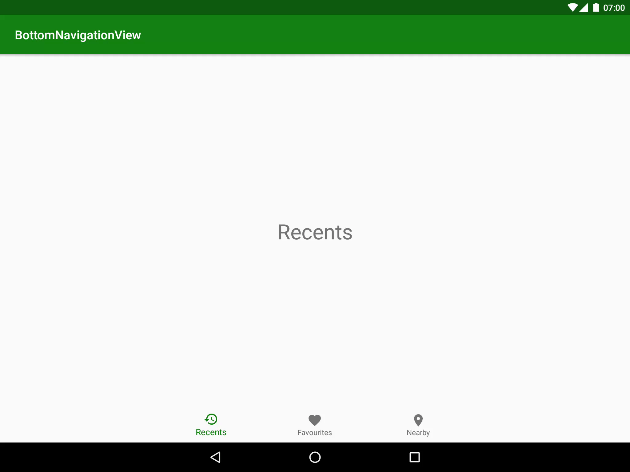
One really nice thing here (which is a common feature of the Design Support Library) is that the styling is picked up from the colours that we’ve defined within the theme. However, if we want to manually tweak things, there are some additional attributes available to us.
If we want to perform some custom styling there are also some XML arguments and their related getters & setters which enable us to change the item background, the item Icon tint, and the item text colour. The official Javadocs explain these sufficiently so there’s no reason for me to go in to specifics here.
That’s about it. Love ’em or hate ’em bottom navigation bars are now officially part of the material design guidelines but with this useful addition to the design support library, they are incredibly easy to implement.
The source code for this article is available here.
© 2016, Mark Allison. All rights reserved.
Copyright © 2016 Styling Android. All Rights Reserved.
Information about how to reuse or republish this work may be available at http://blog.stylingandroid.com/license-information.

Great article, j’aime!
How do you set the background color with circular reveal on the BottomNavigationBar view.