
At Google IO 2016 Google announced a new Android layout named ConstraintLayout. Despite the initial release being labelled as an Alpha release, it is actually pretty stable (with a few caveats). In this series of articles we’ll take a look at this new layout-kid on the block and try and get some insights in how best to use it.
 Before we get in to the nitty gritty of ConstraintLayout it is worth a brief discussion about why it is necessary. The first reason is performance. It has been well documented that deep layout hierarchies are very expensive in terms of the measurement and layout passes. We have also been told that nesting weighted LinearLayouts is inefficient and should be avoided – this is because each child needs to be measured twice and so, as we nest them, then number of measurements per child grows exponentially for each nested layout level. Similarly RelativeLayout has similar double-measurement issues and the advice coming from Google is to avoid them as the top-level container.
The nested, weighted LinearLayout issue has been partly addressed by PercentLayout, and the RelativeLayout issue has been partly addressed by GridLayout. However, as many developers will know, sometimes it is necessary to go against the advice coming from Google simply because these layouts are the ones best suited to creating the layouts that our designers give us.
That also brings us to another issues – which top-level layout should I use? Getting this choice right is an age old problem in Android development and is something that cannot be taught – it becomes almost instinctive with experience. However, no amount of experience can guard against the designer making some supposedly trivial changes to the layout which have big ramifications in terms of the layout hierarchy and require a complete re-organisation of a working layout.
ConstraintLayout is specifically designed to replace RelativeLayout and in the majority of cases only requires a single measurement of child Views within the layout pass – there are some cases where double measurements are required, but the developers are aware of these and are working to either eliminate them or, at least, reduce the impact on performance. It is also designed to be the default top-level layout container and best practice is to avoid nesting other layouts inside the ConstraintLayout. By keeping the layout flattened in this way it also reduces the exponential rise in measurements for the double-measurement cases because we shouldn’t need to add child layouts.
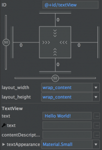
The basic concept behind ConstraintLayout is that child Views have a number of anchor points to which a constraint can be attached for the left, top, right, or bottom edges; or the text baseline for widgets which contain text. A constraint links an anchor point from one View to an anchor point of a sibling View, or the parent. These constraints provide similar kinds of functionality to the Relativelayout.LayoutParams attributes. Similarly to RelativeLayout we can set margins to create offsets. But it doesn’t stop there – on top of this we can also set bias values which allow us to create offsets based upon ratios of the space available. These bias values used in conjunction with different layout_[width|height] values can give us some nice control over how the individual child Views are actually sized.
These concepts are all a little abstract and it’s difficult to actually get a feel for how they work individually let alone in conjunction with each other. However the reason for starting with this high-level explanation is partly to define some naming conventions that we’ll rely on later, and partly to plant the seed that much of the power of ConstraintLayout is the manner in which we can achieve seemingly complex layouts just by combining some of these atomic principles.
Moreover, one of the early criticisms of ConstraintLayout is that it is going to be difficult to code review because developers will not be as familiar with the XML format. Part of the aim of this series is to break some of the concepts down in to these more atomic components in order to make it easier to read and understand the XML when reviewing Pull Requests on Github, Bitbucket or other source repos, without having to pull the code on to your local machine in order to view it within the visual editor. Of course we could always start including screen caps of the visual editor within our PR descriptions to make it easier for our fellow devs to understand our layouts, but being able to understand the XML would be a bonus, as well.
The next step is to actually use the visual editor to create a layout and see how we can achieve various things by combining these concepts, but also take a look at the resulting XML to begin to understand a layout just by reading the XML. In the next article we’ll do precisely that.
© 2016, Mark Allison. All rights reserved.
Copyright © 2016 Styling Android. All Rights Reserved.
Information about how to reuse or republish this work may be available at http://blog.stylingandroid.com/license-information.

Nice
if “ConstraintLayout is specifically designed to replace RelativeLayout and in the majority of cases ” what is the scenario while Designing cardview ? we can’t use ConstraintLayout as a children for cardview ! No Nested ConstraintLayout available right now!
Why can’t you use it inside CardView? You can use ConstraintLayout anywhere that you can use RelativeLayout because it is simply a ViewGroup. Re-read part 1 of this series for an explanation of this.