
At Google IO 2016 Google announced a new Android layout named ConstraintLayout. Despite the initial release being labelled as an Alpha release, it is actually pretty stable (with a few caveats). In this series of articles we’ll take a look at this new layout-kid on the block and try and get some insights in how best to use it.
In the last article we looked at how to create constraints to position a widget relative to another or the parent ConstraintLayout, but we can also fine tune the size and positioning by using a few layout parameters on the child widgets. In actual fact we’ll actually find that we’re already familiar with some of these layout parameters, we just need to understand how they work within the context of Constraintlayout. Let’s start by looking at the visual editor:
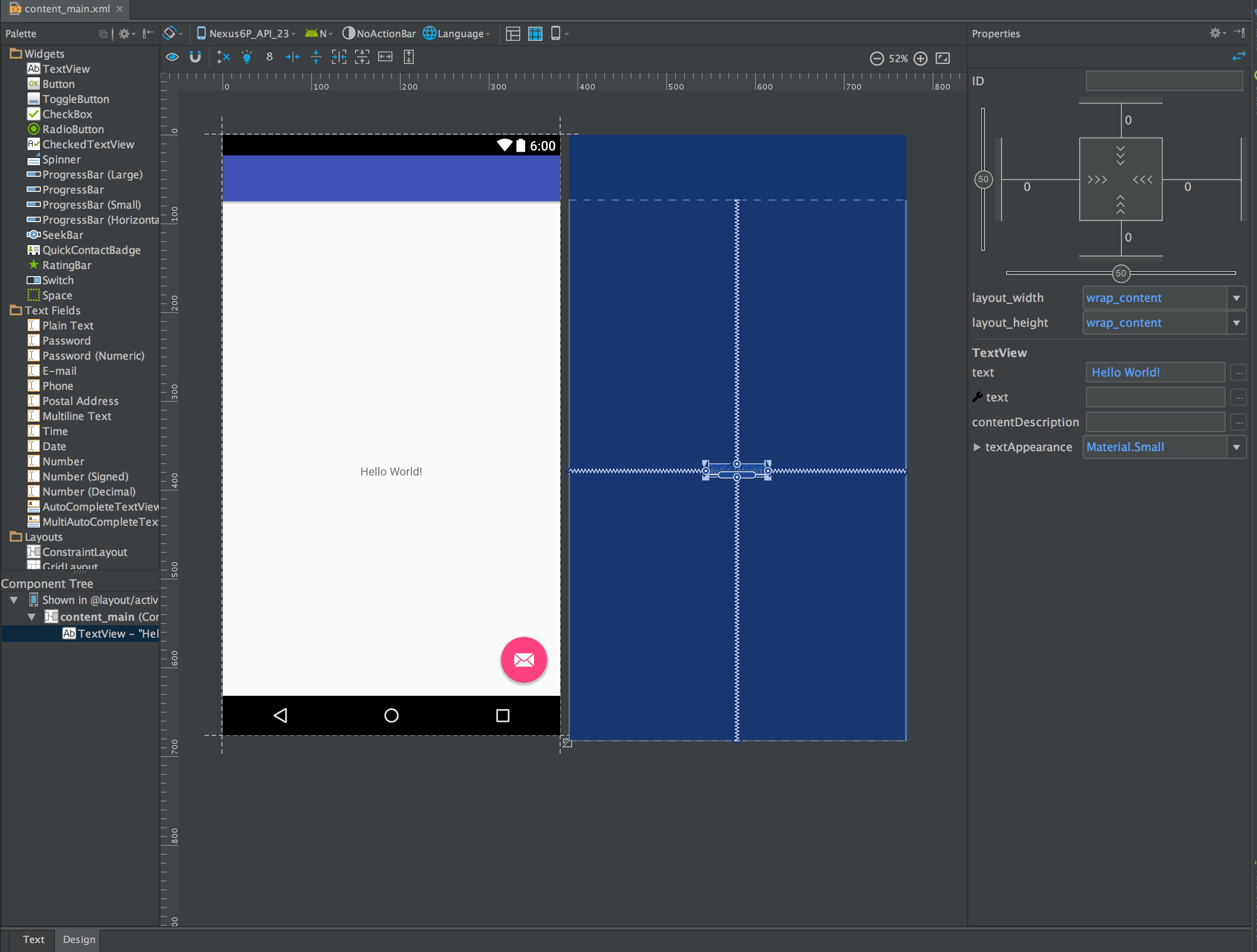
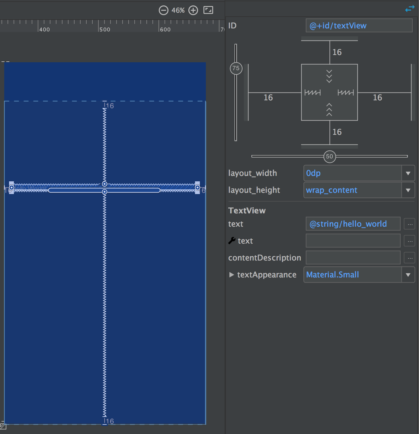
At the top of the Propertied panel is the panel which controls these:
We can see some fields which should make immediate sense to anyone with some Android layout experience: There’s the view ID at the top, and then below the strange diagram we have the layout_width and layout_height attributes followed by some fields specific to TextView. It’s the strange diagram that we’re interested in and it’s not as strange or scary as it might first appear.
If you hover the mouse over any of the controls in this diagram a tool-tip will pop up to give you a hint on its function.
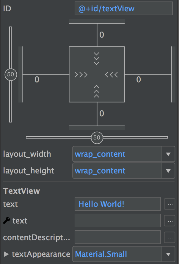
 Let’s start in the middle and work our way out. In the centre of the diagram we have these arrow symbols:
This controls the intrinsic size of the TextView that is currently selected, or to put it in to terms that should be familiar it corresponds to layout_width="wrap_content". Yes, really, it’s as simple as that the arrows simply mean wrap_content and that is actually reflected in the layout_width field in the properties panel. However, there are also two other possible ways that we can populate the layout_width attribute and we can actually toggle between the three states simply by clicking on this symbol. The next state is fixed width – the default value will be the measured size of the View, but you can change it (ideally you would use a dimens value here, but I’m using a raw dp value for clarity):
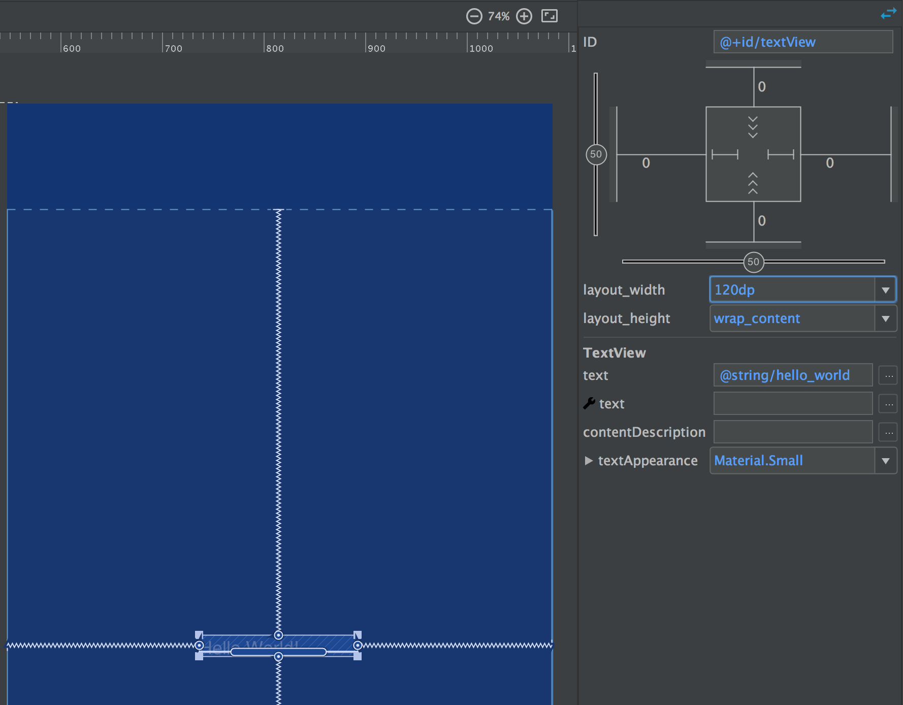
The third state is called “Any Size” and means that the View will size to fit the available space. This is vaguely analogous with match_parent (which is not supported by ConstraintLayout – if you specify it you will actually get Any Size behaviour). Any Size behaviour is actually closer to combining layout_width="0dp" and layout_weight="1" when using a weighted LinearLayout. In our simple example this will behave exactly like match_parent but, as we’ll see later on in this series, Any Size will not necessarily match the parent size hence the decision not to support match_parent because the name is actually misleading in a ConstraintLayout context:

Of course the vertical symbols behave in exactly the same way, except they control layout_height.
So if we move out we can see some lines with numbers beside them, and if we click on one of the numbers we get a drop down containing the numbers: 0, 8, 16, 24, & 32.These set the individual layout_margin* attributes on the widget. Once again, this is simply a graphical editor for attributes that we’re already familiar with, and if we set margins of 16dp all round (you don’t need to specify dp – it will actually cause a crash Android Studio 2.2 preview 2 if you do) we can see how this affects the positioning of the horizontal edges of a view with Any Size behaviour:
Note how the width of the TextView is now offset from the parent by 16dp – and this is visible in the blueprint panel.
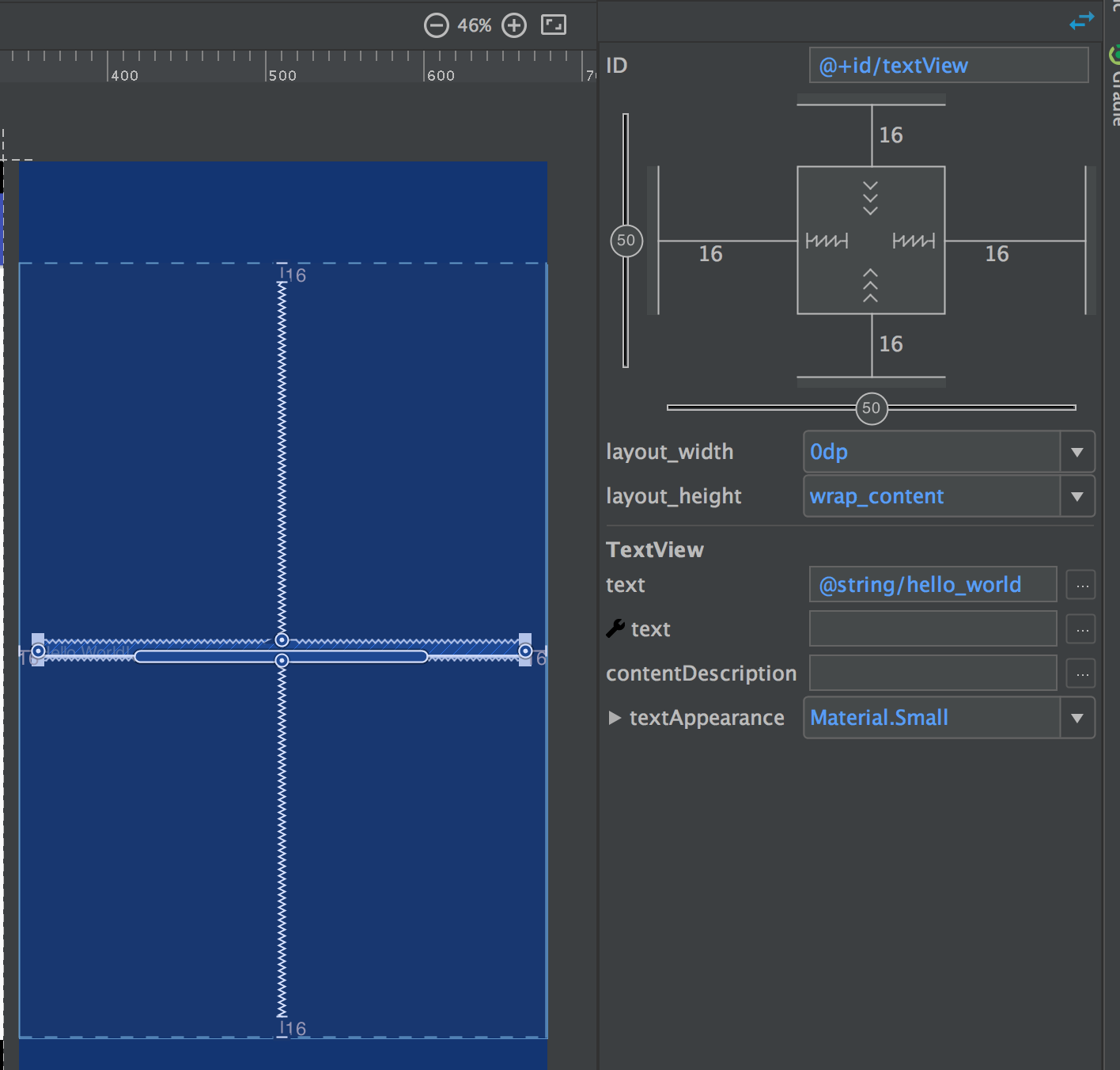
Moving out once again on the diagram, we come to the “Bias” settings – these are the first new parameter types that we’ve seen. If you look at the earlier screen caps you can see how the TextView is centred within its parent ConstraintLayout. This is because we have two constraints applied to the TextView in each direction. For example in the vertical direction we have a constraint from the top of the TextView which is tied to the top of the parent ConstraintLayout, and one from the bottom of the TextView which is tied to the bottom of the parent ConstraintLayout. Because its intrinsic height is set to wrap_content, the TextView is centred within the parent because the two vertical constraints are applied equally. However if we change the “Vertical Bias” we can actually apply the two constraints in different ratios and position the TextView at different relative positions within the parent:
Another way of thinking of this is that the constraints are actually two springs anchoring the child View within its parent – they are represented as such in the blueprint panel. If both springs are the same strength then the child view will be centred, but if we vary the strength of the springs we can position it to different relative positions within the parent – and that’s why the bias setting is doing.
<android.support.constraint.ConstraintLayout xmlns:android="http://schemas.android.com/apk/res/android"
  xmlns:app="http://schemas.android.com/apk/res-auto"
  xmlns:tools="http://schemas.android.com/tools"
  android:id="@+id/content_main"
  android:layout_width="match_parent"
  android:layout_height="match_parent"
  app:layout_behavior="@string/appbar_scrolling_view_behavior"
  tools:context="com.stylingandroid.constraintlayout.MainActivity"
  tools:showIn="@layout/activity_main">

  <TextView
    android:id="@+id/textView"
    android:layout_width="wrap_content"
    android:layout_height="wrap_content"
    android:layout_marginBottom="16dp"
    android:layout_marginEnd="16dp"
    android:layout_marginStart="16dp"
    android:layout_marginTop="16dp"
    android:gravity="center"
    android:text="@string/hello_world"
    app:layout_constraintBottom_toBottomOf="@+id/content_main"
    app:layout_constraintHorizontal_bias="0.20"
    app:layout_constraintLeft_toLeftOf="@+id/content_main"
    app:layout_constraintRight_toRightOf="@+id/content_main"
    app:layout_constraintTop_toTopOf="@+id/content_main"
    app:layout_constraintVertical_bias="0.25" />

</android.support.constraint.ConstraintLayout>
So we should already understand how the size and margins are represented in XML, so I won’t bother going over them here. The only new thing are the bias settings, and these are represented by a couple of new attributes which take a value between 0.0 and 1.0 to represent the position relative to the parent,
 So that’s all of the layout attributes which are represented in the diagram within the properties panel. One thing worth mentioning is that the although the properties panel does not contain all of the possible attributes that can be set on a specific View, tapping the button at the top right will switch to an alternate panel which lists all of the available attributes:
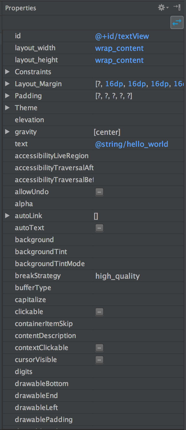
Using this panel we can change any of the available attributes for a specific View and don’t need to edit the XML directly to do so.
Although we now have some tools which enable us to do some quite interesting and hitherto difficult stuff in Android layouts, there’s still another extremely powerful component of ConstraintLayout which we’ll take a look at in the next article.
© 2016, Mark Allison. All rights reserved.
Copyright © 2016 Styling Android. All Rights Reserved.
Information about how to reuse or republish this work may be available at http://blog.stylingandroid.com/license-information.
