At Google IO 2016 Google announced a new Android layout named ConstraintLayout. Despite the initial release being labelled as an Alpha release, it is actually pretty stable (with a few caveats). In this series of articles we’ll take a look at this new layout-kid on the block and try and get some insights in how best to use it.
So far we’ve looked at how to create constraints on a View, and how we can control how those constraints affect the sizing and positioning of that View within the parent ConstraintLayout already we can do some really powerful and interesting things with those tools, but one thing may be obvious: achieving similar behaviours to weighted LinearLayout is difficult to achieve with what we’ve seen thus far. On the face of it setting a bias value offers a certain amount of control over the position of a View but it does not allow us to control the size. While we have Any Size behaviour which we can apply to our Views we still cannot control the proportion of the available space which each View will get as we can with weighted LinearLayout. However there is another feature that ConstraintLayout has which allows us to implement such behaviour, albeit in a rather different way: Guidelines.
For those familiar with graphical editing tools such as Adobe Illustrator, Affinity Designer, Sketch, Photoshop, and even some page layout and word processing tools the concept of guidelines should be fairly familiar. These are lines that can be set on the canvas at edit-time which we can use to align and position other graphical elements, but will not be output to the final image or page. ConstraintLayout has its own implementation and it turns out that they’re really pretty useful.
The problem with Guidelines in the early preview releases was that they were not that easy to find in the new visual editor, but from Android Studio 2.2 preview 3 onwards they have been promoted to the main toolbar in the visual editor:
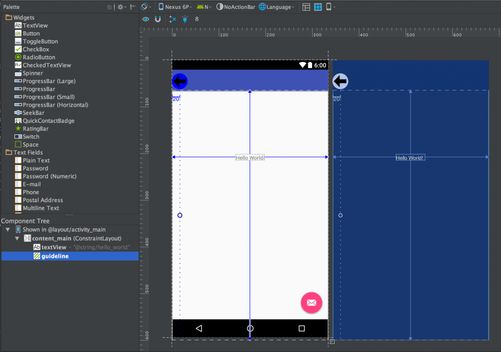
If we add a vertical Guideline we can now see it in both the preview and blueprint panels, but also it appears in the View hierarchy in the Component Tree panel as well:
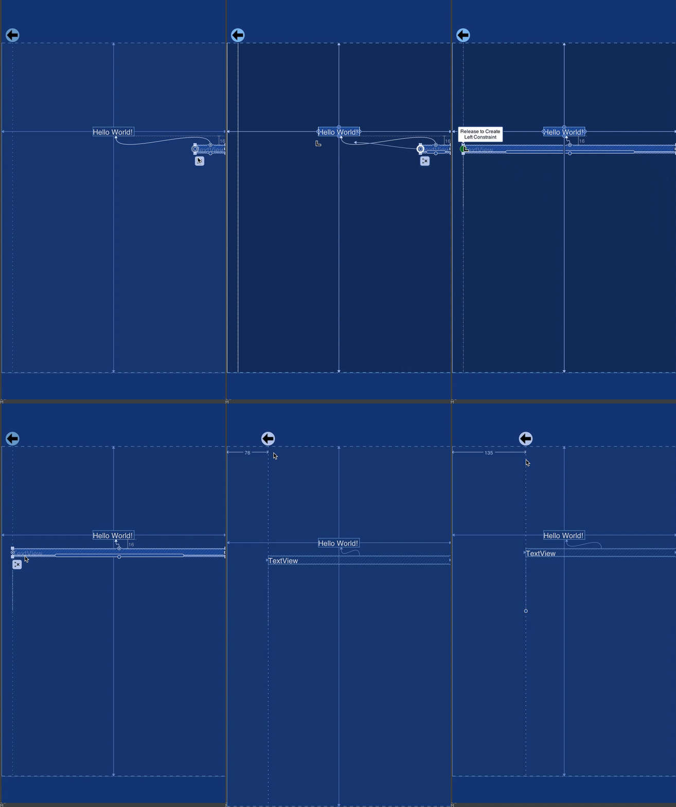
We can now create constraints relative to the Guideline, and if we then move the Guideline after one of more constraints have been attached to it, the attached Views will move with it:
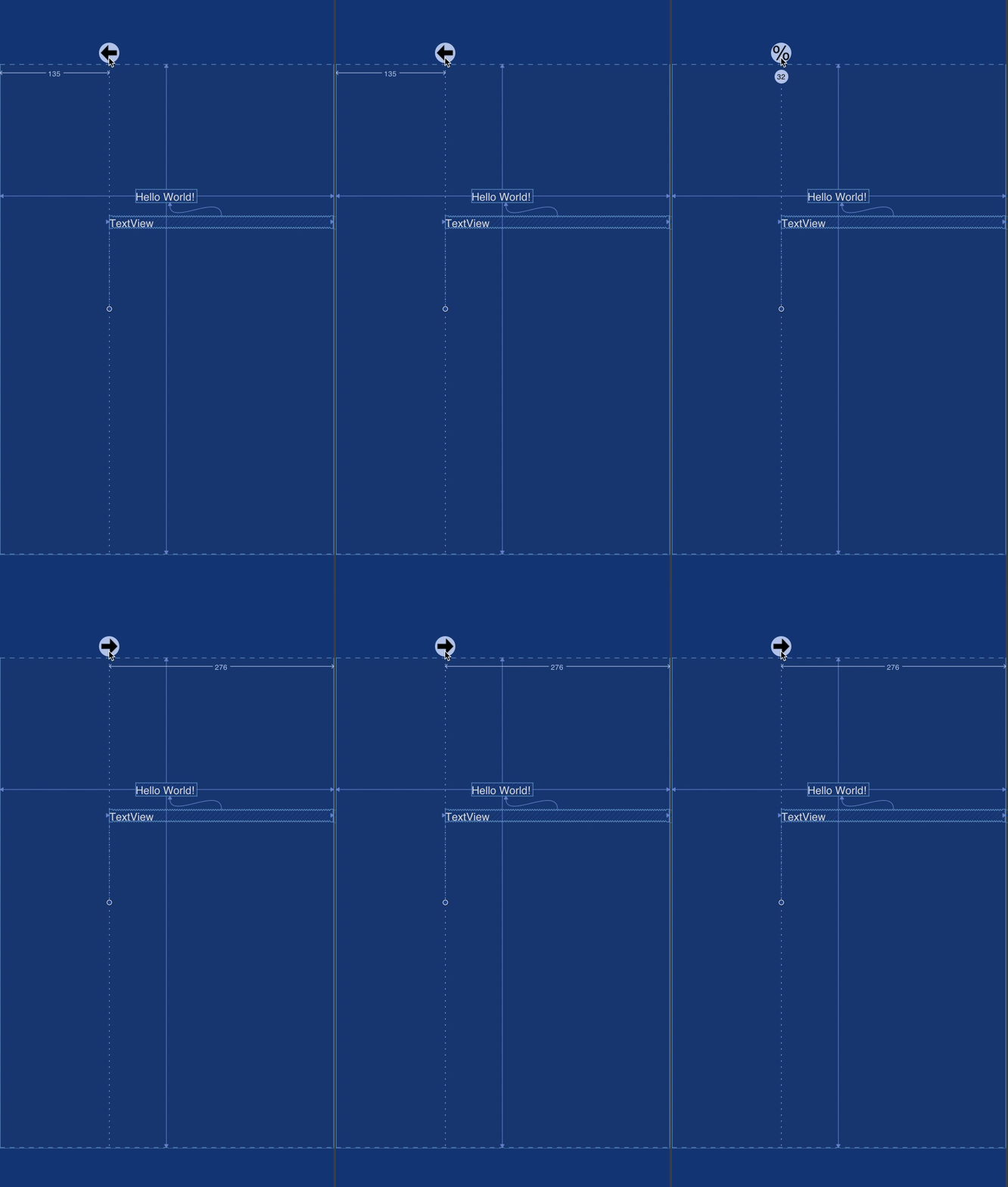
That’s all well and good but we move the Guideline we can see that its position value is changing and it’s simply an offset from the left edge in dp. However there are three different ways that we can position a Guideline – as an offset from the left (or start) edge of the parent in dp; as an offset from the right (or end) edge of the parent in dp; or as a relative percentage of the size of the parent (I’m focusing on vertical Guidelines for now, but the same applies to horizontal ones – only the top and bottom edges). We can toggle between these positioning modes by clicking on the control point for the Guideline:
It should now be fairly obvious that we can divide up the parent ConstraintLayout using Guidelines and align individual Views in Any Size behaviour to the Guidelines and get very similar behaviour (and control of that behaviour) to weighted LinearLayout. Moreover we can use Guidelines on both horizontal and vertical directions to create tabular data with a single flat hierarchy without any nested layouts. That’s pretty powerful stuff.
So how do Guidelines actually work? By diving in to the contraint-layout-1.0.0-alpha2 APK in Android Studio we can actually examine the source code for Guideline and see that it subclasses View, but overrides a few methods to ensure that it has zero height and width, will never actually draw anything, and fixed visibility of View.GONE. During the layout pass it will be positioned as any View during the layout pass, and other Views (or even other Guidelines if you want to start going all Inception-like!) can be positioned relative to it. It’s just a View so it can be a constraint reference just like any other View. But it will never actually render when the layout is drawn.
So how do these appear in our layout XML:
<?xml version="1.0" encoding="utf-8"?>
<android.support.constraint.ConstraintLayout xmlns:android="http://schemas.android.com/apk/res/android"
  xmlns:app="http://schemas.android.com/apk/res-auto"
  xmlns:tools="http://schemas.android.com/tools"
  android:id="@+id/content_main"
  android:layout_width="match_parent"
  android:layout_height="match_parent"
  app:layout_behavior="@string/appbar_scrolling_view_behavior"
  tools:context="com.stylingandroid.constraintlayout.MainActivity"
  tools:showIn="@layout/activity_main">

  <android.support.constraint.Guideline
    android:id="@+id/guideline1"
    android:layout_width="wrap_content"
    android:layout_height="wrap_content"
    android:orientation="vertical"
    app:relativeBegin="135dp"
    tools:layout_editor_absoluteX="135dp"
    tools:layout_editor_absoluteY="0dp" />

  <android.support.constraint.Guideline
    android:id="@+id/guideline2"
    android:layout_width="wrap_content"
    android:layout_height="wrap_content"
    android:orientation="vertical"
    app:relativeEnd="90dp"
    tools:layout_editor_absoluteX="321dp"
    tools:layout_editor_absoluteY="0dp" />

  <android.support.constraint.Guideline
    android:id="@+id/guideline3"
    android:layout_width="wrap_content"
    android:layout_height="wrap_content"
    android:orientation="vertical"
    app:relativePercent="20"
    tools:layout_editor_absoluteX="86dp"
    tools:layout_editor_absoluteY="0dp" />

</android.support.constraint.ConstraintLayout>
The only important attributes are app:relative[Begin|End|Precent] which represents offsets from the start and end edge, and as a percentage of the parent layout – the behaviours that we’ve already discussed.
The are lots of possibilities because of Guidelines, but there are also some limitations that we need to consider. We’ve seen how we can control the position and size of other Views which have constraints attached to a Guideline, but bear in mind that animating a Guideline will have no effect. As we discussed in Part 1 of this series, the size and positions of the other Views are calculated during the layout pass, and if you then animate the Guideline it will have no effect on these Views unless another layout pass is performed. Performing a layout for each frame of an animation is a really bad idea because a layout pass is expensive and your frame-rate will drop through the floor. Nobody likes janky animations! You’ll need to apply animations individually to the Views that you wish to animate.
So we’ve covered all of the basic elements of how ConstraintLayout works, and in the next article in this series we’ll adopt more of a cookbook approach and look some tricks and techniques that we can achieve using ConstraintLayout.
© 2016, Mark Allison. All rights reserved.
Copyright © 2016 Styling Android. All Rights Reserved.
Information about how to reuse or republish this work may be available at http://blog.stylingandroid.com/license-information.


