At Google I/O 2015 the Material Design Support Library was announced, and with it creating material apps targeting API levels below API 19 suddenly got a lot easier. In this series we’ll look at taking the RSS Reader app that we used as a basis for the Material series, and re-write it to make full use of the new Design Support Library. In this article we’ll look at adding a Floating Action Button or FAB.
Before we begin it is worth pointing out that this app really does not need a FAB because there are no actions to perform. However, in order to show how easy it now easy it is to add a FAB I took inspiration from Douglas Adams:
“Arthur Dent: What happens if I press this button?
Ford Prefect: I wouldn’t-
Arthur Dent: Oh.
Ford Prefect: What happened?
Arthur Dent: A sign lit up, saying ‘Please do not press this button again.”? Douglas Adams, The Original Hitchhiker Radio Scripts
So we’ll implement a FAB which, when pressed, pops up a Snackbar saying “Please do not press this button again.”
The first thing we need to do is add a FloatingActionButton to our layout:
<?xml version="1.0" encoding="utf-8"?>
<android.support.design.widget.CoordinatorLayout xmlns:android="http://schemas.android.com/apk/res/android"
  xmlns:app="http://schemas.android.com/apk/res-auto"
  android:id="@+id/main_layout"
  android:layout_width="match_parent"
  android:layout_height="match_parent">

  <android.support.design.widget.AppBarLayout
    android:layout_width="match_parent"
    android:layout_height="wrap_content"
    android:theme="@style/ThemeOverlay.AppCompat.Dark.ActionBar">

    <android.support.v7.widget.Toolbar
      android:id="@+id/toolbar"
      android:layout_width="match_parent"
      android:layout_height="?attr/actionBarSize"
      app:layout_scrollFlags="scroll|enterAlways" />

    <android.support.design.widget.TabLayout
      android:id="@+id/tab_layout"
      android:layout_width="match_parent"
      android:layout_height="wrap_content"
      android:clipToPadding="false"
      android:paddingLeft="@dimen/home_offset"
      app:tabMode="scrollable" />

  </android.support.design.widget.AppBarLayout>

  <android.support.v4.view.ViewPager
    android:id="@+id/viewpager"
    android:layout_width="match_parent"
    android:layout_height="match_parent"
    app:layout_behavior="@string/appbar_scrolling_view_behavior" />

  <android.support.design.widget.FloatingActionButton
    android:id="@+id/fab"
    android:layout_width="wrap_content"
    android:layout_height="wrap_content"
    android:layout_gravity="end|bottom"
    android:layout_margin="16dp"
    android:src="@drawable/ic_block" />

</android.support.design.widget.CoordinatorLayout>
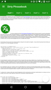
Before we do anything more, let’s see how that looks:
Oh noes! Our FAB is white and looks pretty fugly. Remember when we we having problems with the indicator bar colour in our TabLayout and we set it to white to match the text? Guess what? The same accent colour is used for the FAB colour. However it’s easily fixed, let’s use an accent colour which works in both cases:
<resources>
  <color name="sa_green">#1E9618</color>
  <color name="sa_green_dark">#146310</color>
  <color name="sa_green_transparent">#201E9618</color>
  <color name="sa_accent">#4EE147</color>
</resources>
<resources>

<!-- Base application theme. -->
<style name="AppTheme" parent="Base.AppTheme" />

<style name="Base.AppTheme" parent="Theme.AppCompat.Light.NoActionBar">
  <item name="colorPrimary">@color/sa_green</item>
  <item name="colorPrimaryDark">@color/sa_green_dark</item>
  <item name="colorAccent">@color/sa_accent</item>
  <item name="colorControlHighlight">@color/sa_green_transparent</item>
</style>

</resources>
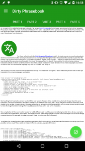
That’s much better:
All that remains is to wire up the OnClickListener in our Activity:
public class MainActivity extends AppCompatActivity implements ArticlesConsumer {
    private static final String DATA_FRAGMENT_TAG = DataFragment.class.getCanonicalName();
    private static final int MENU_GROUP = 0;

    private DrawerLayout drawerLayout;
    private NavigationView navigationView;
    private ViewPager viewPager;
    private TabLayout tabLayout;
    private FloatingActionButton fab;

    private Articles articles;

    @Override
    protected void onCreate(Bundle savedInstanceState) {
        super.onCreate(savedInstanceState);
        setContentView(R.layout.activity_main);

        drawerLayout = (DrawerLayout) findViewById(R.id.drawer_layout);
        navigationView = (NavigationView) findViewById(R.id.nav_view);
        viewPager = (ViewPager) findViewById(R.id.viewpager);
        tabLayout = (TabLayout) findViewById(R.id.tab_layout);
        fab = (FloatingActionButton) findViewById(R.id.fab);

        setupToolbar();
        setupNavigationView();
        setupDataFragment();
        setupFab();
    }
    .
    .
    .
    private void setupFab() {
        fab.setOnClickListener(
                new View.OnClickListener() {
                    @Override
                    public void onClick(View v) {
                        Snackbar.make(v, R.string.fab_press, Snackbar.LENGTH_LONG).show();
                    }
                });
    }
}
So we can now try this out:
Notice how the FAB moves up with the Snackbar? We had to nothing to get that behaviour, so what’s happening? It’s our friend CoordinatorLayout doing stuff in the background, once again.
When the Snackbar is created we pass in a reference to a View – in this case it’s the FAB which generates the onClick() call. Snackbar looks at the parent layout of this View and, if it finds a CoordinatorLayout it registers its behaviour with the CoordinatorLayout. FloatingActionButton also registers it’s own behaviour with the parent CoordinatorLayout which has a dependency on the Snackbar behaviour, and CoordinatorLayout passes the relevant information across when the Snackbar scrolls in and out. It’s even intelligent enough that, on a larger device where the Snackbar does not stretch the full width, it does not move the FAB because it doesn’t need to.
Pretty neat, and we didn’t have to do anything!
For proof of the magic that CoordinatorLayout performs simply pass a View outside of CoordinatorLayout to the Snackbar.make() method and you’ll see this nice behaviour cease.
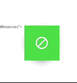
There is one issue that really needs mentioning here. If you run this code on an Android 4.x device the FAB rendering is pretty poor:
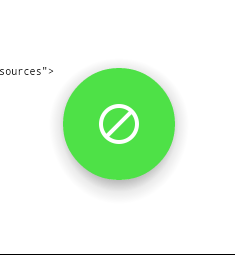
However there is a really simple work-around for this simply add app:borderWidth="0dp" to your FloatingActionButton in the layout and everything looks fine:
This fix came from Chris Banes via Sebastiano Poggi so I’m guessing that it will be fixed in a future version of the design support library. But thanks to Seb & Chris for providing me with such a simple work-around.
With the exception of this final issue, all of the example pictures and videos have been from Lollipop devices and so we’d expect a full material experience, but how do things fare on devices running older versions of Android? In the next article we’ll look at some subtleties regarding backwards compatibility.
The source code for this article is available here.
© 2015, Mark Allison. All rights reserved.
Copyright © 2015 Styling Android. All Rights Reserved.
Information about how to reuse or republish this work may be available at http://blog.stylingandroid.com/license-information.


