
In May 2016 a new project was pushed to the official Google Github repo named flexbox-layout. It is an Android layout manager which offers similar behaviour to the CSS flexible box layout module. In this series we’ll take a look at FlexboxLayout and try and gain some insights in to how it works and how to get the best out of it. In this article we’ll look at the layout attributes which can be applied to child Views to control how they are positioned within the parent FlexboxLayout.
Previously we saw how FlexboxLayout has a number of attributes which control how the child Views are flowed and positioned, but it doesn’t stop there. All of the Android layouts apply their own LayoutParams to their children which provide those children with attributes which are specific to the parent, and FlexboxLayout is not different. Moreover it is these child attributes that really add to the power of what it can do.
Before we dive in, it is probably worth mentioning that these can be accessed in the companion app by long pressing on a child View to enter item mode. Once in item mode, tapping other child Views will select them so that attributes can be set on all of the selected Views.
layout_order
layout_order allows the ordering of the child within the parent to be controlled. By default all Views have a value of 1 and will be laid out according to the order the appear in the XML layout, if the layout is inflated from XML, or otherwise the order in which they were added to the parent layout. I have not bothered to include this setting in the companion app because it’s pretty self-explanatory.
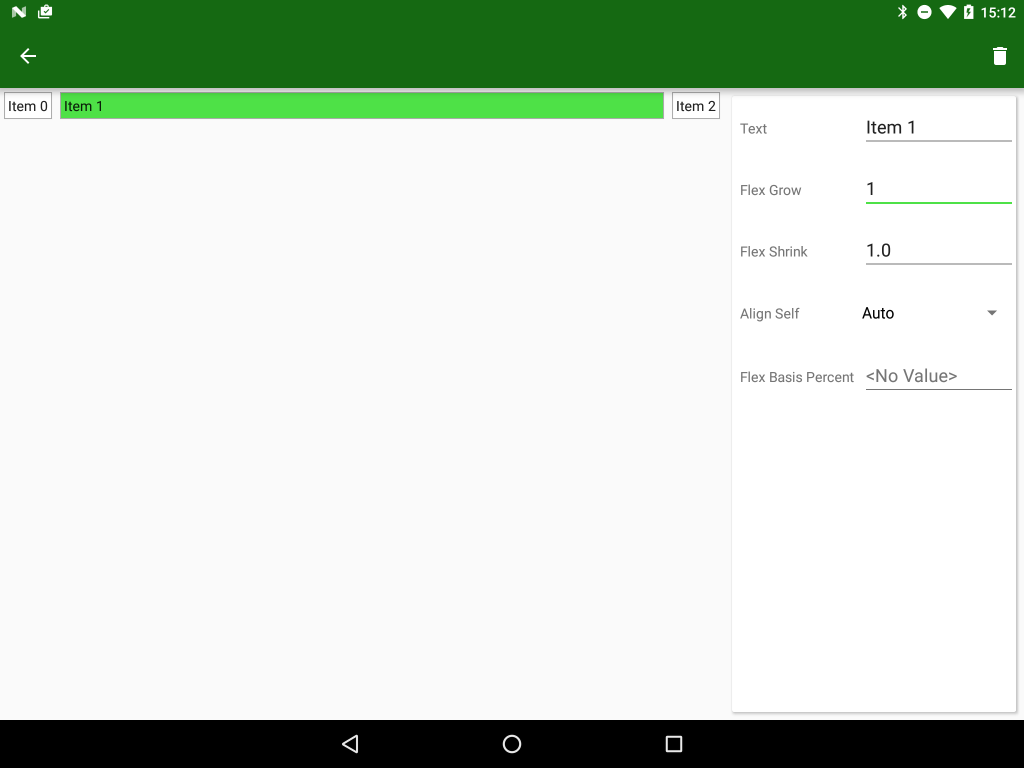
layout_flexGrow
layout_flexGrow works in much the same way as LinearLayout weights – any remaining space within the layout will be divided up according to the ratios of the layout_flexGrow values for each child View. The default value of 0.0 will respect the measured size of the child:
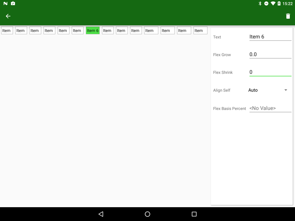
layout_flexShrink
layout_flexShrink is the complete opposite of layout_flexGrow – it is used when the flexWrap of the FlexboxLayout is No Wrap and the combined measured width of the child Views exceeds the size of the parent and the child Views will be shrunk according to the ratios of the layout_flexShrink values. The default value of 1.0 will cause all of the child Views to be shrunk evenly, but setting this to 0.0 on any child will prevent that child from being shrunk at all:
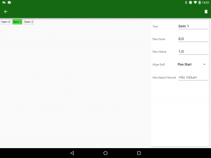
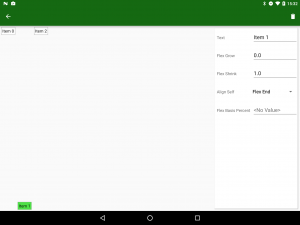
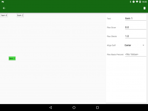
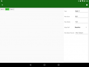
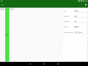
When we looked at the FlexboxLayout attributes we saw the slightly confusing alignItems and alignContent attributes which operated on both the items themselves, and on the virtual lines containing those items. There is actually a third align attribute layout_alignSelf which is applied to individual child Views and enables them to override the alignItem setting of the parent layout. The default value is Auto which will inherit the parent attribute, but the other values are flex_start, flex_end, center, baseline, and stretch:
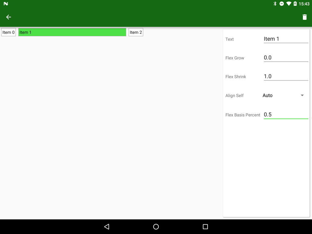
layout_flexBasisPercent
The final attribute is layout_flexBasisPercent which provides behaviour which is analogous to PercentLayout. The default value of -1.0 will not apply any percent sizing, but any value between 0.0 and 1.0 will size the child View relative to the parent – a value of 1.0 will match the size of the parent layout.
That’s all of the various attribute that we have to play with covered. In the final article in this series we’ll adpot a more ‘cookbook’ approach and look at how we can combine the layout and child attributes to meet some real world requirements.
The app is available in the Google Play Store, and the source code for the app will be published at the conclusion of this series.
© 2016, Mark Allison. All rights reserved.
Copyright © 2016 Styling Android. All Rights Reserved.
Information about how to reuse or republish this work may be available at http://blog.stylingandroid.com/license-information.

Hi Mark,
Thanks for your articles! I’m translating these articles into Russian for our IT-community. We thought it would be great if you could also share some review on performance issues when using this layout.
I’m not going to do an in-depth study of FlexboxLayout because I really don’t think it plugs any gaps in the existing layouts. I think that ConstraintLayout is a much bigger deal and will be looking at that instead.
Hi, these articles are an excellent introduction to Flexbox Layout. The app is a very useful demonstration as well. However, I cannot get the item mode to activate – long-pressing an item does the usual longpress vibrate feedback but has no other effect. Am I missing something or is there some problem with the demo app? It’s a shame since the app is a great demo otherwise.
It’s working fine for me. The source code has now been released and is available at https://github.com/StylingAndroid/FlexboxLayout. Feel free to build it yourself and have a play.