
Indeterminate ProgressBars are a useful tool for communicating to our users that an operation is in progress when we cannot predict how long it is likely to take. Previously on Styling Android we’ve covered how to create a backwardly compatible approximation of the material styled horizontal indeterminate ProgressBar but we haven’t looked at the circular form – in this series we’ll create an approximation of the material circular indeterminate ProgressBar which will be backwardly compatible to API 11 (Honeycomb).
Previously we’ve taken a deep dive in to the Lollipop+ implementation of the material circular indeterminate drawable, and now we’ll turn our attention to actually creating our own.
First we’ll look at the actual Drawable component (which is analogous to the VectorDrawable we looked at in AOSP) that is responsible for actually drawing the circular component (or a section of one, at least). We can’t use VectorDrawable because it’s Lollipop+ only and VectorDrawableCompat isn’t ready for serious use (at the time of writing). But we can use good, old-fashioned Canvas and Paint to do what we need.
Let’s first of all look at how we construct it:
public class IndeterminateDrawable extends Drawable implements Animatable {
    private static final int STROKE_WIDTH = 6;
    private static final int PADDING = 3;

    private final Paint paint;
    private final RectF bounds;
    private final float padding;
    private float startAngle;
    private float endAngle;
    private float rotation;
    private Animator animator;

    public static IndeterminateDrawable newInstance(Context context) {
        DisplayMetrics displayMetrics = context.getResources().getDisplayMetrics();
        float strokeWidthPx = TypedValue.applyDimension(TypedValue.COMPLEX_UNIT_DIP, STROKE_WIDTH, displayMetrics);
        float paddingPx = TypedValue.applyDimension(TypedValue.COMPLEX_UNIT_DIP, PADDING, displayMetrics);
        Paint paint = createPaint(fetchAccentColour(context), strokeWidthPx);
        RectF bounds = new RectF();
        float padding = strokeWidthPx / 2 + paddingPx;
        IndeterminateDrawable drawable = new IndeterminateDrawable(paint, bounds, padding);
        drawable.createAnimator();
        return drawable;
    }

    @ColorInt
    private static int fetchControlColour(Context context) {
        TypedArray typedArray = context.obtainStyledAttributes(0, new int[]{R.attr.colorControlActivated});
        try {
            return typedArray.getColor(0, 0);
        } finally {
            typedArray.recycle();
        }
    }

    static Paint createPaint(@ColorInt int colour, float strokeWidth) {
        Paint paint = new Paint();
        paint.setColor(colour);
        paint.setStyle(Paint.Style.STROKE);
        paint.setStrokeWidth(strokeWidth);
        paint.setAntiAlias(true);
        paint.setStrokeCap(Paint.Cap.SQUARE);
        return paint;
    }

    IndeterminateDrawable(Paint paint, RectF bounds, float padding) {
        this.paint = paint;
        this.bounds = bounds;
        this.padding = padding;
    }

    private void createAnimator() {
        startAngle = 0;
        endAngle = 270;
        animator = new AnimatorSet();
    }
    .
    .
    .
}
First we determine the pixel values for the stroke width and internal padding of the drawable to closely match those used my the actual material drawable. It is important to convert these from DIP to PX values based upon the DisplayMetrics at runtime to ensure that we can consistency across displays with differing densities.
Next we create a Paint object with the necessary colour and stroke width which will be used to actually draw the section of the circle. We can retrieve the correct colour from the theme by performing the appropriate lookup (we’re using the Design support library so this will honour the values in our Theme).
It’s important to turn on anti-aliasing on the Paint otherwise we’ll get some lovely jaggy edges. Also we set a square cap on the path which mimics what is set for the pathData in the material VectorDrawable that we looked at earlier in the series.
We also create a RectF object which we’ll use later on. Both the Paint and RectF objects will be used in the onDraw() method and we create them in advance and re-use them each time onDraw() is called to avoid any object creation and keep our onDraw() implementation as lean and clean as possible to ensure that we don’t drop any frames in the animations.
Next we actually create the IndeterminateDrawable instance itself before calling createAnimator() to construct the animations. This is currently a dummy implementation which just sets some static default values. We’ll get the the Animators in due course!
Because we subclass Drawable, we need to override some abstract methods:
public class IndeterminateDrawable extends Drawable implements Animatable {
    .
    .
    .
    @Override
    public void setAlpha(int alpha) {
        paint.setAlpha(alpha);
    }

    @Override
    public void setColorFilter(ColorFilter colorFilter) {
        paint.setColorFilter(colorFilter);
    }

    @Override
    public int getOpacity() {
        return paint.getAlpha();
    }
    .
    .
    .
}
We just need to apply changes to our Paint object as needed.
Because we implement Animatable we also need to override some methods to control the animation state:
public class IndeterminateDrawable extends Drawable implements Animatable {
    .
    .
    .
    @Override
    public void start() {
        animator.start();
    }

    @Override
    public void stop() {
        animator.end();
    }

    @Override
    public boolean isRunning() {
        return animator.isRunning();
    }
    .
    .
    .
}
Once again we delegate these only to the Animator this time.
We now need to implement some setters which will be used by the Animators later to change the parameters of the Drawable in order to animate it:
public class IndeterminateDrawable extends Drawable implements Animatable {
    .
    .
    .
    public void setStartAngle(float startAngle) {
        this.startAngle = startAngle;
        invalidateSelf();
    }

    public void setEndAngle(float endAngle) {
        this.endAngle = endAngle;
        invalidateSelf();
    }

    public void setRotation(float rotation) {
        this.rotation = rotation;
        invalidateSelf();
    }
    .
    .
    .
}
If you’ve read the previous article in this series these should be fairly self-explanatory – we are going to use animators to dynamically change the start and end of the sweep, and also rotate the whole thing.
Finally we have our onDraw():
public class IndeterminateDrawable extends Drawable implements Animatable {
    .
    .
    .
    @Override
    public void draw(Canvas canvas) {
        bounds.set(padding, padding, canvas.getWidth() - padding, canvas.getHeight() - padding);
        canvas.drawArc(bounds, rotation + startAngle, endAngle - startAngle, false, paint);
    }
}
This is really simple! First we populate the RectF bounds object that we created earlier with the dimensions of the Canvas taking in to account the internal padding. Then we draw an arc within these bounds and set the start and end angles according to the values set. We also add the rotation to the start angle and this will effectively rotate everything. This will get rendered using the Paint object that we set up earlier.
Actually using this in our Activity is pretty easy. We include a View in our layout (I’ve used an ImageView in the example code) and then construct the IndeterminateDrawable, and start the animations in exactly the same way as you would start and AnimatedVectorDrawable:
public class MainActivity extends AppCompatActivity {

    @Override
    protected void onCreate(Bundle savedInstanceState) {
        super.onCreate(savedInstanceState);
        setContentView(R.layout.activity_main);

        ImageView imageView = (ImageView) findViewById(R.id.image);
        IndeterminateDrawable drawable = IndeterminateDrawable.newInstance(this);
        imageView.setImageDrawable(drawable);
        drawable.start();
    }
}
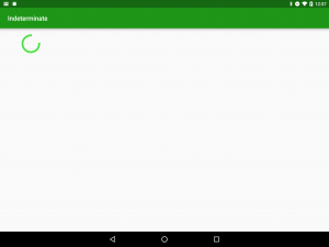
If we run this we can see that we get a static three quarters of a circle drawn because of the default values that we use in place of the animator construction:
Just before we finish it is worth pointing out that there are some known issues with drawArc in the Skia library which Android uses to render things. Eugenio Marletti has described these in detail and his post is well worth a read. However, we’re only drawing a single arc here so I’m not bothered about the slight rendering discrepancies – they simply won’t be apparent in this case.
In the next article we’ll turn our attention to the Animators which will bring this to life!
The source code for this article is available here.
© 2016, Mark Allison. All rights reserved.
Copyright © 2016 Styling Android. All Rights Reserved.
Information about how to reuse or republish this work may be available at http://blog.stylingandroid.com/license-information.
