I recently read an article bemoaning the fact that Android apps look inferior to their iPhone counterparts even when both apps are produced by the same company. You can read the original article here. While I don’t necessarily agree with some of the points raised, the purpose of this blog is to help improve the look and feel of Android apps, so let’s look at a specific example, and try to improve upon it.
Let’s consider the criticism levelled at the Facebook app dashboard activity where the complaint is regarding the area below the grid of icons. Just for the record I’ll point out that this is clearly a conscious design decision to have this space, and it is actually an image preview control which serves a distinct purpose. This did get me thinking though: if the intention was to create an icon-based dashboard to fill the screen? On the face of it, this is relatively easy, but becomes a little more complex when we consider the possibility of running on a vast array of devices which may have different screen sizes and pixel densities. The issue of device fragmentation becomes a major issue in UI design if you decide to write your app first and only then worry about getting it to work across a range of different form factors. If you are mindful of this from the outset, and consider it when designing your layouts, then it will not be an issue.
For those who have experience of HTML, the following is no great revelation: avoid absolute positioning wherever possible. While Android includes support for an AbsoluteLayout, it is deprecated and actually unnecessary. While AbsoluteLayout may offer you pixel-perfect control of the position of your child controls, by laying things out using static positions, your layout will only display well on the one specific screen size and density. A much better approach is to use the other layout types (such as LinearLayout, RelativeLayout, and TableLayout) instead. The main difference between these and AbsoluteLayout is that using these other layout types, you tell Android how you want to lay your controls out, and Android is responsible for working out the position of all of your controls at runtime based upon the characteristics of the device. A really simple example of this is if you consider handling rotation with an AbsoluteLayout – it simply wouldn’t work and you would need to provide two distinct layouts of the two device orientations.
OK, let’s start by creating a new project called “IntelligentLayout” with a target API of 2.3.3 (level 10), a package name of “com.stylingandroid.IntelligentLayout”, and an activity called “MainActivity”. Now let’s change the main layout to provide us with a 3×3 grid of icons with labels. Let’s modify res/layout/main.xml:
While this may look complex at a first glance, it’s really just the same pattern repeated. At the outer level we have a vertical LinearLayout which is going to fill the display and has a weight sum of “3”. It contains three horizontal LinearLayouts, each of which will fill the width and has a layout_weight of “1” and layout_width set to “fill_parent”. The combination of these two attributes will ensure that each row will be one third that of the parent. The horizontal LinearLayouts apply this same principle again in the horizontal direction so that we get a 3 x 3 grid of cells which are perfectly spaced. Each cell consists of a vertical LinearLayout which contains an image and some text.
We are being a little sneaky here by using the launcher icon that the Eclipse project wizard creates for us. At the time of writing, the current version of the Android Development Tools for Eclipse is 10.0.1, and this creates three different icons for different pixel densities (ldpi, mdpi, and hdpi). By using the default icon, it means that different versions of the icon will automatically be used by Android on devices with different pixel densities.
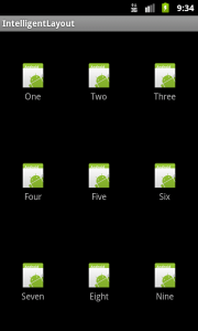
OK, let’s see how that looks on a WVGA800 (480 x 800) device:

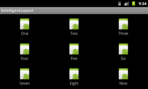
If we rotate the device, it works in landscape, as well:

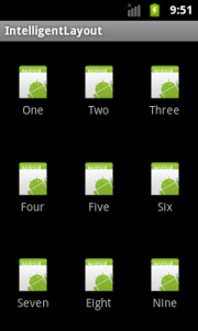
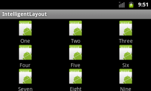
And the same app on a WQVGA400 (240 x 400) device:


This demonstrates how we can use Android Layouts to effectively manage our layouts and ensure that they work across a variety of devices and form factors.
Before we finish, it is worth pointing out that, as is often the case in Android, there is another method that we can chose instead of nesting LinearLayouts: a TableLayout. Let’s create a new layout in Let’s create res/layout/main2.xml:
This should be pretty easy to understand if you’ve followed the previous example.
To use this new layout, we’ll need to slightly modify MainActivity:
@Override
public void onCreate(Bundle savedInstanceState)
{
	super.onCreate(savedInstanceState);
	setContentView(R.layout.main2);
}
I will not bother with screen shots as the net result is all but identical to the previous example.
There is a key concept that is extremely important in these examples: we make no reference to pixels, even density-independent pixels, or any kind of size measurement. The more that we can abstract from thinking in terms of screen size and pixels, the better. We can also apply these principles when dealing with bitmap drawables. If we supply a fixed size bitmap, Android will have to do a “best effort” in displaying it on different devices with slightly different display sizes (even if they are all of the same pixel density), and we’ll usually have either an anamorphically distorted image; a cropped image; or some blank space added around the image. However, if we use a 9-patch bitmap or even a shape drawable, then we give Android more scope to adapt things to the device.
It is worth mentioning that while nesting layouts like this certainly works, and has allowed us to explore some fundamental concepts of dynamic layouts, it is somewhat inefficient. In a real application, it might be better to, for example, use a GridView object, and populate it programatically from a ListAdapter. Also, it would be sensible to have a slightly different layout in landscape orientation to portrait orientation, but that’s the subject of a future article.
As always, the source for this project can be found here.
© 2011 – 2014, Mark Allison. All rights reserved.
Copyright © 2011 Styling Android. All Rights Reserved.
Information about how to reuse or republish this work may be available at http://blog.stylingandroid.com/license-information.

Nice article, very helpful thanks.
Thanks for article, though this works using layout declared in xml, seems to be not working while creating layout/views dynamically..
It does work by programmatically..
thanks
Nice article but We can implement the same with other layouts like tablelayout and relative layout and code will be lesser then this linear layout code.
Did you read all of the article? At the end I explain that TableLayout can be used instead and provide an example of using TableLayout.
Also, I think that you’re slightly missing the point of the article if you are focussing on the layout types that I used in the examples. The point is that irrespective of which layout types you use, you need to understand how to configure them to properly scale across different devices, form-factors, pixel densities and orientations.
thanx…for highlighting the impt point….
Mark, is populating something like this more efficient if you do the layout *in-code* (Java code) or in XML? You mention at the end that it’s inefficient to use the linear layouts like you did in the last example with the TableLayout, does that mean a “best practice” would be to do a GridLayout and populate it in java-code?
Ultimately I’m doing the same thing that this layout has, for a home screen of an application. Each Icon represents a new activity/view that’s a different section of the application, and I’m trying to determine what a best practice would be for the design of the layout..
Thanks! Awesome blog, I can’t believe I’m just now coming across this.
I always do layouts in XML. The reason for this is that XML layouts are integrated through the Android resource management mechanism, which makes it much easier to create a UI which will work well across different form-factors, screen sizes, densities, and orientations.
I’m currently working on a new article which may help a little in simplifying your layouts particularly if you are creating icons with a text label below them. It should be published in the next few weeks.