Amazing things are possible with AnimatedVectorDrawable and regular readers of Styling Android will know that I’m a huge fan of them. Earlier this year I worked on a project for a UK TV broadcaster and produced an AnimatedVectorDrawable of the isometric company logo which went in to the app as an Easter Egg. Sadly I was unable to obtain permission to use the logo in question, but in this series of articles we’ll look at the entire process that I went through in order to create this animated logo.
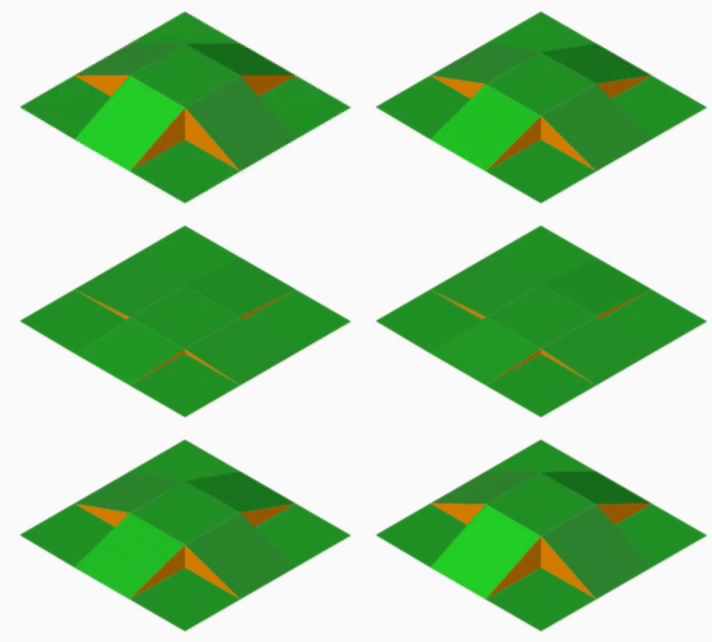 Before we begin it is worth explaining a couple of things. Firstly the technique that we’re going to use will utilise pathData animation within the AnimatedVectorDrawable and this is not currently supported by the VectorDrawableCompat library – so this technique will only work on API 21 (Lollipop) and later devices. Secondly, we’re going to start by looking at some graphics and how they are constructed. Please bear with me on this – by covering this first it will make things much easier to understand once we get to the Android part later on. The animated GIF shows the animation that we’re aiming to produce – the type of animation that we might see in isometric games which allow us to raise and lower grassy areas of land.
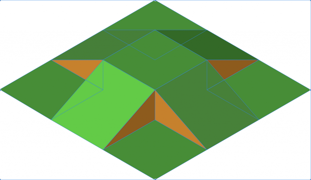
The whole animation seems quite complex and it isn’t immediately apparent how we can achieve this with AnimatedVectorDrawable. However if we break it down in to smaller components and look at each in isolation then it should be a little easier to understand. I created the basic graphic using Affinity Designer which has a really nice isometric mode which made it really easy:
The graphic is made up a number of individual shapes – I’ve left the outlines visible so that the individual shapes can be much more easily identified. Essentially there are nine parallelograms (the green areas), and four triangles (the brown areas). Although there should actually be eight of the brown areas to represent all of the exposed ‘earth’ surfaces, only four are actually visible and the others are actually hidden. We’ll save ourself some processing by not drawing the hidden ones – hence the need for only four.
In the flattened state only the green parallelograms are visible:
The basic approach here is that we’re going to create animations to transition between these two states by manipulating the individual shapes which make up the entire graphic.
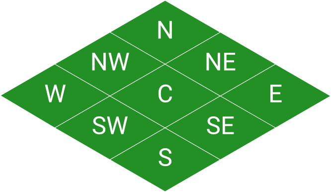
Let’s start by identifying the shapes – we’ll name the green parallelograms according to their positions relative to a compass face (and the centre one, of course):
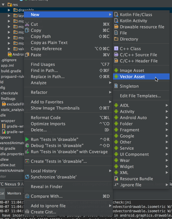
The next things that we need to do is save these as SVG from Affinity Designer, and import them in to Android Studio using Asset Studio. This is done by right clicking on the drawable resource folder and selecting Vector Asset:
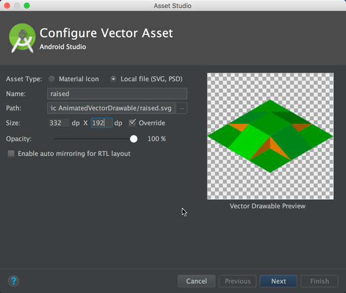
This brings up the Vector import tool and we select the SVG that we wish to import – specifying the dimensions, if necessary:
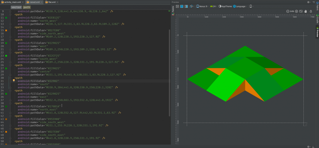
This will import the SVG as a VectorDrawable and we need to manually edit it to name each of the individual shape elements:
<vector xmlns:android="http://schemas.android.com/apk/res/android"
  android:width="332dp"
  android:height="192dp"
  android:viewportHeight="384.0"
  android:viewportWidth="664.0">
  <path
    android:name="side_north_west"
    android:fillColor="#D27E00"
    android:pathData="M109.2,128L220.1,192L220.3,127.9Z" />
  <path
    android:name="side_south_west"
    android:fillColor="#955900"
    android:pathData="M331.1,255.9L220.1,320L331.1,191.9Z" />
  <path
    android:name="side_south_east"
    android:fillColor="#D27E00"
    android:pathData="M441.8,320L330.9,256L331.1,191.9Z" />
  <path
    android:name="side_north_east"
    android:fillColor="#955900"
    android:pathData="M552.8,127.9L442,191.9L442,127.9Z" />
  <path
    android:name="north"
    android:fillColor="#229025"
    android:pathData="M330.9,128L441.8,64L330.9,-0L220.1,64Z" />
  <path
    android:name="north_west"
    android:fillColor="#2E812E"
    android:pathData="M220.3,127.9L331.1,63.9L220.3,63.9L109.2,128Z" />
  <path
    android:name="west"
    android:fillColor="#229025"
    android:pathData="M109.2,256L220.1,192L109.2,128L-0,191.1Z" />
  <path
    android:name="south_west"
    android:fillColor="#22CF25"
    android:pathData="M109.2,256L220.1,320L331.1,192L220.1,128Z" />
  <path
    android:name="centre"
    android:fillColor="#229025"
    android:pathData="M331.1,191.9L441.8,128L331.1,63.9L220.3,127.9Z" />
  <path
    android:name="south"
    android:fillColor="#229025"
    android:pathData="M330.9,384L441.8,320L330.9,256L220.1,320Z" />
  <path
    android:name="east"
    android:fillColor="#229025"
    android:pathData="M552.6,256L663.5,192L552.6,128L441.8,192Z" />
  <path
    android:name="north_east"
    android:fillColor="#176B1A"
    android:pathData="M441.8,128L552.8,127.9L442,63.9L331.1,63.9Z" />
  <path
    android:name="south_east"
    android:fillColor="#2D832D"
    android:pathData="M441.8,320L552.8,255.9L441.8,128L331.1,191.9Z" />
</vector>
It’s worth noting that I have named the brown triangles with respect to the green parallelogram to which they are attached. The green areas in question will actually have two ‘side’ components, but only one is visible.
One of the problems when it comes to naming the individual shapes is actually identifying which is which. There’s a little trick that I use for this – if you change the fillColor attribute for one of the path elements by simply removing the last digit of the colour, then Android Studio preview will not draw that path because it doesn’t understand the colour value:
After you’ve identified and named the path you can restore that colour value back to what it was. I’t a lot more straightforward identifying elements in this why than by trying to do it from the raw pathData itself!
The naming can be a little tedious but is necessary for two main reasons – firstly it helps us to remember which shape is which – and makes our Vectors easier to read, understand, and review. But also it enables us to address the individual paths when we come to animate things later on.
The flat form of the animation isn’t actually required in our project (although, as we shall see, it could be useful when constructing our animations), but I’ve included it in the source just as a reference in case anyone wants to study it.
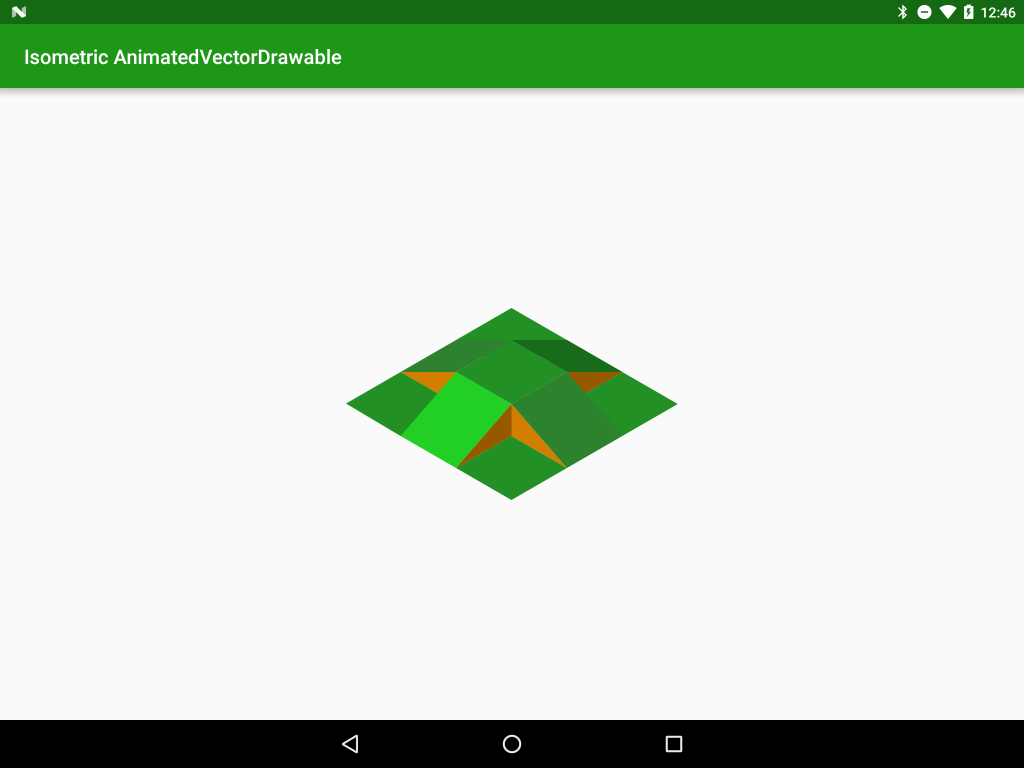
If we drop this vector in to an ImageView we can see this displayed in our app:
In the next article in this series we’ll take a look at the pathData itself to begin to understand how we can actually animate things.
The source code for this article is available here.
© 2016, Mark Allison. All rights reserved.
Copyright © 2016 Styling Android. All Rights Reserved.
Information about how to reuse or republish this work may be available at http://blog.stylingandroid.com/license-information.

