The Material Design Components library is a really nice thing. It has some widgets which make implementing Material Design really easy. Back in February 2020 version 1.2.0-alpha05 introduced Material Transitions and Motion. In this series we’ll look at the different transitions, and explore how and, perhaps more importantly, when to use them.
Overview

The Fade transition sounds similar to Fade Through that we looked at previously. Fade Through is a transition between two distinct layouts of fragments. However, Fade is focussed on components whose visibility change.
The animation itself is an initial fade-in taking 50ms with a scale from 80%-100% starting at the same time as the fade, but lasting 150ms. For components which also have a scrim (such as a dialog which has a background scrim) the scrim fades in over 150ms.
Usage
This transition is generally used for components which appear and disappear. Obvious examples of these are dialogs, menus, and Snakckbars. However, if we use those implementations from Material Design Components library this transition will be applied automatically.
Sample Code
For the purposes of demonstrating this transition I’m going with simply toggling the visibility of an ImageView. The Fragment layout looks like this:
The Fragment itself wires up the Button to toggle the visibility of the ImageView and change its own text:
@AndroidEntryPoint
class AppearFragment : Fragment() {

    private lateinit var binding: FragmentAppearBinding

    override fun onCreate(savedInstanceState: Bundle?) {
        super.onCreate(savedInstanceState)

        enterTransition = MaterialFadeThrough()
        exitTransition = MaterialFadeThrough()
    }

    override fun onCreateView(
        inflater: LayoutInflater,
        container: ViewGroup?,
        savedInstanceState: Bundle?
    ): View? {
        binding = FragmentAppearBinding.inflate(inflater, container, false)
        binding.showButton.setOnClickListener {
            val resources = layoutInflater.context.resources
            if (binding.showButton.text == resources.getString(R.string.show)) {
                binding.showButton.text = resources.getString(R.string.hide)
                binding.motionImage.visibility = View.VISIBLE
            } else {
                binding.showButton.text = resources.getString(R.string.show)
                binding.motionImage.visibility = View.INVISIBLE
            }
        }
        return binding.root
    }
}
If we run this, toggling the visibility causes a hard transition of the ImageView:

Personally I would never do this. There’s a single line addition that we can make which makes this much nicer:
@AndroidEntryPoint
class AppearFragment : Fragment() {

    private lateinit var binding: FragmentAppearBinding

    override fun onCreate(savedInstanceState: Bundle?) {
        super.onCreate(savedInstanceState)

        enterTransition = MaterialFadeThrough()
        exitTransition = MaterialFadeThrough()
    }

    override fun onCreateView(
        inflater: LayoutInflater,
        container: ViewGroup?,
        savedInstanceState: Bundle?
    ): View? {
        binding = FragmentAppearBinding.inflate(inflater, container, false)
        binding.showButton.setOnClickListener {
            TransitionManager.beginDelayedTransition(binding.root)
            val resources = layoutInflater.context.resources
            if (binding.showButton.text == resources.getString(R.string.show)) {
                binding.showButton.text = resources.getString(R.string.hide)
                binding.motionImage.visibility = View.VISIBLE
            } else {
                binding.showButton.text = resources.getString(R.string.show)
                binding.motionImage.visibility = View.INVISIBLE
            }
        }
        return binding.root
    }
}
Adding beginDelayedTransitions() call will cause TransitionManager to apply some transitions for us:

In this case, it adds an alpha fade when the visibility changes. Already this is much nicer, but we haven’t used the Material transition yet.
Add Fade
The Material Design Components transitions are actually built on top of TransitionManager so we’ve already done much of the work. To use the Material Fade transition, we just need to specify a custom transition to our beginDelayedTransitions() call:
@AndroidEntryPoint
class AppearFragment : Fragment() {

    private lateinit var binding: FragmentAppearBinding

    override fun onCreate(savedInstanceState: Bundle?) {
        super.onCreate(savedInstanceState)

        enterTransition = MaterialFadeThrough()
        exitTransition = MaterialFadeThrough()
    }

    override fun onCreateView(
        inflater: LayoutInflater,
        container: ViewGroup?,
        savedInstanceState: Bundle?
    ): View? {
        binding = FragmentAppearBinding.inflate(inflater, container, false)
        binding.showButton.setOnClickListener {
            TransitionManager.beginDelayedTransition(binding.root, MaterialFade())
            val resources = layoutInflater.context.resources
            if (binding.showButton.text == resources.getString(R.string.show)) {
                binding.showButton.text = resources.getString(R.string.hide)
                binding.motionImage.visibility = View.VISIBLE
            } else {
                binding.showButton.text = resources.getString(R.string.show)
                binding.motionImage.visibility = View.INVISIBLE
            }
        }
        return binding.root
    }
}
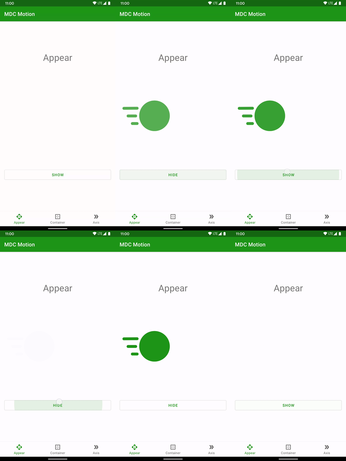
If we run this we get a scale when the view appears, as well as the fade:

This doesn’t look as good in a GIF as it does on a real device, but a slowed down version makes it a little easier to see:

Conclusion
As with Fade Through, this is quite a subtle animation but makes things feel much smoother. It is very quick and simple to add – even simpler if beginDelayedTransitions() has already been added. But even if it hasn’t the nicer UX more than justifies adding a single line of code!
The source code for this article is available here.
© 2020, Mark Allison. All rights reserved.
Copyright © 2020 Styling Android. All Rights Reserved.
Information about how to reuse or republish this work may be available at http://blog.stylingandroid.com/license-information.


Source code link at the bottom is broken.
Oooops. My bad. It should be fixed now. Thanks for letting me know.