
The Material Design Components library is a really nice thing. It has some widgets which make implementing Material Design really easy. Back in February 2020 version 1.2.0-alpha05 introduced Material Transitions and Motion. In this series we’ll look at the different transitions, and explore how and, perhaps more importantly, when to use them.
Overview

The Container Transform is similar to the Shared Element transform. Furthermore that transition is the foundation for the container transform.
While it is built on shared element transitions, the concept is slightly different. Shared element transitions will animate individual which appear in both start and end states. However, as the name suggests, the container transform is more about transitioning a container such as a CardView. However, it is possible to use both together, as we’ll see.
Usage
The cases best suited to this transform are those where we have common UI elements in two Activities or Fragments. The power of this kind of transition is that it can draw the users eye during the transition from one layout to another.
This can be a subtle mechanism for improving the user experience. If we can draw the users’ eye to the title of the incoming layout, it provides immediate context to the user.
Sample Code
Anyone who has used shared element transitions will know that they can be temperamental and tricky to get right. Container transition share this problem sadly. However, we’ll look at some techniques which can improve this. This is far more complex than any of the other material transitions that we’ve looked at.
The fundamental principle of shared element transitions is to give views in both start and end layouts common transition names. We pass these names between Activities or Fragments as extras. The transitions framework then handles the animations for us. But it can be tricky to get it right. I must confess that it took me a lot of trial and error to get this sample code working. That is the norm when it comes to shared element transitions.
Standard Container Transition
The first thing we need to set up is the starting layout:
On two controls I have specified a transitionName using string resources. I have also added transitionGroup="true" to the MaterialCardView. Setting this to true makes this ViewGroup and its child Views behave as a single item for the purposes of the transition. The MaterialCardView is the container for the container transition so this controls the behaviour a little.
Strictly speaking we don’t need to specify the transitionName attributes in the layout, as they are not used for the initial transition. However, adding them will make the return transition (id the user hits “Back”) just work.
The Start Fragment
Next we need to configure the transition in our Fragment:
@AndroidEntryPoint
class ContainerFragment : Fragment() {

    private lateinit var binding: FragmentContainerBinding

    override fun onCreate(savedInstanceState: Bundle?) {
        super.onCreate(savedInstanceState)

        enterTransition = MaterialFadeThrough()
        exitTransition = MaterialFadeThrough()
    }

    override fun onCreateView(
        inflater: LayoutInflater,
        container: ViewGroup?,
        savedInstanceState: Bundle?
    ): View? {
        binding = FragmentContainerBinding.inflate(inflater, container, false)
        binding.card.setOnClickListener { card ->
            navigateCard(
                card,
                binding.textView,
                getString(R.string.container_card),
                getString(R.string.shared_elements_text),
                ContainerFragmentDirections.actionContainerFragmentToContentFragment(
                    binding.textView.text.toString()
                )
            )
        }
        return binding.root
    }

    override fun onViewCreated(view: View, savedInstanceState: Bundle?) {
        super.onViewCreated(view, savedInstanceState)

        postponeEnterTransition()
        view.doOnPreDraw { startPostponedEnterTransition() }
    }

    private fun navigateCard(
        card: View,
        textView: TextView,
        cardTransitionName: String,
        textTransitionName: String,
        navDirections: NavDirections
    ) {
        val extras = FragmentNavigatorExtras(
            card to cardTransitionName,
            textView to textTransitionName
        )
        findNavController().navigate(navDirections, extras)
    }
}
We add on onClickListener to the card which calls the navigateCard() method. We’ll re-use this method later hence the decision to create a method here.
The arguments it takes are the MaterialCardView, and a TextView instances from the layout. Then we have the two strings that we used for the transitionNames in the layout (Hopefully the decision to use string resources for these is beginning to make sense). Finally there is an action that has been generated by the Jetpack Navigation library. As well as Jetpack Navigation, I have also used the SafeArgs library to allow the passing of arguments in navigation actions. It is actually SafeArgs that created ContainerFragmentDirections for us. In this case we pass the text from the TextView as the argument to this action.
The navigateCard() method first creates some extras which are mappings between the view instances and their transitionNames. Finally we use the navController to navigate using the action and these extras.
The onViewCreated() method contains a couple of lines to delay the enter transition until after the layout pass has completed. This is important because the shared element transition will not be able to determine the correct positions of the views until then.
The Destination Fragment
The layout of the destination fragment has the same attributes added – the transitionName for both the card and textView widgets, and a transitionGroup on the card.
The Fragment itself is actually pretty simple:
@AndroidEntryPoint
class ContentFragment : Fragment() {

    private lateinit var binding: FragmentContentBinding
    private val args: ContentFragmentArgs by navArgs()

    override fun onCreate(savedInstanceState: Bundle?) {
        super.onCreate(savedInstanceState)

        sharedElementEnterTransition = MaterialContainerTransform().apply {
            drawingViewId = R.id.nav_host_fragment
            scrimColor = Color.TRANSPARENT
        }
    }

    override fun onCreateView(
        inflater: LayoutInflater,
        container: ViewGroup?,
        savedInstanceState: Bundle?
    ): View? {
        binding = FragmentContentBinding.inflate(inflater, container, false)
        binding.textView.text = args.title
        return binding.root
    }

    override fun onViewCreated(view: View, savedInstanceState: Bundle?) {
        super.onViewCreated(view, savedInstanceState)

        postponeEnterTransition()
        view.doOnPreDraw { startPostponedEnterTransition() }
    }
}
The args val obtains the arguments from the navigation action. In onCreate() we set the sharedElementEnterTransition as a MaterialContainerTransform instance. In onCreateView() we set the text of the TextView in the layout to the title string that was passed through the navigation arguments. Finally we do the same trick to postpone the enter transition until after the layout pass.
Technically we are doing both a Container transition (on the MaterialCardView) and a shared element transition (on the TextView). Personally I think this adds a little smoothness to the transition, and helps draw the users eye with the title. This will become a little clearer if we see them.
Firstly this is with the shared element transition of the TextView disabled, so we only have the Container transition of the MaterialCardView:

The bounds of the card view animate during the transition but the contents don’t. If we now add in the shared element transition for the title, we get nicer continuity, I think:
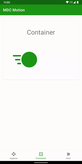
The title of “Container” is a constant element, and the small movement of it gives a tighter visual link between the two layouts, I think. It also helps focus the users eye on the item which gives immediate context to the new layout. The user has just understood this title before tapping, so they don’t need to re-process this on the new layout.
Complex Example
Things become a little more complex if we have something like a recycler view where we multiple items which navigate to the same fragment:
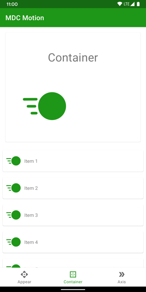
Each item in the RecyclerView will navigate to the same fragment, and we’ll need to load content in that Fragment according to the specific item that was clicked upon. But it also means we need to do a little more work with our Container transitions – specifically the transitionName attributes. We cannot embed these in the layout for each RecyclerView item because then we would have multiple items with the same transitionName attribute in the layout. The transitions framework will not work well if we do this. Instead we need to assign dynamic transition names to each item in the layout:
    override fun onCreateView(
        inflater: LayoutInflater,
        container: ViewGroup?,
        savedInstanceState: Bundle?
    ): View? {
        binding = FragmentContainerBinding.inflate(inflater, container, false)
        binding.card.setOnClickListener { card ->
            navigateCard(
                card,
                binding.textView,
                getString(R.string.container_card),
                getString(R.string.shared_elements_text),
                ContainerFragmentDirections.actionContainerFragmentToContentFragment(
                    binding.textView.text.toString()
                )
            )
        }
        binding.recyclerView.apply {
            layoutManager = LinearLayoutManager(inflater.context, VERTICAL, false)
            adapter = ItemsAdapter(
                inflater.context.resources.getStringArray(R.array.items).toList()
            ) { card, textView, index ->
                navigateCard(
                    card,
                    textView,
                    getString(R.string.container_item_card, index),
                    getString(R.string.shared_elements_item_text, index),
                    ContainerFragmentDirections.actionContainerFragmentToContentItemFragment(
                        textView.text.toString(),
                        index
                    )
                )
            }
        }
        return binding.root
    }
The lambda on the ItemsAdapter constructor will be called when that item is tapped. As before we call navigateCard() but the two strings containing the transition names are created from a formatted string which has the index of the item in the Adapter appended. This means that we have different transition names for each RecyclerView item. This allows the return transition to correctly transition back to the correct RecyclerView item.
We also have an additional argument in the navigation action which is the index of the item. This will enable the destination to dynamically load the correct content. Although for simplicity we won’t do that here.
The Destination Fragment
The key thing that we need to do in the destination fragment is dynamically set the transitionNames of the card and text views:
@AndroidEntryPoint
class ContentItemFragment : Fragment() {

    private lateinit var binding: FragmentContentBinding
    private val args: ContentItemFragmentArgs by navArgs()

    override fun onCreate(savedInstanceState: Bundle?) {
        super.onCreate(savedInstanceState)

        sharedElementEnterTransition = MaterialContainerTransform().apply {
            drawingViewId = R.id.nav_host_fragment
            scrimColor = Color.TRANSPARENT
        }
    }

    override fun onCreateView(
        inflater: LayoutInflater,
        container: ViewGroup?,
        savedInstanceState: Bundle?
    ): View? {
        binding = FragmentContentBinding.inflate(inflater, container, false)
        binding.textView.text = args.title

        binding.card.transitionName = getString(R.string.container_item_card, args.index)
        binding.textView.transitionName = getString(R.string.shared_elements_item_text, args.index)

        return binding.root
    }

    override fun onViewCreated(view: View, savedInstanceState: Bundle?) {
        super.onViewCreated(view, savedInstanceState)

        postponeEnterTransition()
        view.doOnPreDraw { startPostponedEnterTransition() }
    }
}
Here we construct the transition name string in exactly the same way as we did in the source Fragment.
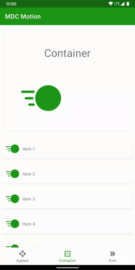
If we now run this we can see we get a really nice expansion and contraction transitions when we tap on the individual items:
Conclusion
Container and shared element transitions can be tricky to get right. That’s not a failing of the Material container transition itself, but more that the underlying shared element transitions can be fiddle. However, if we take the time to endure the frustrations that they present we can give much more fluid flow within our app when we have common information in different Fragments.
The source code for this article is available here.
© 2020, Mark Allison. All rights reserved.
Copyright © 2020 Styling Android. All Rights Reserved.
Information about how to reuse or republish this work may be available at http://blog.stylingandroid.com/license-information.
