
In the previous article we applied a colour scheme to our RSS reader app using the appcompat library. In this article we’ll look at styling our text and also take a look at CardView.
One of the less well-publicised aspects (in terms of Lollipop rather than Material design itself) of the Material themes in Lollipop and the appcompat library is the introduction of some pre-defined text styles. The idea behind these is that we can select the most appropriate text style from one of the pre-defined styles and a consistent text style is maintained across different apps. These styles are detailed in the Material Design Style reference.
Actually applying these text styles is simplicity itself. On Lollipop there are a number of TextAppearance styles in android.R.style.TextAppearance.Material.* and these correspond to the styles in the Material Style reference. Using appcompat is just as easy – we use the styles defined in R.style.TextAppearance.AppCompat.* instead:
<?xml version="1.0" encoding="utf-8"?>
<LinearLayout xmlns:android="http://schemas.android.com/apk/res/android"
  android:layout_width="match_parent"
  android:layout_height="wrap_content"
  android:minHeight="?android:attr/listPreferredItemHeight"
  android:orientation="vertical"
  android:paddingLeft="?android:attr/listPreferredItemPaddingLeft"
  android:paddingStart="?android:attr/listPreferredItemPaddingStart"
  android:paddingEnd="?android:attr/listPreferredItemPaddingEnd"
  android:paddingRight="?android:attr/listPreferredItemPaddingRight">

  <TextView
    android:id="@+id/feed_item_title"
    android:layout_width="match_parent"
    android:layout_height="wrap_content"
    android:layout_marginTop="@dimen/margin"
    android:textColor="@color/text_dark"
    android:textAppearance="@style/TextAppearance.AppCompat.Title" />

  <TextView
    android:id="@+id/feed_item_description"
    android:layout_width="match_parent"
    android:layout_height="wrap_content"
    android:textColor="@color/text_medium"
    android:textAppearance="@style/TextAppearance.AppCompat.Body1" />

  <TextView
    android:id="@+id/feed_item_date"
    android:layout_width="match_parent"
    android:layout_height="wrap_content"
    android:layout_marginBottom="@dimen/margin"
    android:textColor="@color/text_light"
    android:gravity="end"
    android:textAppearance="@style/TextAppearance.AppCompat.Body1" />

</LinearLayout>
We also need to do the same in res/layout/feed_detail.xml, but I won’t bother listing it here as the changes are much the same.
The next thing worth considering is using CardView within our layouts. CardView is a utility component which has been released in its own compatibility library and makes it very easy to include a Material cards in our apps. The cardview compatibility library defines a new CardView widget which essential has the same behaviour as FrameLayout (it actually subclasses FrameLayout) and will render a card-like outline.
As this is a compatibility library it will use the appropriate controls and features of the host OS – so on Lollipop the shadows will be rendered using the new algorithms which are baked in, but on pre-Lollipop devices drawables will be use to create the shadow effects. The best user experience will be on Lollipop which supports the native shadow drawing, but it still looks pretty good on older devices:
One point that Nick Butcher & Chris Banes made during their Papercraft talk at Droidcon London 2014 was not to over cardify apps – only use cards where they are appropriate. In this case, I do not feel that cards are appropriate for our ListView because these individual ListView items are essentially all the same kind of data. However, in the detail view he have a header section and the body containing the full article in a WebView and these sections are ideal for separating as cards.
Firstly we need to add the cardview library to our dependencies:
apply plugin: 'com.android.application'

android {
    compileSdkVersion 21
    buildToolsVersion "21.1.1"

    defaultConfig {
        applicationId "com.stylingandroid.materialrss"
        minSdkVersion 14
        targetSdkVersion 21
        versionCode 1
        versionName "1.0"
    }
    buildTypes {
        release {
            minifyEnabled false
            proguardFiles getDefaultProguardFile('proguard-android.txt'), 'proguard-rules.pro'
        }
    }
}

dependencies {
    compile 'com.mcxiaoke.volley:library:1.0.7'
    compile "com.android.support:appcompat-v7:21.0.0"
    compile "com.android.support:cardview-v7:21.0.0"
}

apply from: "${project(':').projectDir}/config/static_analysis.gradle"
Then it is simply a case of wrapping the existing controls in CardView containers in the layout:
<LinearLayout xmlns:android="http://schemas.android.com/apk/res/android"
  xmlns:tools="http://schemas.android.com/tools"
  android:id="@+id/feed_detail"
  android:layout_width="match_parent"
  android:layout_height="match_parent"
  android:orientation="vertical"
  tools:context=".FeedDetailFragment">

  <android.support.v7.widget.CardView
    android:layout_height="wrap_content"
    android:layout_width="match_parent"
    android:layout_margin="@dimen/outer_margin">

    <LinearLayout
      android:layout_height="wrap_content"
      android:layout_width="match_parent"
      android:orientation="vertical">

      <TextView
        android:id="@+id/feed_detail_title"
        style="@style/TextAppearance.AppCompat.Title"
        android:textColor="@color/text_dark"
        android:layout_margin="@dimen/margin"
        android:layout_width="match_parent"
        android:layout_height="wrap_content"
        tools:text="Title"/>

      <TextView
        android:id="@+id/feed_detail_date"
        style="@style/TextAppearance.AppCompat.Caption"
        android:textColor="@color/text_light"
        android:layout_margin="@dimen/margin"
        android:gravity="end"
        android:layout_width="match_parent"
        android:layout_height="wrap_content"
        tools:text="Date"/>
    </LinearLayout>

  </android.support.v7.widget.CardView>

  <android.support.v7.widget.CardView
    android:layout_height="0dp"
    android:layout_width="match_parent"
    android:layout_weight="1"
    android:layout_marginTop="0dp"
    android:layout_marginLeft="@dimen/outer_margin"
    android:layout_marginBottom="@dimen/outer_margin"
    android:layout_marginRight="@dimen/outer_margin">

    <WebView
      android:id="@+id/feed_detail_body"
      android:layout_height="match_parent"
      android:layout_width="match_parent"
      android:layout_margin="@dimen/margin" />

  </android.support.v7.widget.CardView>

</LinearLayout>
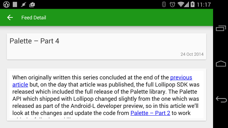
That’s all there is to it! This is how it looks on Lollipop:

And on Kitkat it also looks pretty good (there is a difference in the form-factor of the devices which accounts for the layout differences – a Nexus 9 for Lollipop and a Nexus 5 for Kitkat):
So we’ve actually achieved quite a lot in terms of converting our app to use Material design patterns without having to add a great deal of code in this article!
In the next article we’ll switch from looking at UI to how we can optimise things behind the scenes as an enabler to adding more Material goodness to the app.
The source code for this article is available here.
© 2014 – 2015, Mark Allison. All rights reserved.
Copyright © 2014 Styling Android. All Rights Reserved.
Information about how to reuse or republish this work may be available at http://blog.stylingandroid.com/license-information.
