
At Google IO 2018 ConstraintLayout 2.0 was announced and the biggest new addition was MotionLayout which gives us an amazing new tool for layout animations. Nicolas Roard has already published an excellent introduction to MotionLayout and I would highly recommend giving that a read to understand the basics and components of MotionLayout. In this short series we’ll look at how we can use MotionLayout to create a behaviour that we should all be familiar with: a Collapsing Toolbar.
 Before we begin it is worth mentioning that there is nothing whatsoever wrong with using CollapsingToolbarLayout inside a CoordinatorLayout to achieve this behaviour. Moreover, if you already have that working in an app then there is little to be gained by changing. That said, which CoordinatorLayout provides some really useful behaviours, trying to tweak them or even create your own custom behaviours is quite difficult. It is those situations where MotionLayout may provide far greater flexibility and, my early experiments would suggest, a far easier path to achieving what you want. Furthermore, MotionLayout opens up new behaviours that would be really difficult with CoordinatorLayout.
One of the key differences between MotionLayout and many of the other animation frameworks on Android is that view animations and property animations run for a given duration. While it is possible to specify the duration and cancel a running animation, it is not possible to control a running animation based upon user input. For example, a Collapsing Toolbar should expand and collapse based upon the user scrolling, and the actual animation should follow the user’s drag. This is simply not possible with those frameworks.
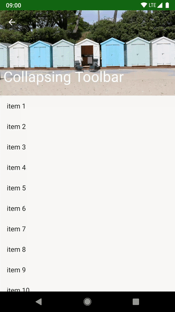
Let’s begin by taking a look at the behaviour that we’re trying to emulate. Here’s a Collapsing Toolbar which is implemented using CollapsingToolbarLayout from the Material Components Library and CoordinatorLayout:
<?xml version="1.0" encoding="utf-8"?>
<androidx.coordinatorlayout.widget.CoordinatorLayout xmlns:android="http://schemas.android.com/apk/res/android"
  xmlns:app="http://schemas.android.com/apk/res-auto"
  android:layout_width="match_parent"
  android:layout_height="match_parent">

    <androidx.recyclerview.widget.RecyclerView
      android:id="@+id/recyclerview"
      android:layout_width="match_parent"
      android:layout_height="match_parent"
      app:layout_constraintStart_toStartOf="parent"
      app:layout_constraintEnd_toEndOf="parent"
      app:layout_constraintBottom_toBottomOf="parent"
      app:layout_constraintTop_toBottomOf="@id/appbar"
      app:layout_behavior="@string/appbar_scrolling_view_behavior" />

    <com.google.android.material.appbar.AppBarLayout
      android:id="@+id/appbar"
      android:layout_width="match_parent"
      android:layout_height="wrap_content"
      android:fitsSystemWindows="true"
      app:layout_constraintStart_toStartOf="parent"
      app:layout_constraintEnd_toEndOf="parent"
      app:layout_constraintTop_toTopOf="parent"
      android:theme="@style/ThemeOverlay.AppCompat.Dark.ActionBar">

      <com.google.android.material.appbar.CollapsingToolbarLayout
        android:id="@+id/collapsing_toolbar"
        android:layout_width="match_parent"
        android:layout_height="200dp"
        android:fitsSystemWindows="true"
        app:contentScrim="?attr/colorPrimary"
        app:expandedTitleGravity="bottom"
        app:expandedTitleMarginEnd="@dimen/activity_horizontal_margin"
        app:expandedTitleMarginStart="@dimen/activity_horizontal_margin"
        app:layout_scrollFlags="scroll|exitUntilCollapsed"
        app:title="@string/app_name">

        <ImageView
          android:id="@+id/toolbar_image"
          android:layout_width="match_parent"
          android:layout_height="match_parent"
          android:adjustViewBounds="true"
          android:contentDescription="@null"
          android:fitsSystemWindows="true"
          android:scaleType="centerCrop"
          android:src="@drawable/beach_huts" />

        <androidx.appcompat.widget.Toolbar
          android:id="@+id/toolbar"
          android:layout_width="match_parent"
          android:layout_height="?attr/actionBarSize"
          app:layout_collapseMode="pin"
          app:popupTheme="@style/ThemeOverlay.AppCompat" />
      </com.google.android.material.appbar.CollapsingToolbarLayout>
    </com.google.android.material.appbar.AppBarLayout>

</androidx.coordinatorlayout.widget.CoordinatorLayout>
The behaviour that we get from that is this:
Getting a close approximation to that using MotionLayout is really quite easy. We first start with our layout file:
<?xml version="1.0" encoding="utf-8"?>
<androidx.constraintlayout.motion.widget.MotionLayout xmlns:android="http://schemas.android.com/apk/res/android"
  xmlns:app="http://schemas.android.com/apk/res-auto"
  xmlns:tools="http://schemas.android.com/tools"
  android:layout_width="match_parent"
  android:layout_height="match_parent"
  tools:context=".MainActivity"
  app:layoutDescription="@xml/collapsing_toolbar"
  tools:showPaths="true">

  <androidx.recyclerview.widget.RecyclerView
    android:id="@+id/recyclerview"
    android:layout_width="0dp"
    android:layout_height="0dp"
    app:layout_constraintBottom_toBottomOf="parent"
    app:layout_constraintEnd_toEndOf="parent"
    app:layout_constraintStart_toStartOf="parent"
    app:layout_constraintTop_toBottomOf="@+id/toolbar_image" />

  <ImageView
    android:id="@+id/toolbar_image"
    android:layout_width="0dp"
    android:layout_height="200dp"
    android:adjustViewBounds="true"
    android:contentDescription="@null"
    app:layout_constraintStart_toStartOf="parent"
    app:layout_constraintEnd_toEndOf="parent"
    app:layout_constraintTop_toTopOf="parent"
    android:fitsSystemWindows="true"
    android:scaleType="center"
    android:src="@drawable/beach_huts"
    android:background="@color/colorPrimary" />

  <ImageView
    android:id="@android:id/home"
    android:layout_width="wrap_content"
    android:layout_height="wrap_content"
    android:paddingStart="16dp"
    android:paddingEnd="16dp"
    android:paddingTop="16dp"
    android:paddingBottom="16dp"
    android:src="@drawable/abc_ic_ab_back_material"
    android:tint="?android:attr/textColorPrimaryInverse"
    app:layout_constraintStart_toStartOf="parent"
    app:layout_constraintTop_toTopOf="parent"/>

  <TextView
    android:id="@+id/title"
    android:layout_width="wrap_content"
    android:layout_height="wrap_content"
    android:layout_marginStart="8dp"
    android:layout_marginBottom="24dp"
    android:text="@string/app_name"
    android:textColor="?android:attr/textColorPrimaryInverse"
    android:textSize="32sp"
    android:textStyle="bold"
    app:layout_constraintBottom_toBottomOf="@id/toolbar_image"
    app:layout_constraintStart_toStartOf="parent" />

</androidx.constraintlayout.motion.widget.MotionLayout>
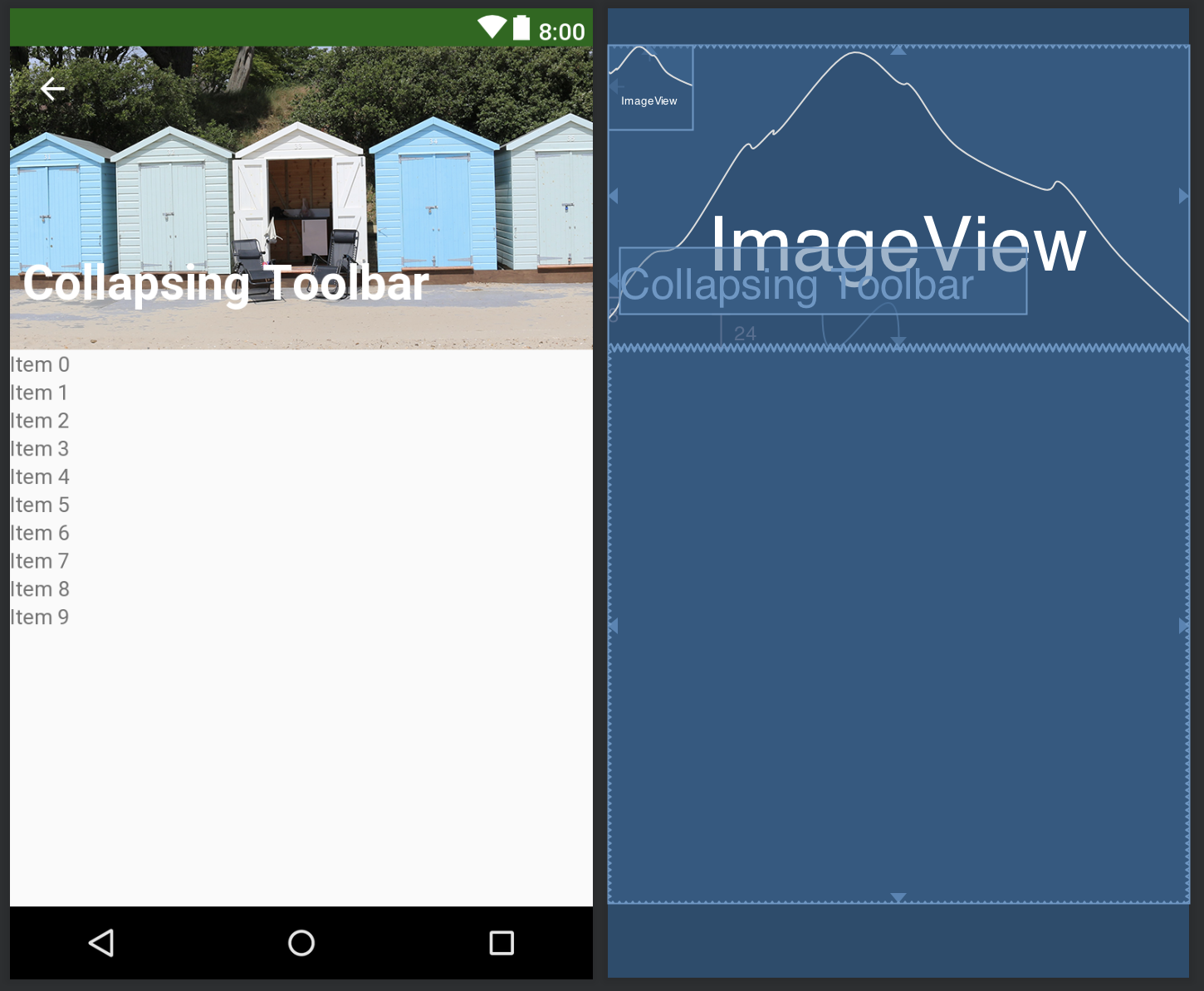
This is essentially a standard layout that we might create using ConstraintLayout, the only difference being the parent is actually MotionLayout (which extends ConstraintLayout, so we can use MotionLayout just like a normal ConstraintLayout). The MotionLayout has an attribute named app:layoutDescription which is where the magic happens. I have deliberately used basic View types here to make it clear that there’s no behaviour coming from the Views themselves. In a real app I would be using AppBarLayout and Toolbar.
If we view this in the design tool, we can see that this represents the layout when the toolbar is in its expanded state:
I just mentioned that the magic happens in the file which is referenced in the app:layoutDescription attribute, so let’s take a look at this:
<?xml version="1.0" encoding="utf-8"?>
<MotionScene xmlns:android="http://schemas.android.com/apk/res/android"
  xmlns:app="http://schemas.android.com/apk/res-auto">

  <Transition
    app:constraintSetEnd="@id/collapsed"
    app:constraintSetStart="@id/expanded">

    <OnSwipe
      app:dragDirection="dragUp"
      app:touchAnchorId="@id/recyclerview"
      app:touchAnchorSide="top" />

  </Transition>

  <ConstraintSet android:id="@+id/expanded">
    <Constraint
      android:id="@id/toolbar_image"
      android:layout_height="200dp"
      app:layout_constraintEnd_toEndOf="parent"
      app:layout_constraintStart_toStartOf="parent"
      app:layout_constraintTop_toTopOf="parent">
      <CustomAttribute
        app:attributeName="imageAlpha"
        app:customIntegerValue="255" />
    </Constraint>
    <Constraint
      android:id="@id/title"
      android:layout_width="wrap_content"
      android:layout_height="wrap_content"
      android:layout_marginStart="8dp"
      android:layout_marginBottom="24dp"
      android:scaleX="1.0"
      android:scaleY="1.0"
      app:layout_constraintBottom_toBottomOf="@id/toolbar_image"
      app:layout_constraintStart_toStartOf="parent">
    </Constraint>
  </ConstraintSet>

  <ConstraintSet android:id="@+id/collapsed">
    <Constraint
      android:id="@id/toolbar_image"
      android:layout_height="?attr/actionBarSize"
      app:layout_constraintEnd_toEndOf="parent"
      app:layout_constraintStart_toStartOf="parent"
      app:layout_constraintTop_toTopOf="parent">
      <CustomAttribute
        app:attributeName="imageAlpha"
        app:customIntegerValue="0" />
    </Constraint>
    <Constraint
      android:id="@id/title"
      android:layout_width="wrap_content"
      android:layout_height="wrap_content"
      android:layout_marginStart="20dp"
      android:layout_marginBottom="0dp"
      android:scaleX="0.625"
      android:scaleY="0.625"
      app:layout_constraintBottom_toBottomOf="@id/toolbar_image"
      app:layout_constraintStart_toStartOf="parent"
      app:layout_constraintTop_toTopOf="@id/toolbar_image">
    </Constraint>

  </ConstraintSet>

</MotionScene>
So this is all new to MotionLayout and probably looks a little scary, so let’s break it down in to smaller, more manageable chunks. The parent layout is a MotionScene, and this holds all of the components which define the transition. It contains two ConstraintSets with each ConstraintSet defining a set of constraints which represent a fixed state of the layout. We’ll take a detailed look at these in a moment, but for now it is enough to understand that one ConstraintSet represents the toolbar in its fully expanded state, and the other represents the toolbar in its fully collapsed state.
The Transition element defines what these start and end states are and how the transition between the two is controlled by user interaction:
<Transition
    app:constraintSetEnd="@id/collapsed"
    app:constraintSetStart="@id/expanded">

    <OnSwipe
      app:dragDirection="dragUp"
      app:touchAnchorId="@id/recyclerview"
      app:touchAnchorSide="top" />

  </Transition>
The app:constraintSetStart and app:constraintSetEnd attributes are references to the two ConstrainSets defining the expanded and collapsed states. The OnSwipe element binds this transition to the user dragging on the RecyclerView in the main layout file that we looked at earlier. In the expanded and collapsed states, the top edge of the RecyclerView is at a different location because it is constrained to the bottom edge of the ImageView with the ID toolbar_image, and this transition is all about controlling that variable location, and that control comes from the user dragging on the RecyclerView. There’s a huge amount of work being done for us in these 10 lines of XML. The internals are quite complex because it’s being driven off the scrolling behaviour of the RecyclerView.
To understand the two ConstrainSet definitions, let’s first consider that there are only two things that we need to control. The first is the ImageView which represents the background (with ID toolbar_image) changes height, and the image opacity changes. By changing the height, it will also cause the top of the RecyclerView to move because the latter is constrained to the bottom of this ImageView. The second view is the TextView which contains the title (with ID title) which needs to both move and change size.
Let’s first look at the delta between the two states of the ImageView. In the expanded state it is this:
  <ConstraintSet android:id="@+id/expanded">
    <Constraint
      android:id="@id/toolbar_image"
      android:layout_height="200dp"
      app:layout_constraintEnd_toEndOf="parent"
      app:layout_constraintStart_toStartOf="parent"
      app:layout_constraintTop_toTopOf="parent">
      <CustomAttribute
        app:attributeName="imageAlpha"
        app:customIntegerValue="255" />
    </Constraint>
For the collapsed state is thus:
  <ConstraintSet android:id="@+id/collapsed">
    <Constraint
      android:id="@id/toolbar_image"
      android:layout_height="?attr/actionBarSize"
      app:layout_constraintEnd_toEndOf="parent"
      app:layout_constraintStart_toStartOf="parent"
      app:layout_constraintTop_toTopOf="parent">
      <CustomAttribute
        app:attributeName="imageAlpha"
        app:customIntegerValue="0" />
    </Constraint>
There are only two small differences here. The first is the layout_height, and the second is a CustomAttribute named imageAlpha. The name CustomAttribute may imply that we’re using a custom View, but that’s not the case. Although we’re using a standard ImageView, the main attributes on the Constraint element in a ConstraintSet can be any of the attributes of ConstraintLayout.LayoutParams or any of the attributes of View, but for subclasses of View such as ImageView we need to use a CustomAttribute which is actually very similar in principle to ObjectAnimator. In this case, we’re adjusting the imageAlpha property of ImageView. Of course you can also use this technique for custom attributes on custom Views, just like ObjectAnimator.
The TextView is actually really similar. The expanded state is:
    <Constraint
      android:id="@id/title"
      android:layout_width="wrap_content"
      android:layout_height="wrap_content"
      android:layout_marginStart="8dp"
      android:layout_marginBottom="24dp"
      android:scaleX="1.0"
      android:scaleY="1.0"
      app:layout_constraintBottom_toBottomOf="@id/toolbar_image"
      app:layout_constraintStart_toStartOf="parent" />
And the collapsed state is:
    <Constraint
      android:id="@id/title"
      android:layout_width="wrap_content"
      android:layout_height="wrap_content"
      android:layout_marginStart="20dp"
      android:layout_marginBottom="0dp"
      android:scaleX="0.625"
      android:scaleY="0.625"
      app:layout_constraintBottom_toBottomOf="@id/toolbar_image"
      app:layout_constraintStart_toStartOf="parent"
      app:layout_constraintTop_toTopOf="@id/toolbar_image"/>
Here we’re using view scaling to alter the size of the TextView. If you’re wondering why I opted for view scaling rather than changing textSize via a CustomAttribute, the reason is that changing the text size and re-rendering it is computationally much more expensive than simply applying a transformation, so we’re much less likely to get jank in out transition using this technique.
The other thing we’re doing is changing margins, and how the TextView is positioned relative to the ImageView. In the collapsed state it is centred vertically, and in expanded state it is aligned to the bottom, so the TextView will more relative to the size of the ImageView.
If we use that layout in place of the CoordinatorLayout implementation that we started with we get this behaviour:
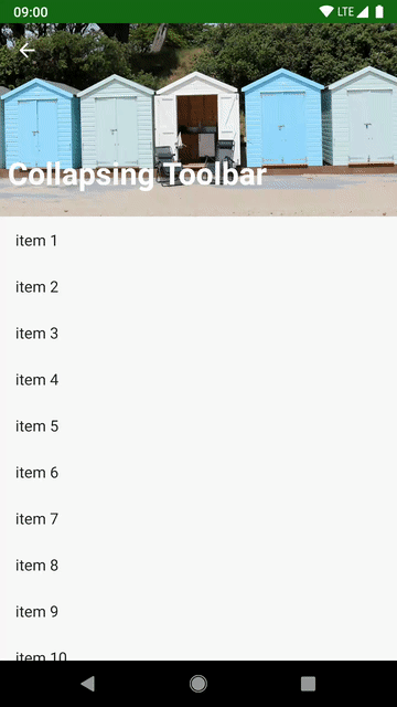
That’s actually pretty close, but the eagle eyed may spot that there is a slight difference between that and the CoordinatorLayout approach that we looked at at the start: In the CoordinatorLayout transition the image fade does not happen uniformly during the transition as it does with the MotionLayout version. In the concluding article in this series we’ll look at some of the finer-grained control we can get with MotionLayout.
The source code for this article is available here.
© 2018 – 2019, Mark Allison. All rights reserved.
Copyright © 2018 Styling Android. All Rights Reserved.
Information about how to reuse or republish this work may be available at http://blog.stylingandroid.com/license-information.

Great article, thank you! Just an FYI, I was able to copy the “enterAllways” behavior with motion:moveWhenScrollAtTop=”false”